Cell Ranger5.1, printed on 03/26/2025
This page is a walk-through of the Summary Plots tab of the Loupe V(D)J Browser.
There are seven different charts through which you can investigate the diversity of a V(D)J sample: clonotype abundance, CDR3 abundance, V gene usage, D gene usage, J gene usage, C gene usage, and a V-J gene heatmap. Each chart comes with various viewing options and can be used to filter the clonotype list. They also support the ability to export the data as a CSV table, a PNG image, or an SVG drawing via the Export As button in the upper right. You can select a chart from the Chart Type dropdown at the upper left. The question mark above the chart selector will show help text for the current chart, but here is an overview:
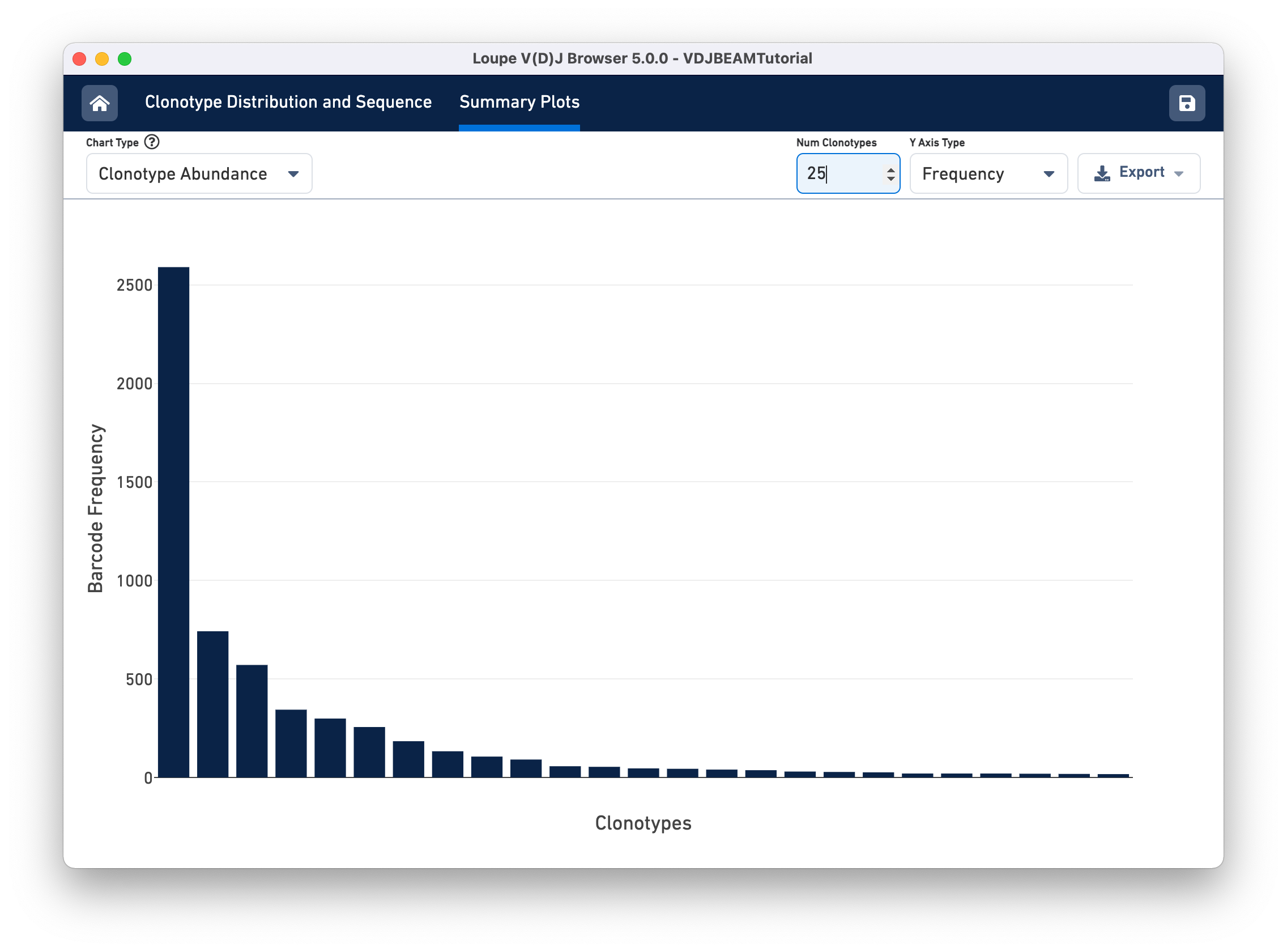
This chart shows the most frequent clonotypes, from most to least abundant. You can change the number of top clonotypes displayed by typing a new number in the Num Clonotypes input box above the chart. As with all bar charts in the Summary Chart View, you can change the y-axis to reflect either the absolute clonotype count or the percent of clonotypes (or genes) that each bar represents. You should see that the tutorial sample has one prominent clonotype with 41.33% barcodes. The abundance quickly drops off, and we see a long tail of singleton clonotypes represented once each.
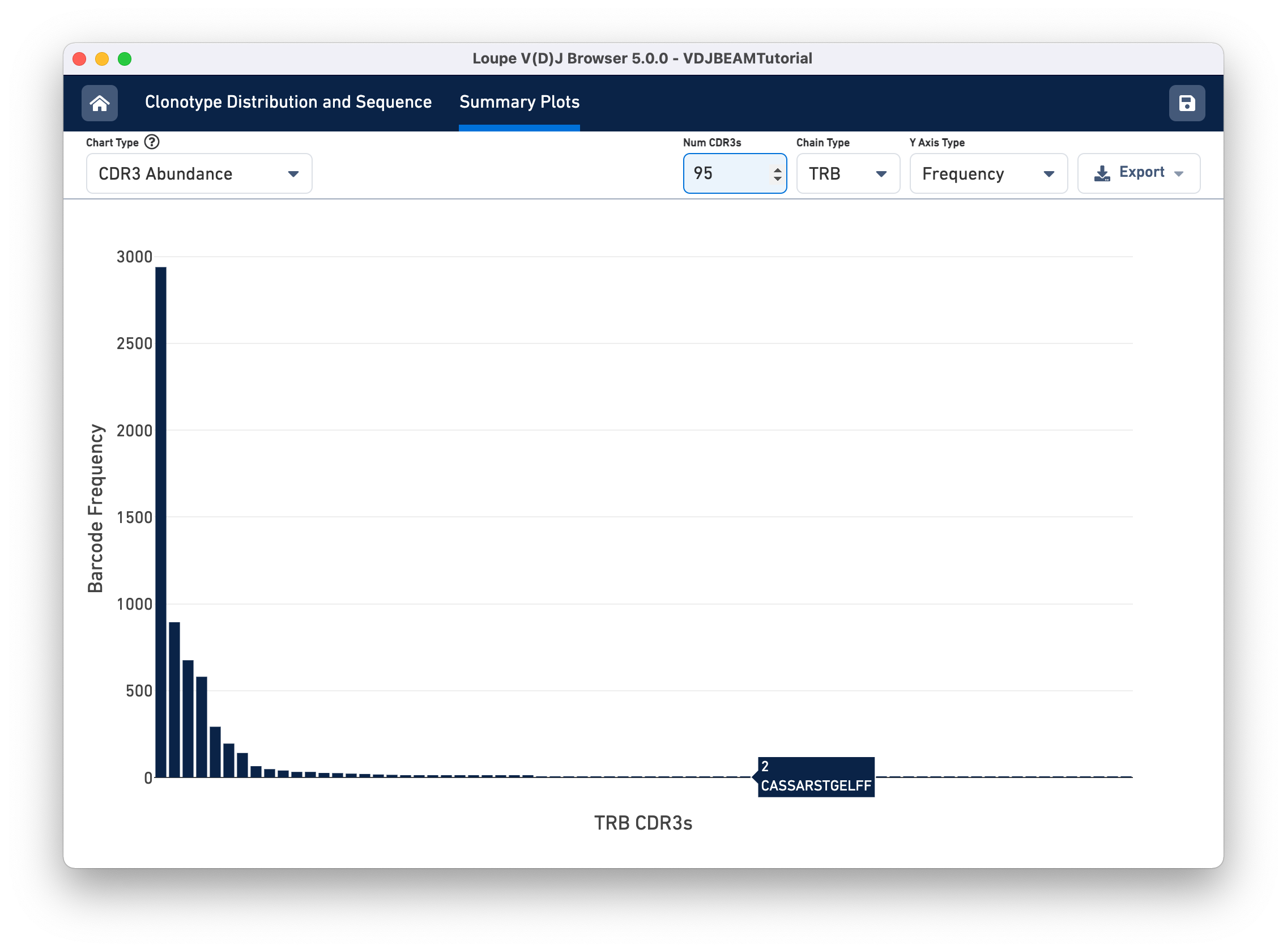
Select CDR3 Abundance from the Chart Type selector. This chart is similar to the Clonotype Abundance plot except that it shows the abundance of CDR3 sequences within individual chains. It counts all chains with each CDR3 detected in any cell in the sample. In this plot, you can view one chain type at a time.
Other features of the CDR3 Abundance chart are the same as the Clonotype Abundance plot. You can change the number of CDR3s shown, as well as the y-axis type.
Select V Gene Usage from the Chart Type selector. The chart in the content panel will change to a histogram of V gene frequency across the sample. The y-axis is the number of cells in which a particular V gene was expressed. You can see that the most numerous V gene in this sample is TRAV6-5, which was detected in the transcripts of ~3000 distinct cell barcodes.
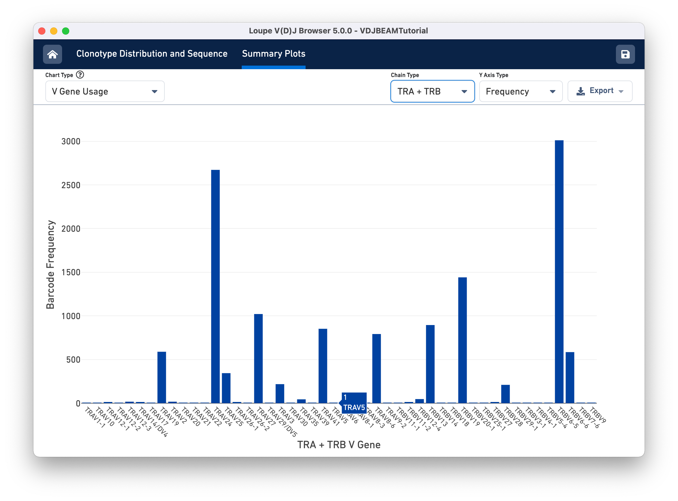
The Chain Type selection box allows you to see all chain types or limit the chart to one chain type. In this case, we can see options TRA and TRB; for a B cell sample, we would have IGH, IGK, and IGL instead.
The D, J, and C Gene Usage plots are analogous. Those charts show their respective gene usage distributions with the same functionality. You can view them by selecting them from the Chart Type selector.
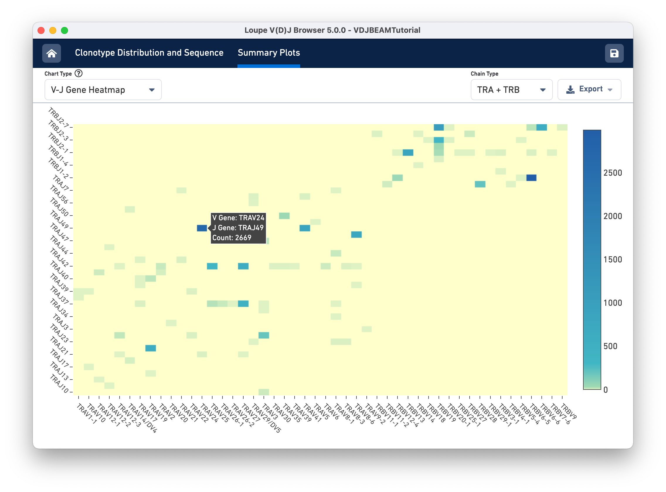
Finally, select V-J Gene Heatmap from the Chart Type selector to see the V-J Gene Heatmap. Through this chart, you can view the frequency of V-J gene pairings across your sample. Each box in the heatmap represents the number
of cells in which Cell Ranger detected transcripts with the specified V gene (column) and J gene (row). If a particular box is yellow, no such transcripts were detected in the sample. Darker colors show more frequent V-J gene pairings. If you hover over each box, you will see the names of the V and J genes as well as the frequency of the pairing. After hovering the TRAV26-1/TRAJ34 cell, you should see the cell count as shown below: