Space Ranger2.0, printed on 04/26/2025
The spaceranger count pipeline outputs an interactive summary HTML file named web_summary.html that contains summary metrics and automated secondary analysis results. Any alerts issued by the pipeline are displayed at the top of the page, such as an indication that results or sequencing data are out-of-spec. Further information about alerts is provided in the troubleshooting documentation.
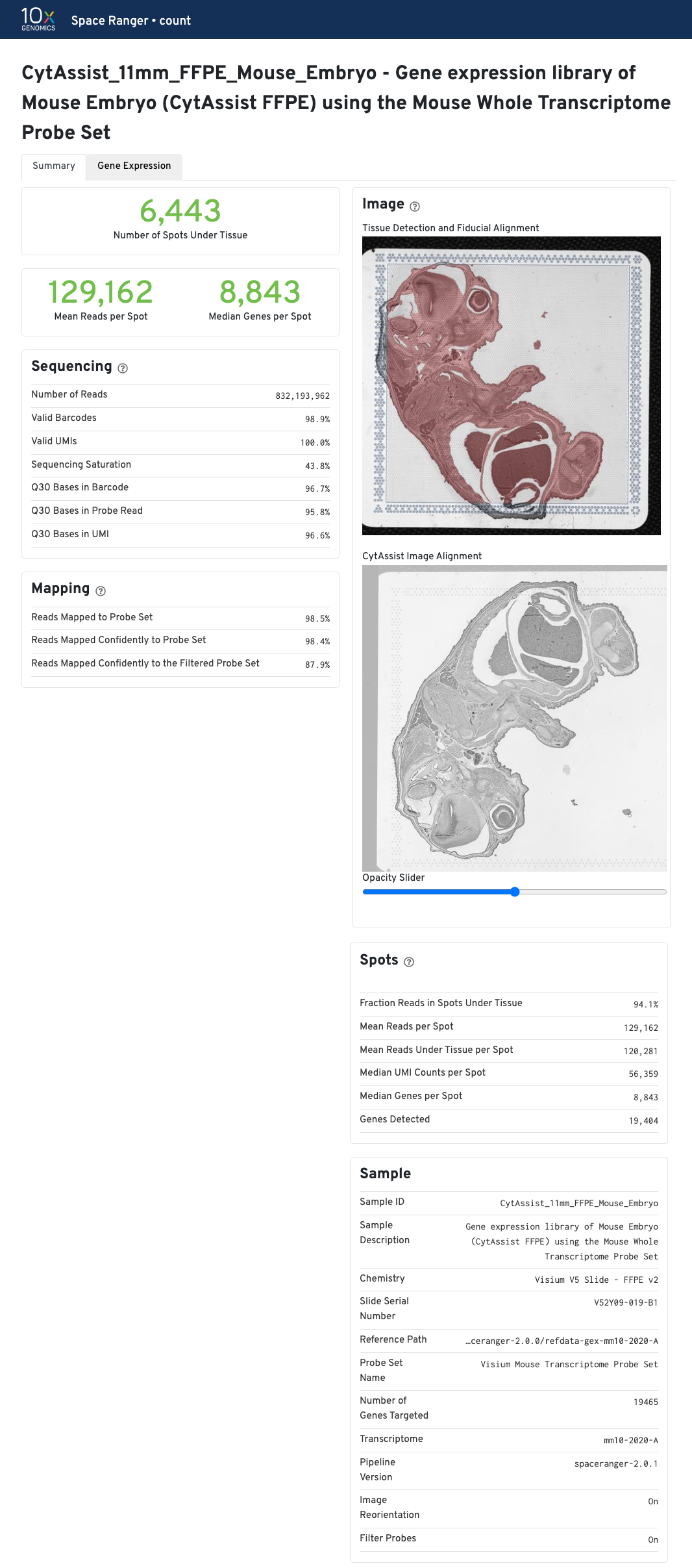
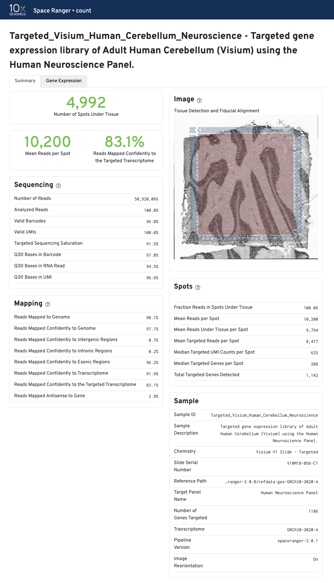
| If automated tissue detection was performed, a reddish color will be assigned to any pixel labeled as tissue, even if that pixel does not coincide with a spot. Image panel is intended for checking the quality of the alignment and tissue selection that was performed, and is an important first step in interpreting your results. See Imaging Algorithms for details about these features. |
Select the tabs to find the summary information for each pipeline.
The summary metrics describe sequencing quality and various characteristics of the detected spots for whole-transcriptome (WTA) analyses.
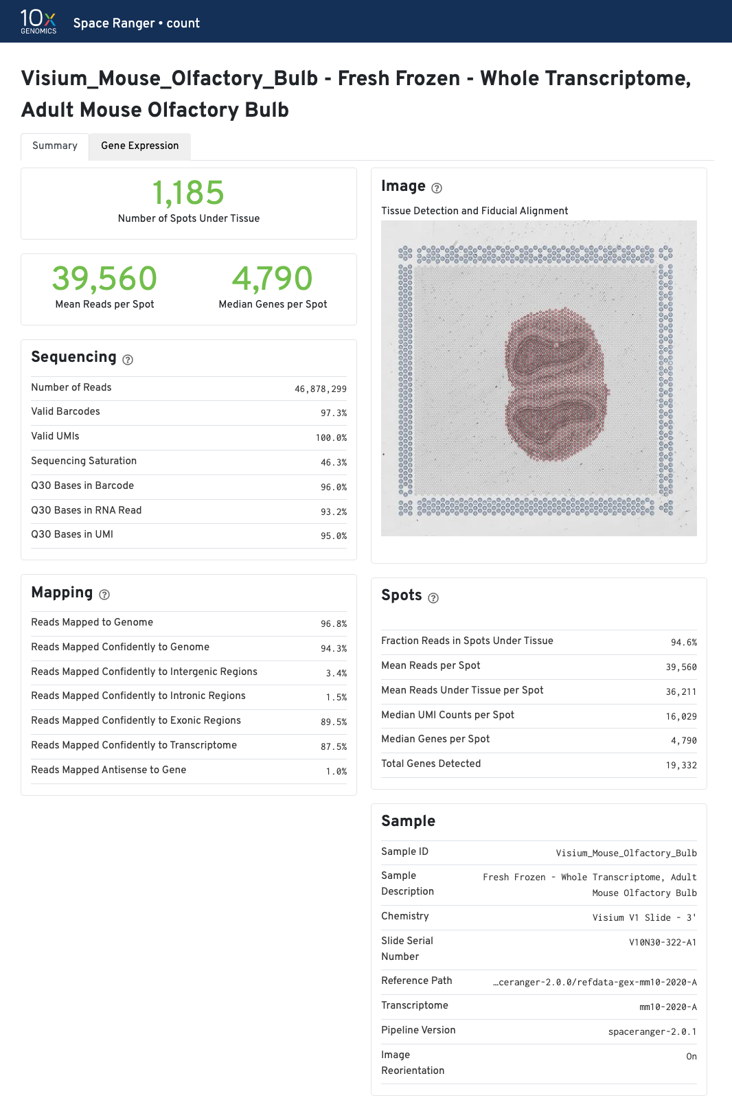
The recommended value for Mean Reads per Spot is 50,000.
Median Genes per Spot will vary by sample, and low values are not necessarily indicative of a failed experiment. Samples with abundant connective tissue may have some tissue-covered spots with few UMIs; this is expected.
The Visium for FFPE web summary includes the probe-specific metrics under Mapping panel:
None with --filter-probes=false.More detailed explanation about the different metrics are included in the Interpreting Space Ranger Web Summary Files for Visium Spatial Gene Expression for FFPE assay Technical Note.
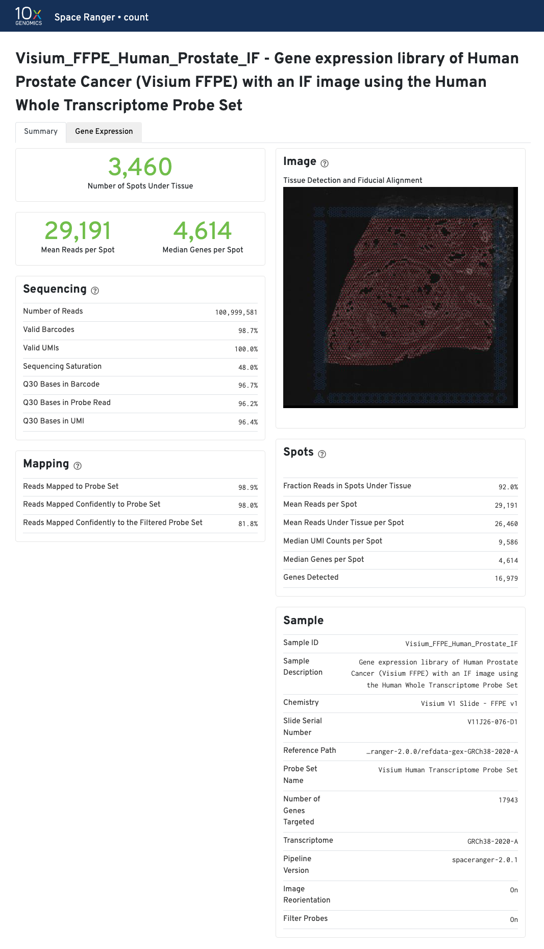
The recommended value for Mean Reads per Spot is 25,000.
Median Genes per Spot will vary by sample and low values not indicative of failed experiment. Samples with lots of connective tissue may have some tissue covered spots with few UMIs and that is expected.
The metrics reported in the summary view for CytAssist-enabled GEX are identical to GEX (FFPE). If a microscope image of the tissue section on a standard slide was provided as an input, the Image panel shows the results of the CytAssist Image Alignment. Dark-background fluorescence microscope image inputs are pre-processed to invert colors to have white backgrounds in the CytAssist Image Alignment box in web_summary.html file.
Move the opacity slider to assess the results of the image registration between the two image inputs in this web_summary.html file. Use the slider to check for tissue boundary continuity (both outer and inner boundaries) and similarity in the image sizes, i.e. no shrinkage or expansion between the two images. The CytAssist captured image which contains the fiducial frame is always used in the Tissue Detection and Fiducial Alignment box.
| The results of the image registration do not impact the sequencing based metrics or secondary analysis. |
In addition to the metrics included in the WTA output, the targeted output includes targeting-specific metrics (highlighted in blue) such as Analyzed Reads, Mean Targeted Reads per Spot, and Median Targeted Genes per Spot.
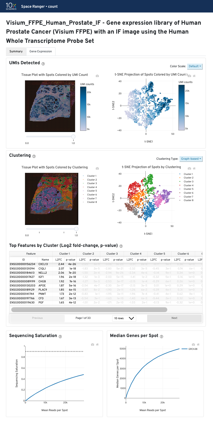
The contents of the Gene Expression tab are similar across sample types (FF vs FFPE) and different workflows (GEX or CytAssist enabled GEX). The tab is divided into three panels that each contain the following data:
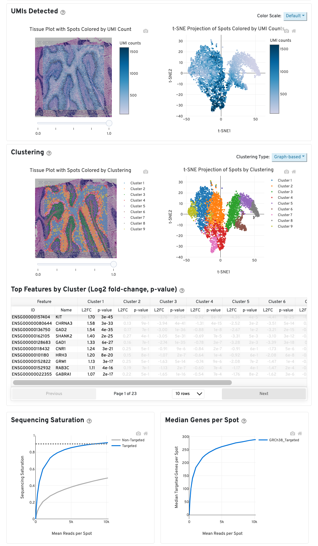
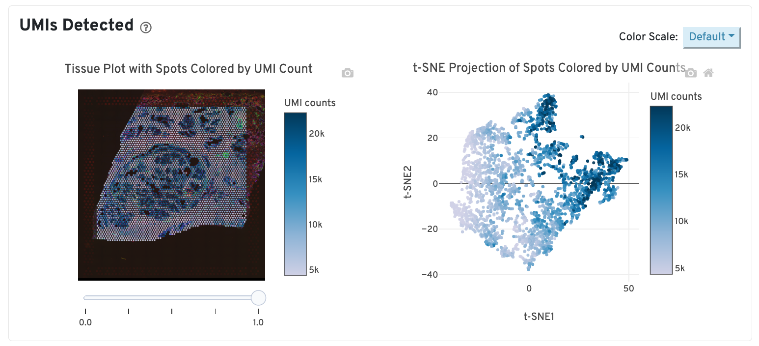
The top left plot shows the tissue colored by the total UMI counts per spot, where darker blue indicates higher UMI counts and more RNA content in each spot. Regions containing mostly connective tissue or other RNA poor structures will typically have low UMI counts.
The top right plot shows the 2-D t-SNE projection of the spots colored by the total UMI counts per spot. In this space, pairs of spots that are close to each other have more similar gene expression profiles than spots that are distant from each other. The color scale is selectable from the dropdown in the upper right - change this to vary the default coloring scheme.
The middle left plot overlays the clustering results onto the tissue segment. The spots are colored according to the cluster they are assigned to - clustering itself is done on the transcriptome data, without taking into account the spatial information.
The middle right plot overlays the clustering results onto the 2-D t-SNE projection of spots. The type of clustering analysis is selectable from the dropdown in the upper right - change this to vary the type of clustering and/or number of clusters that are assigned to the data.
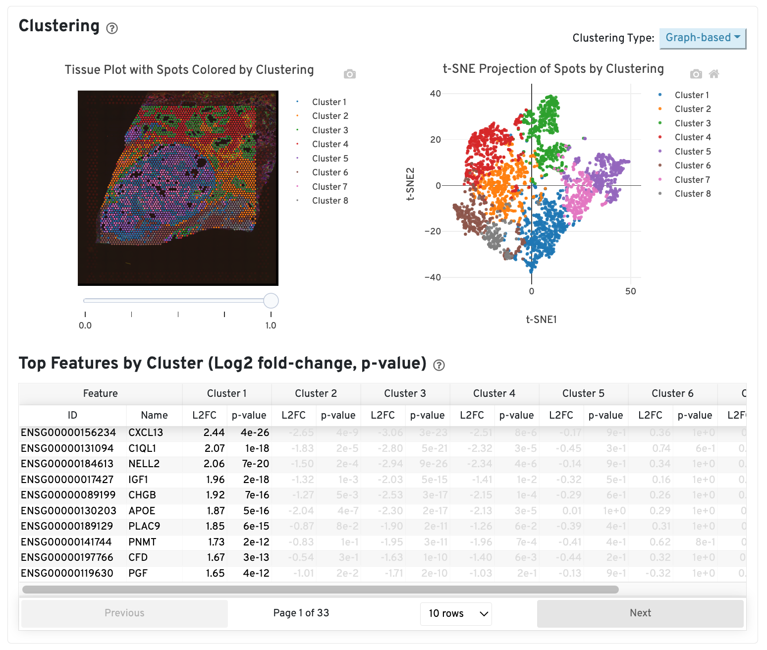
The table in the middle shows which genes are differentially expressed in each cluster relative to all other clusters. The table presents the opportunity to check for known cell markers and assign clusters to cell types. To find the genes associated with a particular cluster, you can click the cluster number to sort the table by specificity for that cluster.
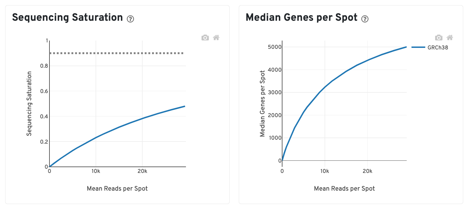
The bottom left plot shows the effect of decreased sequencing depth on Sequencing Saturation, which is a measure of the fraction of library complexity that was observed. The far right point of the line is the full sequencing depth obtained in this run.
Similarly, the bottom right plot shows the effect of decreased sequencing depth on Median Genes per Spot, which is a way of measuring data yield as a function of depth. The far right point is the full sequencing depth obtained in this run.
These plots can be helpful for assessing the benefit of sequencing the library deeper. A steep slope at the end of either plot suggests there maybe a benefit, while a plateaued curve suggests no further gain.
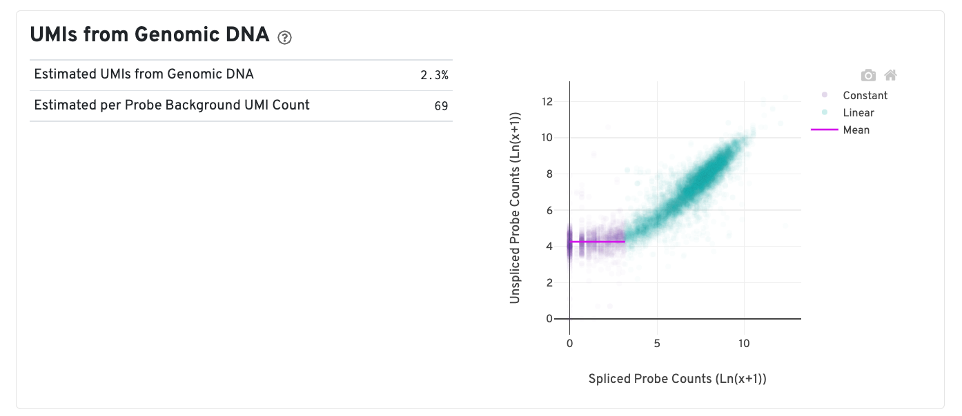
In CytAssist Spatial Gene Expression for FFPE or Fresh Frozen chemistry, due to the change in the decrosslinking temperature in the workflow, accessibility to both the RNA and genomic DNA (gDNA) is increased. Some of the sequenced ligation events reflect contribution from open gDNA.
A new plot is added to estimate the UMIs from gDNA which is reflected by the mean of the constant portion of the log scale curve. Each point represents a gene that has probes targeting both exon-junction-spanning and non-exon-junction-spanning regions, 'spliced' and 'unspliced', respectively. Unspliced probes may originate from open gDNA and from RNA. Spliced probes are expected to stem only from RNA. A segmented linear model is used to estimate where the unspliced and spliced counts begin to deviate. The mean of unspliced counts in purple estimates the UMI background level per unspliced probe. Counts less than this have a high probability of stemming from gDNA. The Estimated UMIs from Genomic DNA is the estimated percent of filtered UMIs derived from gDNA based on the discordance between probes targeting exon-junction-spanning regions and non-exon-junction-spanning regions.
The Estimated per Probe Background UMI Count is the per unspliced probe estimate of UMIs derived from genomic DNA. Note that this plot is present only in Human samples run on the CytAssist instrument, since the Human probe set reference v2 CSV file contains probes targeting both exon-junction-spanning and non-exon-junction-spanning regions. For further discussion, please refer to this Technical Note.
In addition to the output from spaceranger count in WTA mode, additional targeting-specific metrics are captured when run against a targeted panel. A Targeted Enrichment dashboard is added to the top with
A successful targeted experiment where targeted genes are well-enriched looks like the example below, with targeted genes (blue) cleanly separable from non-targeted genes (gray). See Targeted Gene Expression Algorithms for more information on how gene enrichments are computed.
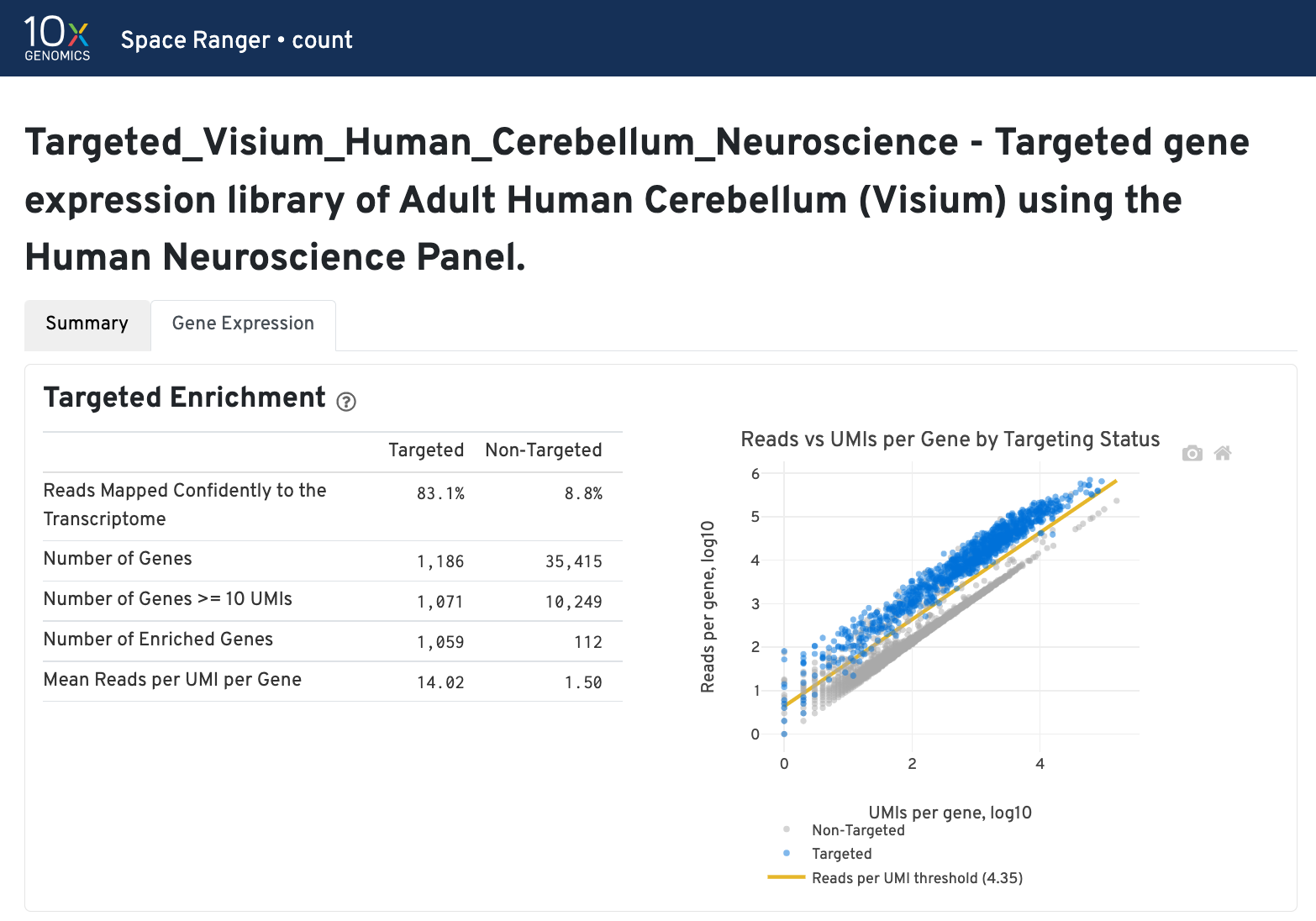
The remainder of the analysis tab is similar to that of a WTA run, but focuses on targeted genes (Sequencing Saturation, Median Genes per spot). As described under count-targeted Targeted Gene Expression Analysis, all secondary analyses (t-SNE, differential expression) are done using only targeted genes.