Cell Ranger4.0, printed on 03/11/2025
Loupe V(D)J Browser 4 now allows you to load .vloupe files from the cellranger aggr
pipeline to do multi-sample comparisons.
To demonstrate the different comparisons available, you will need to download the
two-sample PBMC .vloupe file.
Upon opening the aggr file in Loupe V(D)J Browser, note that the views are the same as
the ones produced for a single sample file. The charts explored so far in the tutorial
all function the same way for aggr files, but for aggr files every view can contain
data from multiple samples. The only difference is the clonotype table now has a
Sample filter.
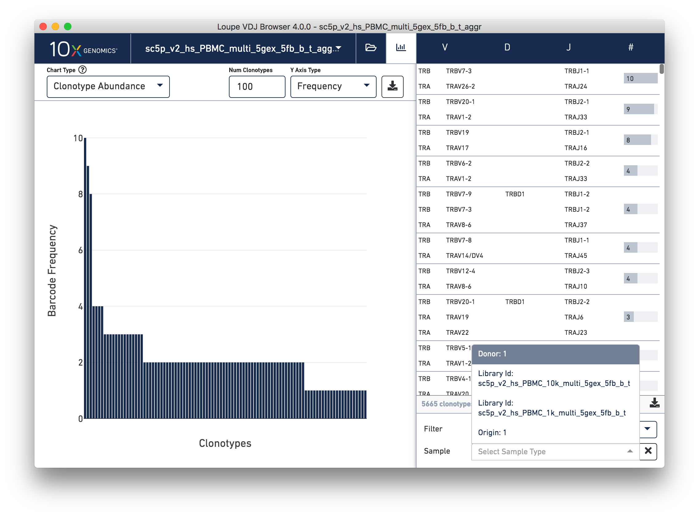
After selecting the filter, there will be a list of options for dividing the barcodes in
the file into samples. There are two names associated in each dropdown item. The first is
the Sample Group, which represents a column that the aggregation CSV used as input to
the aggr pipeline. The default options are donor, origin, and library id, but custom
fields can be provided as well to represent a group like time points or disease status.
For details on the definitions of the default groups look at the Cell Ranger glossary.
The second name is the sample name. For example, if the samples originate from heart and
lung tissue, two of the filter options might be Origin: Heart and Origin: Lung.
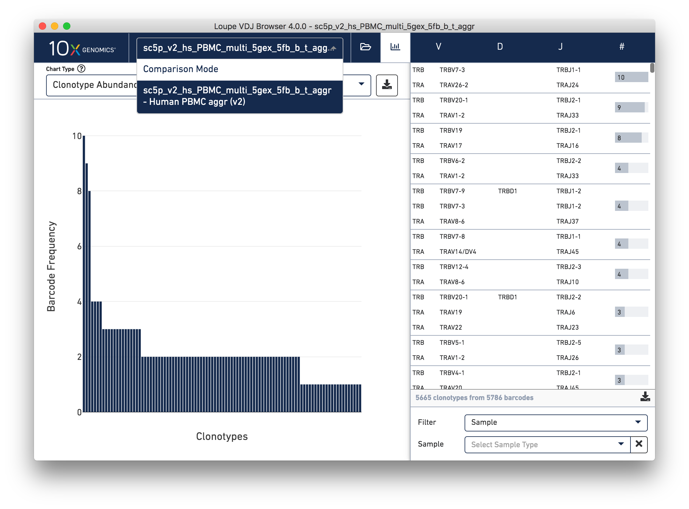
To compare the samples in detail, click on the file name in the top bar selector and select Comparison Mode.
When switching into Comparison Mode, you initially see a summary of all loaded samples referred to as the sample table.
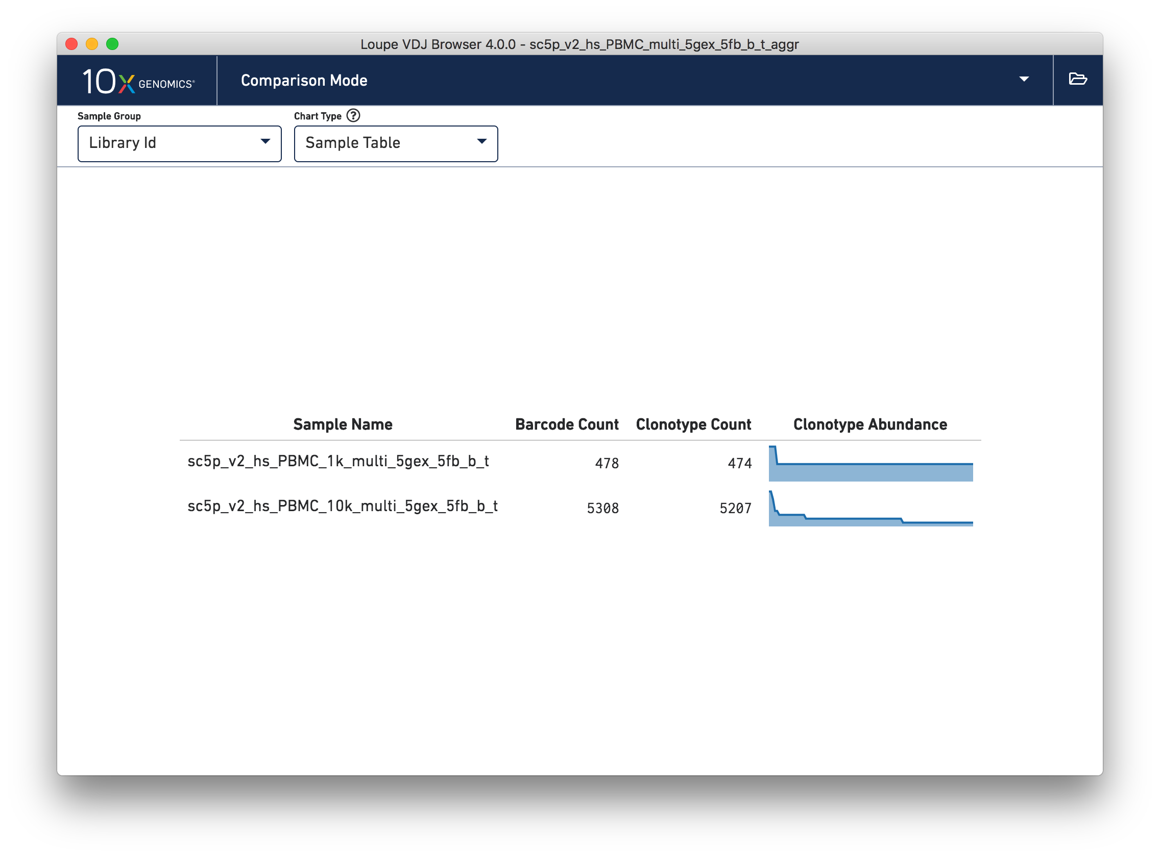
Above the sample table are all other comparison charts is the control bar. The
leftmost widget in the control bar is the Sample Group selector, which can be used to
toggle between the different sample groups to divide the data in the views in different
ways. For example, when looking at a dataset with multiple donors and a custom Time Point
group, all views can be divided by Donor or Time Point. The tutorial file has the same
donor and origin but comes from two different libraries, so toggle to the Library Id
option.
The next dropdown is the Chart Type selector, which allows you to switch between charts. Each chart has its own set of options, which will be on the right side of the control bar. Most charts will have an export button, where the chart image can be exported to SVG or PNG, or the underlying data can be exported to a CSV file.
When the file has a large number of samples, another selector will appear that can be used to select a subset of samples to view throughout the charts.
The Sample Table is the default comparison chart. For each sample in the sample group, you will see a row in the sample table with its name, the number of detected barcodes for that sample, the number of unique clonotypes, and its distribution of the top clonotype frequencies.
The Clonotype Frequency chart gives you a feel for how closely the clonotypes of two samples map onto each other. The x-axis represents the frequency of a particular clonotype in sample A, and the y-axis represents the frequency of a particular clonotype in sample B. The size of the circles at each point represent the number of clonotypes that have x barcodes in sample A and y barcodes in sample B.
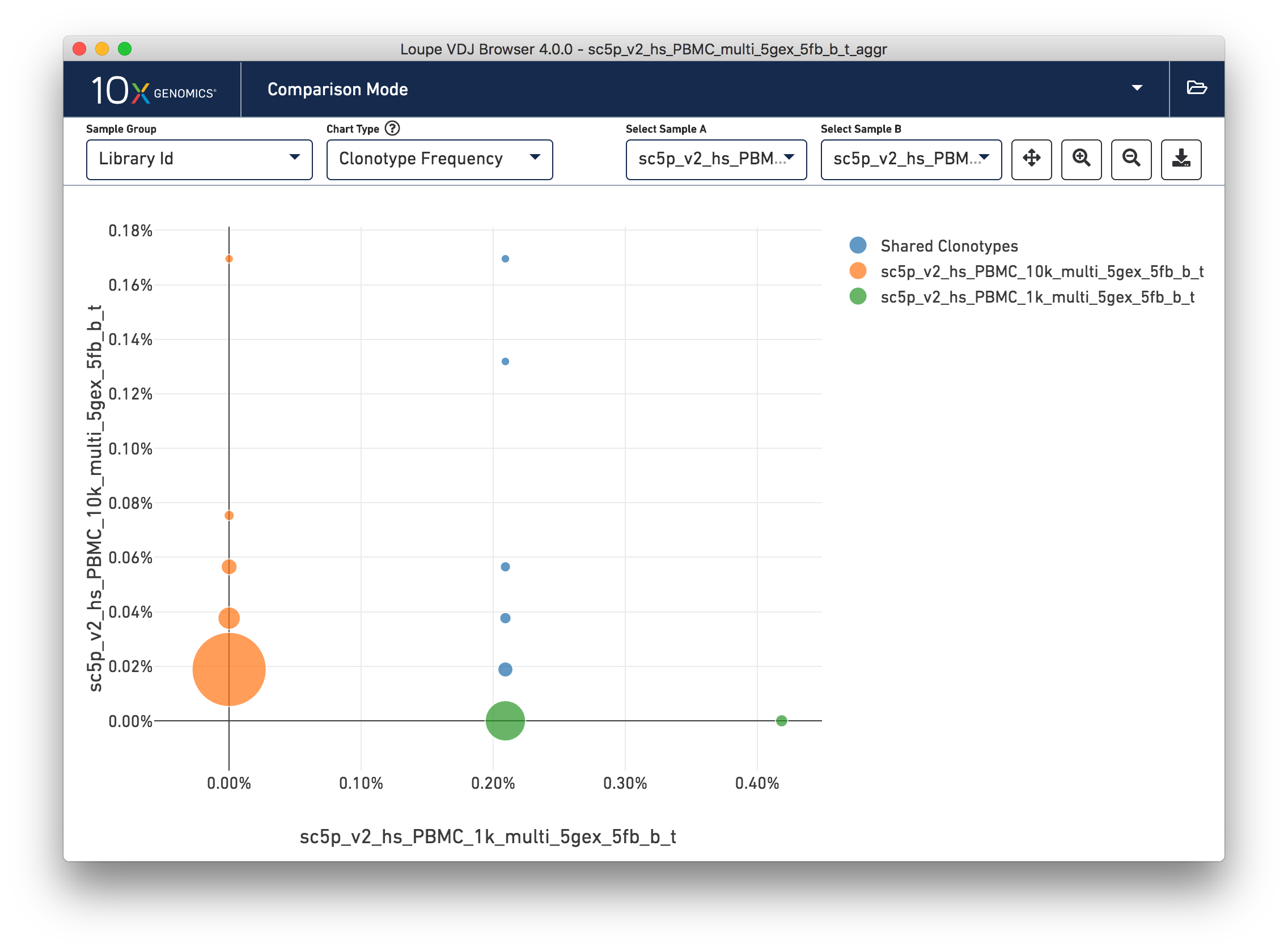
To get a feel for this, compare the two samples by library ID. The mutual frequencies are lined up vertically in the center of the chart. In this case the green sample primarily has clonotypes with one barcode, which is where that line falls, but no overlap in clonotypes with multiple barcodes.
You can use the zoom in/out and autoscale buttons on the control bar to zoom into regions of the chart in more detail, and drag the chart around with your mouse.
This chart shows the frequencies of one sample's top clonotypes in the other loaded samples. You can set the anchor sample by selecting a sample from the Top 10 Clonotypes From selector at upper right. For example, when the 10k (orange) sample is selected as the anchor, the frequencies of the 1k's top N clonotypes for each sample are shown in the chart.
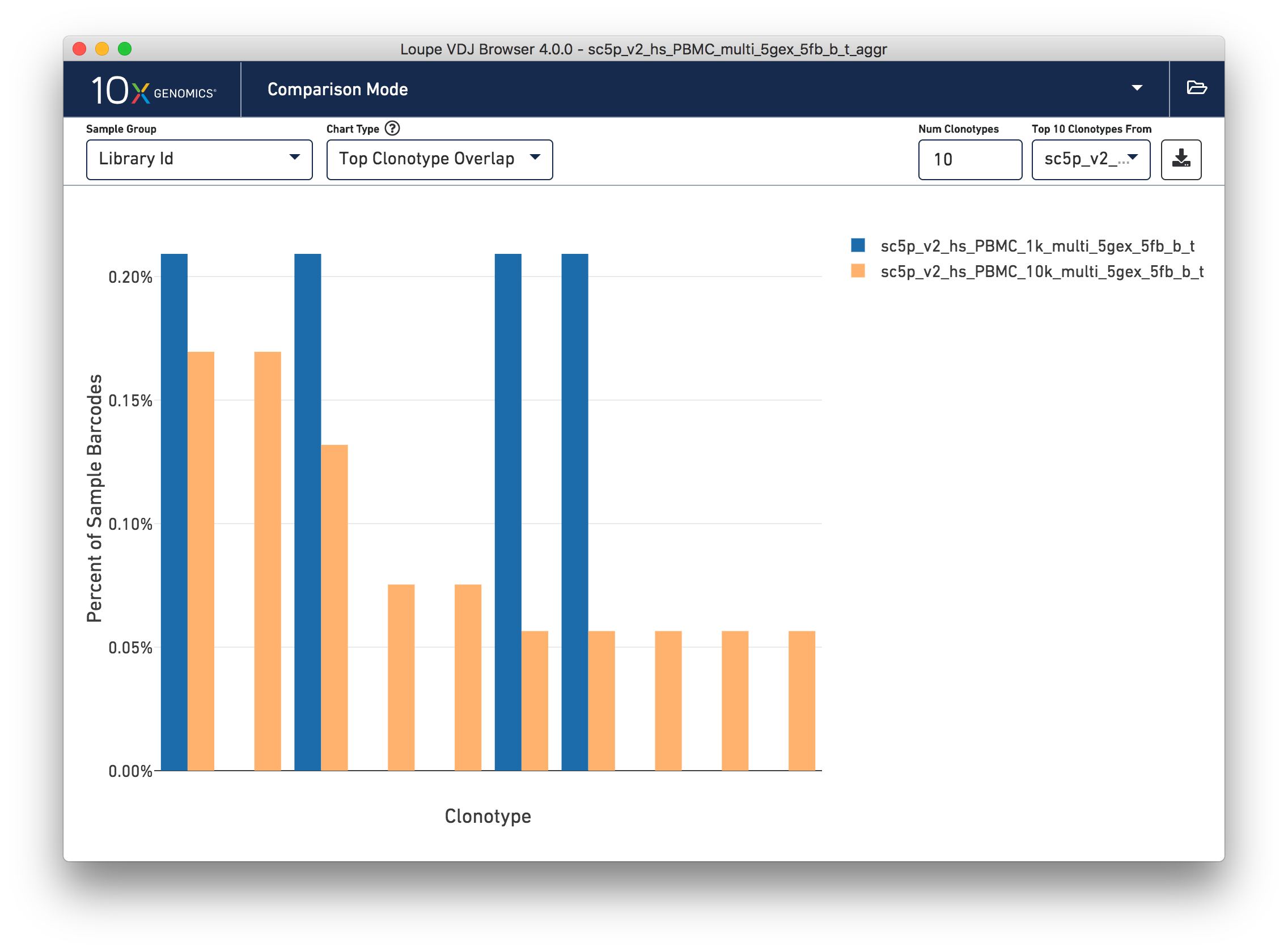
The top 10 clonotypes from the 10k sample (orange) are also fairly abundant in the 1k sample (blue). You can change the number of clonotypes compared by editing the Num Clonotypes value in the control bar. You can toggle the visibility of any given sample by clicking on it in the legend in the upper right.
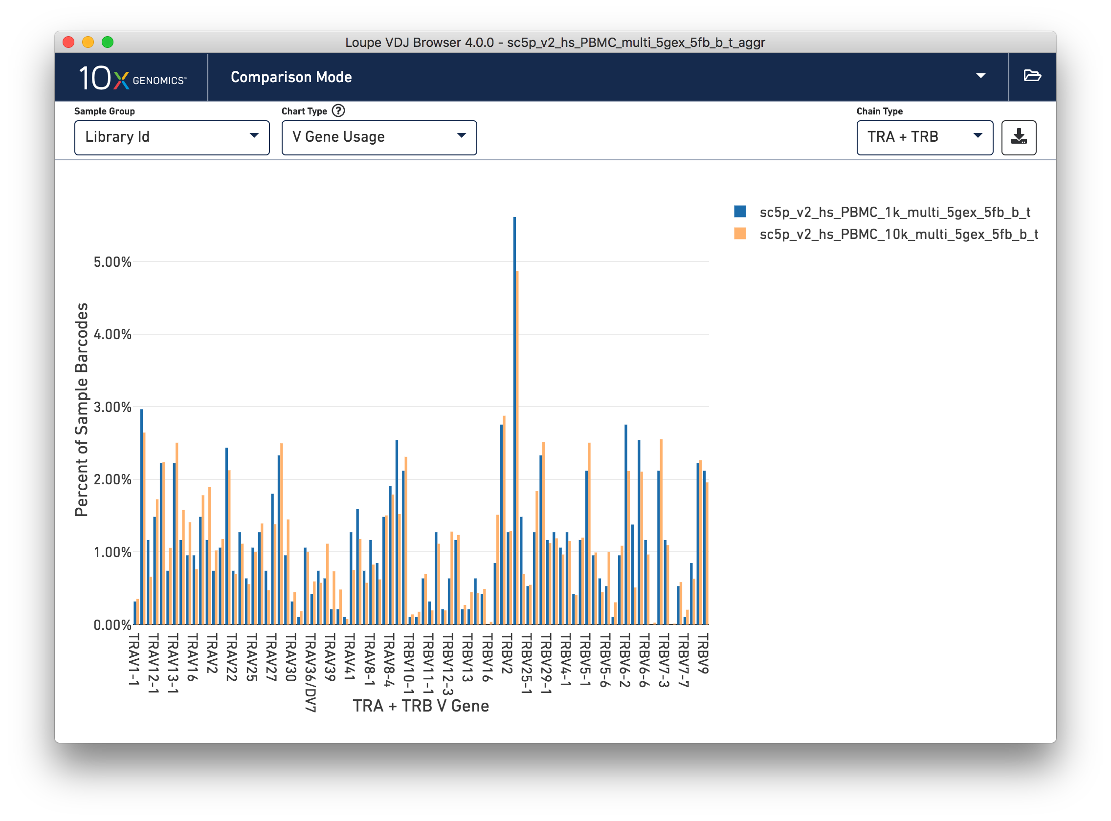
Finally, you can compare the relative frequencies of V, D, J, and C genes across multiple samples by selecting one of those four charts in the chart type selector. For each gene usage chart, you can either look at all chain types, or limit to a single chain type through the Chain Type selector.
This concludes the Loupe V(D)J Browser tutorial. We hope that you are comfortable enough now to use this tool on your own Chromium Single Cell 5′ V(D)J data. If you have matching 5′ Gene Expression data, the Loupe V(D)J and Cell Browsers are more powerful together. See the integrated V(D)J and gene expression analysis tutorial.
If you encounter difficulties or have general questions about the software, email [email protected] with your questions.