Cell Ranger6.0, printed on 03/11/2025
The cellranger pipeline outputs a summary HTML file named web_summary.html that contains summary metrics and automated secondary analysis results. If an issue was detected during the pipeline run, an alert appears on this page, and more information about these is provided in the troubleshooting documentation.
The cellranger vdj pipeline outputs a summary HTML file containing summary metrics and automated secondary analysis results.
The run summary can be viewed by clicking "Summary" in the top left corner. The summary metrics describe sequencing quality and various characteristics of the detected cells.
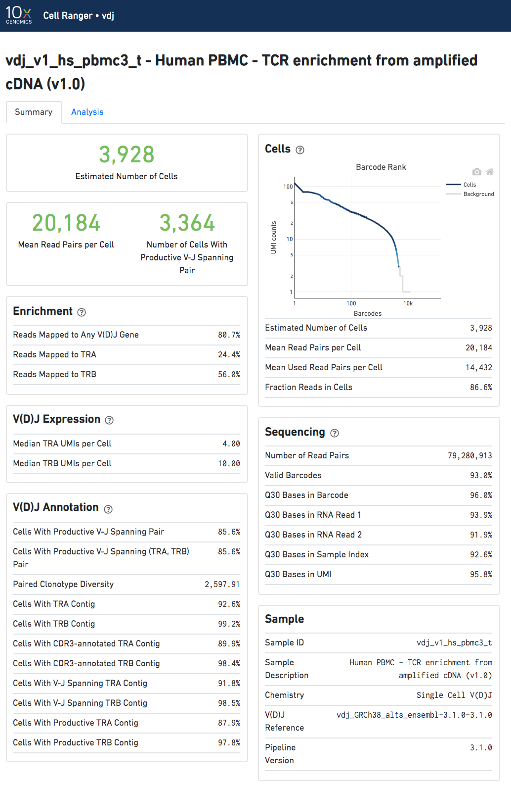
The number of cells detected, the mean read pairs per cell, and the number of V-J spanning productive paired cells are prominently displayed near the top of the page.
Click the '?' in the upper right corner of each dashboard for more information on each metric.
The Barcode Rank Plot under the "Cells" dashboard shows the count of filtered UMIs mapped to each barcode. A barcode must have a contig that aligns to a V segment to be identified as a targeted cell. (In the denovo case, the only requirement is a contig's presence.) There must also be at least three filtered UMIs with at least two read pairs each. It is possible that a barcode with at least as many filtered UMIs as another cell-associated barcode is not identified as a targeted cell. The color of the graph is based on the local density of cell-associated barcodes.
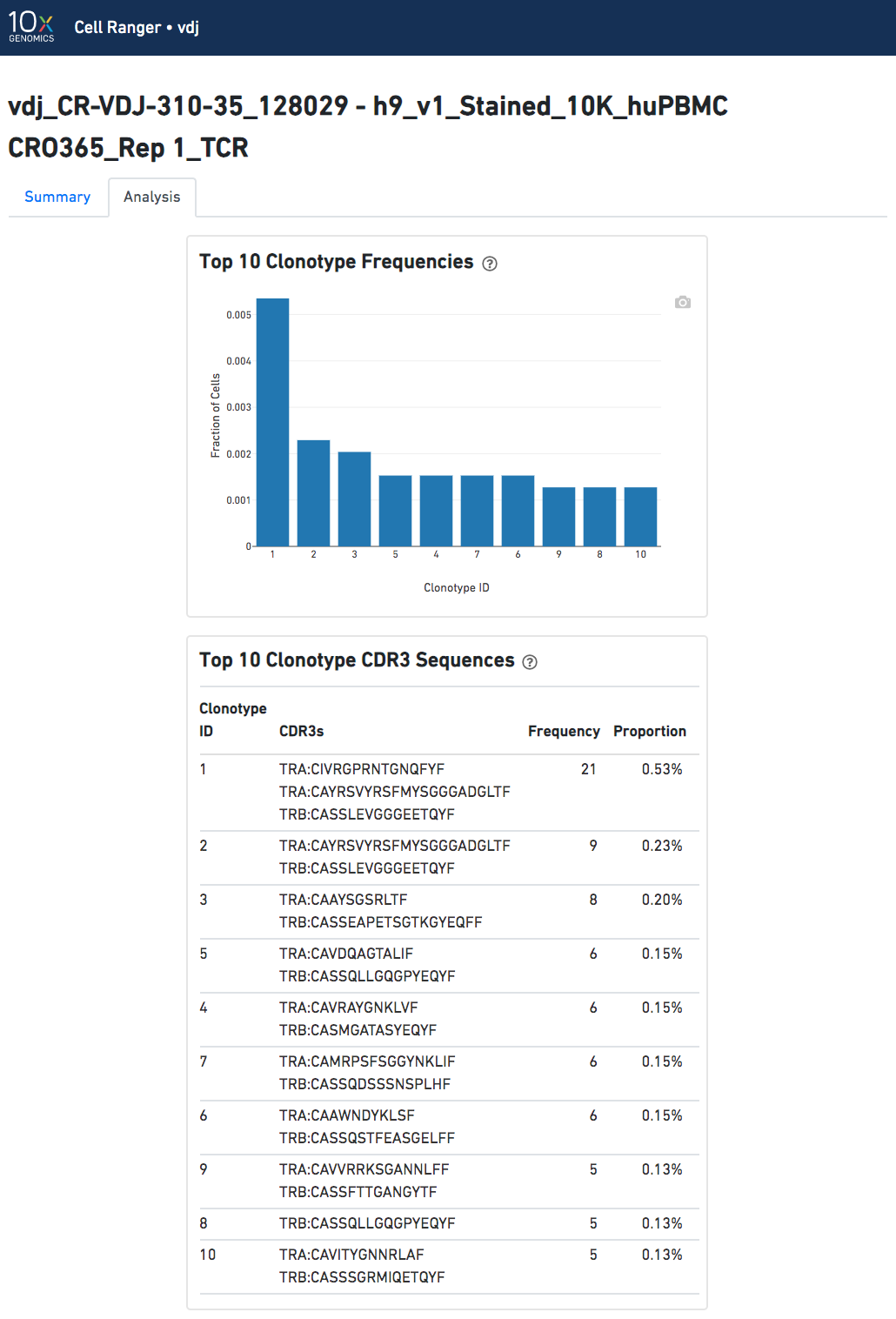
The automated secondary analysis results can be viewed by clicking "Analysis" in the top left corner. The secondary analysis provides the following:
Note that because clonotypes are defined by productive sequences only, there are additional sequences that may not be displayed in the web summary. A more complete set of sequences associated with each cell can be found in the filtered contig files.
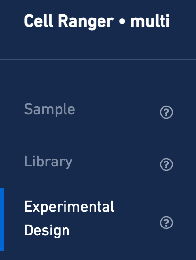
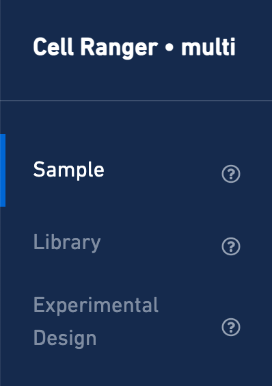
The web_summary.html file is also the starting point for quality control on a joint Gene Expression and V(D)J experiment run through cellranger multi. Here is an example from a public dataset consisting of 1K Human B cells. On the left, note that there are three views: Sample, Library, and Experimental Design. First, click the Experimental Design view:
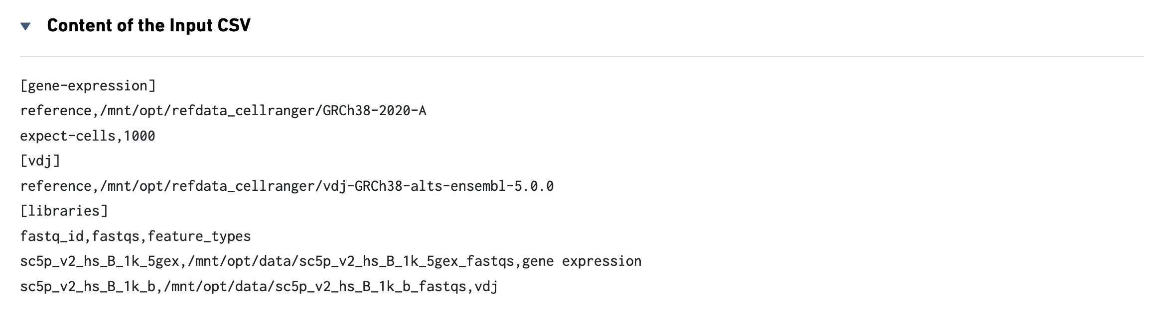
This view enables one to visualize the experimental design for the dataset:

The CSV file is also included for troubleshooting convenience.
Now click the Sample view:
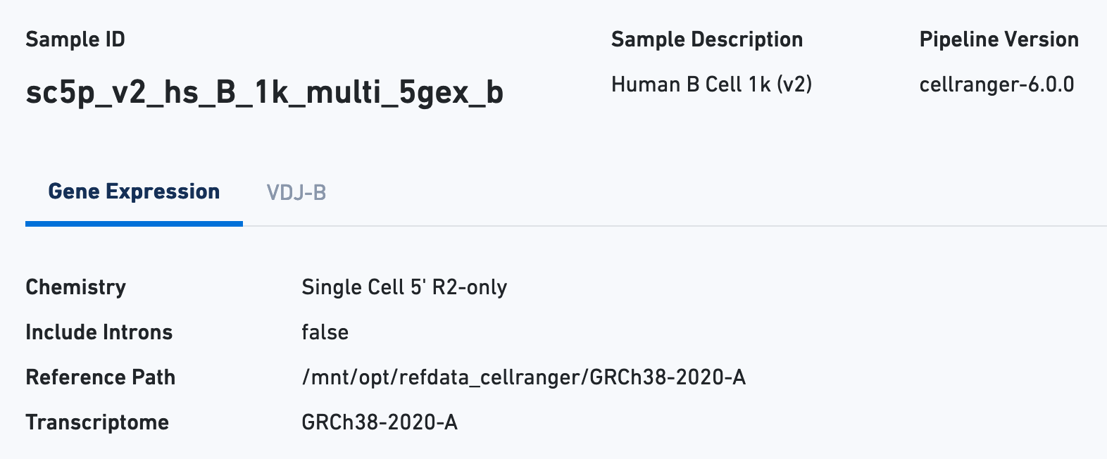
The Sample view contains key metadata, such as the reagent chemistry, transcriptome version, and reference path:
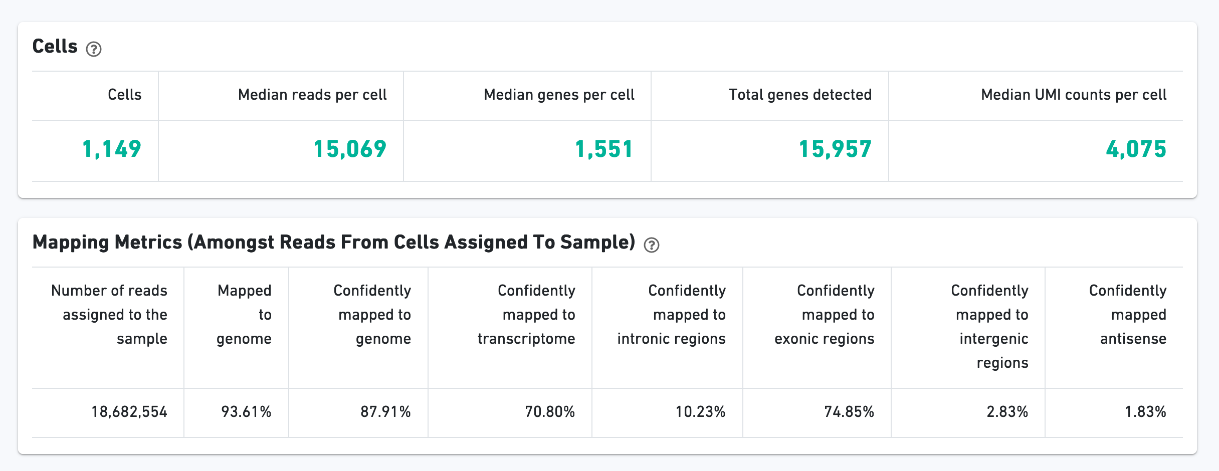
The Cells section contains the most important hero metrics for the sample. The Mapping Metrics section contains metrics regarding how reads mapped to the reference. Click the question mark "?" symbol to read descriptions for each metric:
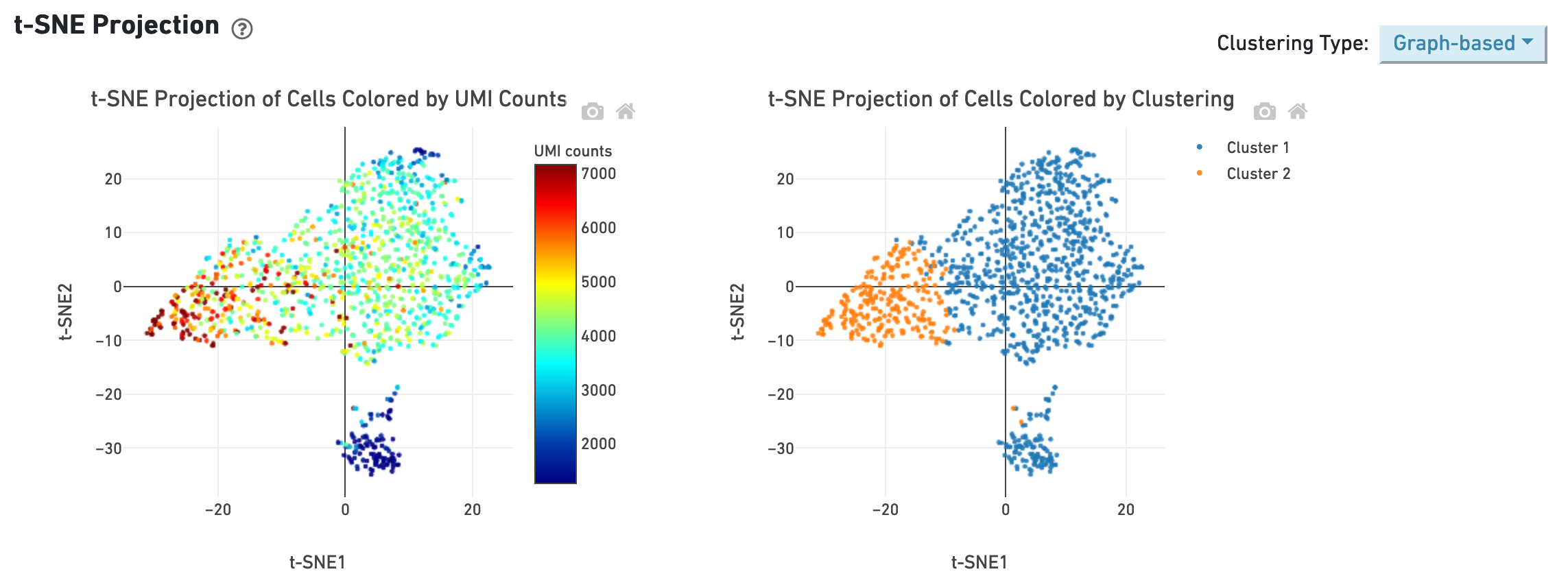
The t-SNE section shows the data reduced to two dimensions, colored by UMI count or clustering (graph-based by default). It is a good starting point to explore structure in the data.
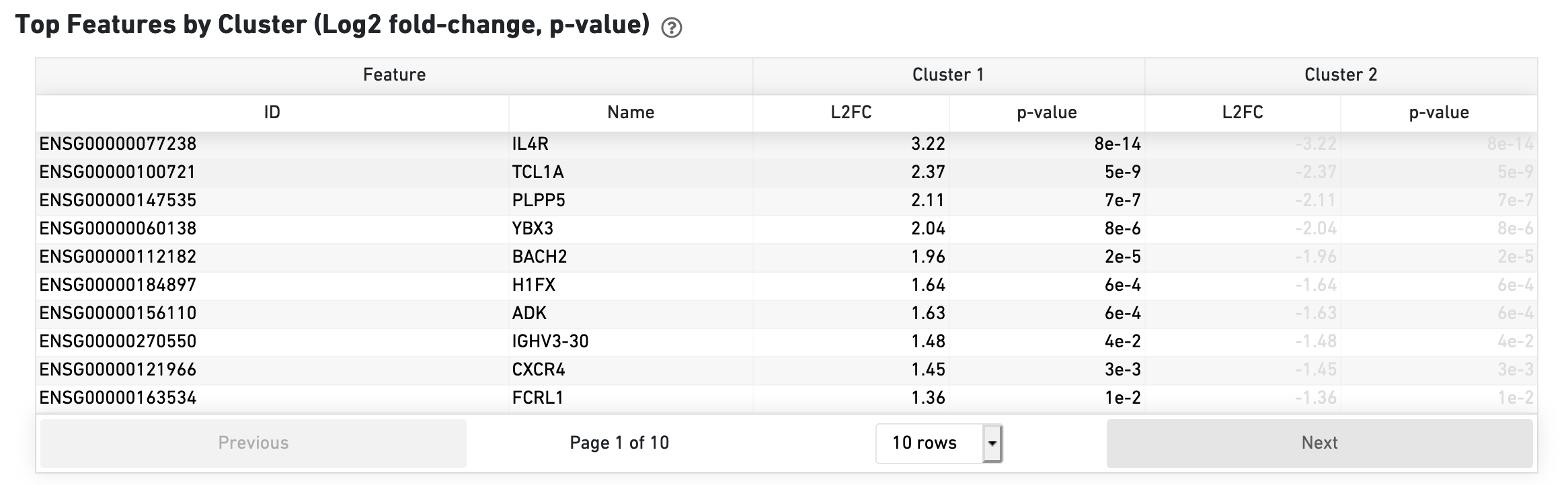
The Top Features by Cluster section shows the results of a differential gene expression analysis among clusters:
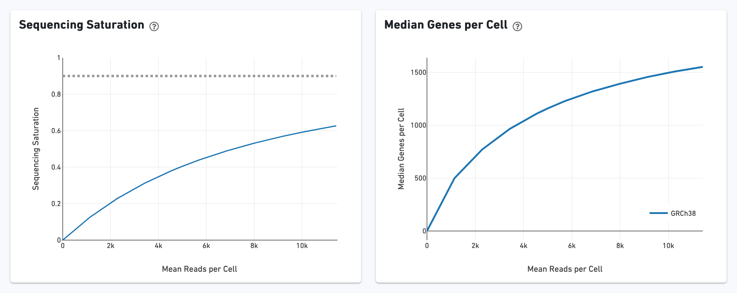
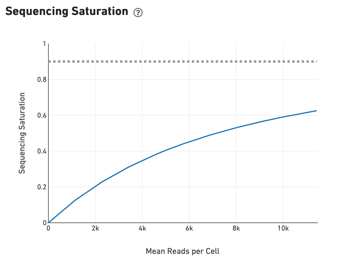
The Sequencing Saturation section enables one to gauge whether it is worth sequencing deeper, with diminishing returns of UMIs recovered.
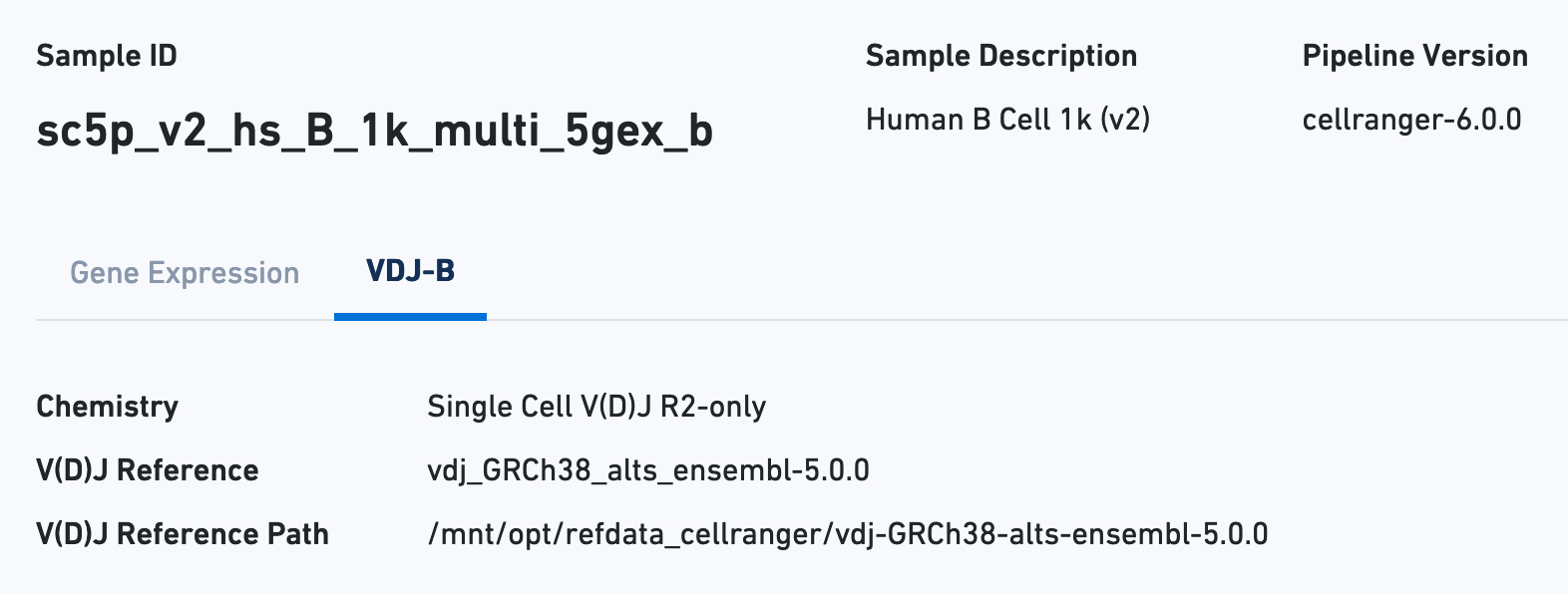
Next click the VDJ tab to see metadata and hero metrics for the V(D)J libraries:
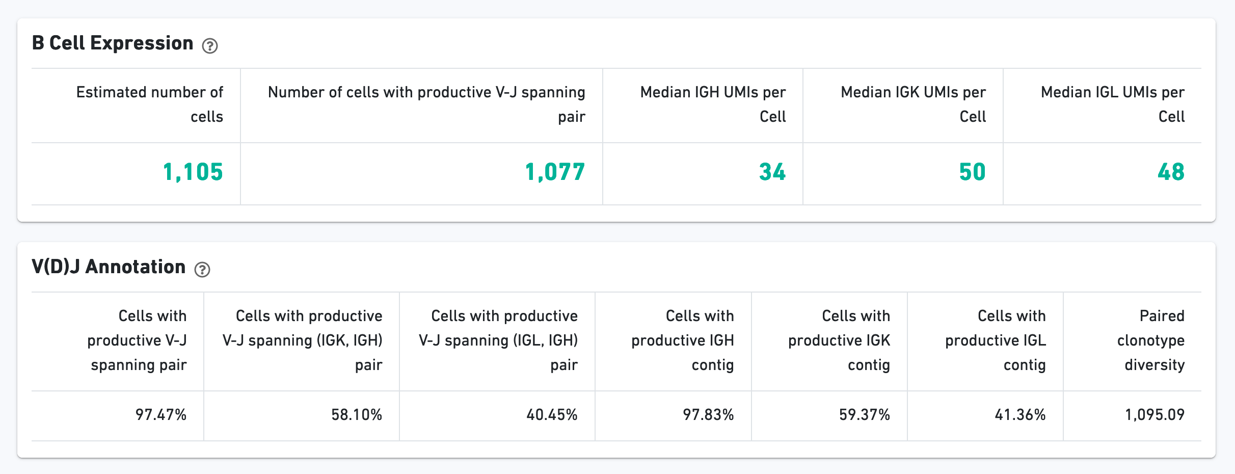
The B Cell Expression section contains metrics regarding B cell expression, and the V(D)J Annotation section contains metrics regarding V(D)J annotations.
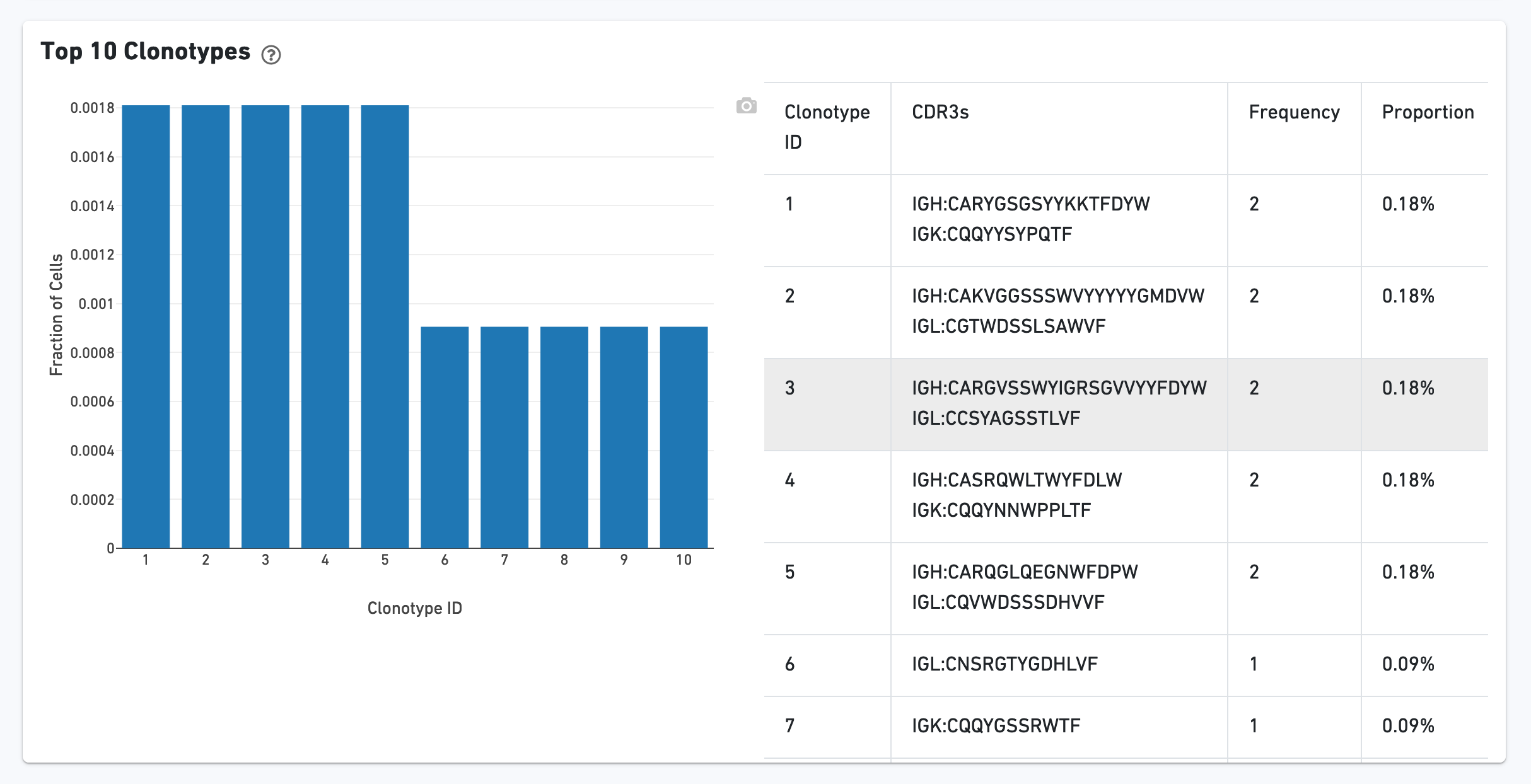
The Top 10 Clonotypes section contains a histogram for the top 10 clonotypes, and a list of their CDR3 sequences, frequencies, and proportions:
Next switch to the Library view. By default, the Gene Expression tab is toggled to see metrics calculated for the physical library:
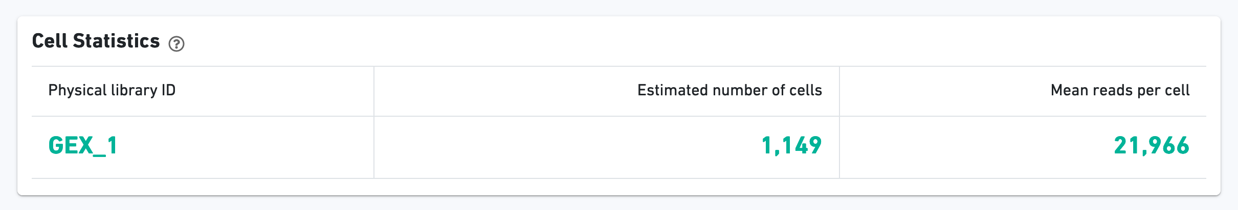
As with the Sample view, metadata for the physical library is displayed on top.
The green hero metrics display the most important results of the experiment:
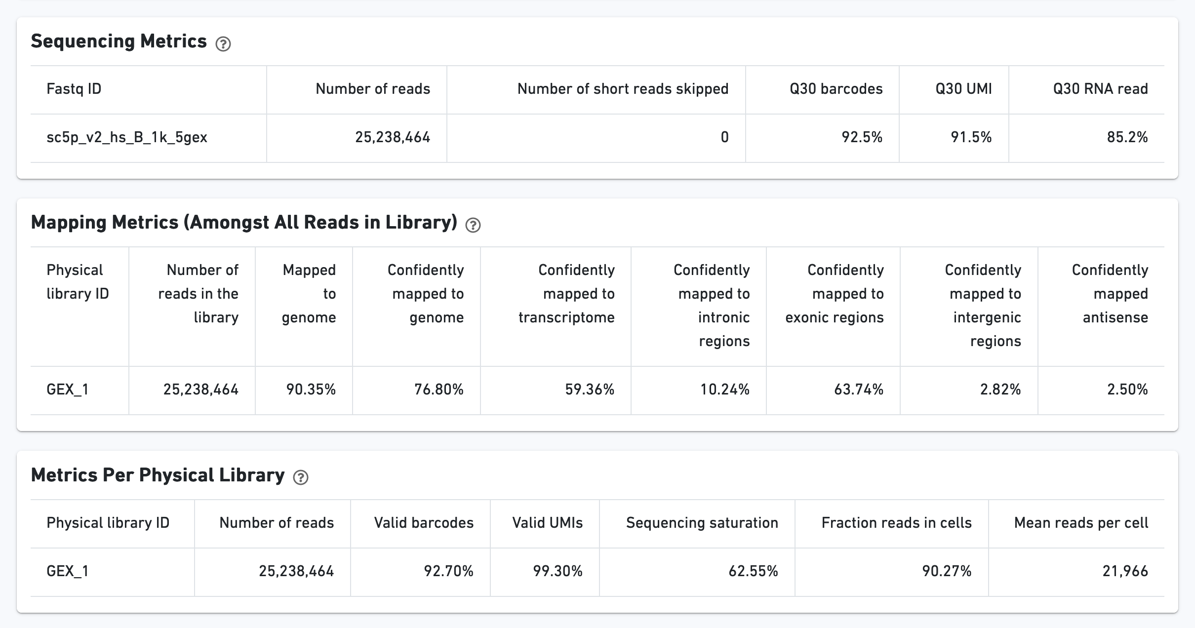
Additional metrics are displayed below the hero metrics. Click the question mark "?" to read full descriptions for each one.
The Ranked Barcode Plot for the gene expression data enables one to assess sample quality. Ideally there is a steep dropoff separating high UMI count cells from low UMI count background noise:
The sequencing saturation plot allows the user to asssess the relative tradeoffs of sequencing deeper or shallower. As sequencing saturation increases, the total number of molecules detected in the library increases, but with diminishing returns as saturation is approached.
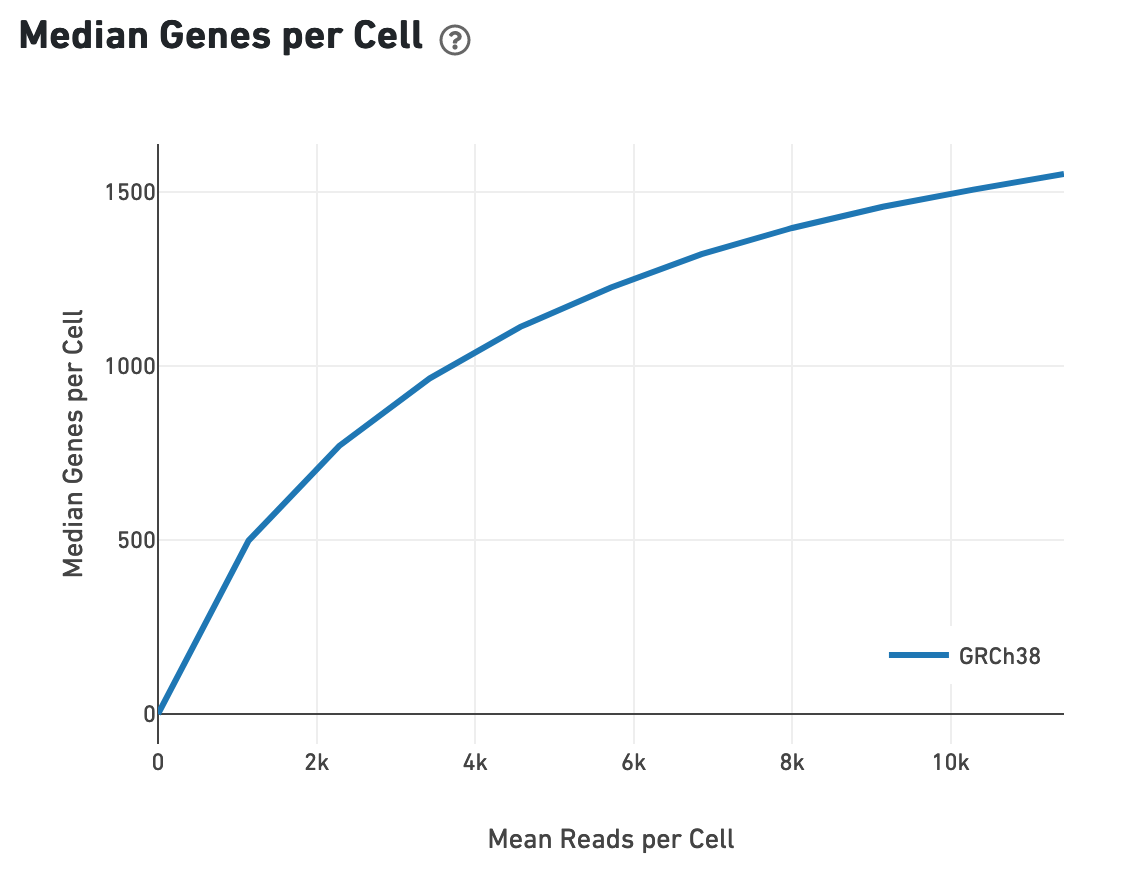
Likewise, one can assess the median genes per cell graph:
Do you have questions or feedback about this tutorial? Please contact [email protected].