Cell Ranger4.0, printed on 07/26/2024
The cellranger pipeline outputs a summary HTML file named web_summary.html that contains summary metrics and automated secondary analysis results. Rarely, an issue may also be detected during the pipeline run leading to an alert also appearing on this page, and more information about these is provided in the troubleshooting documentation.
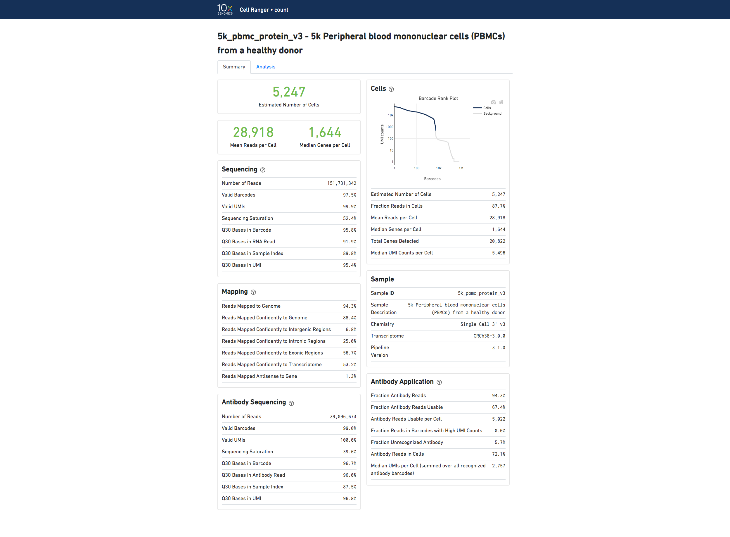
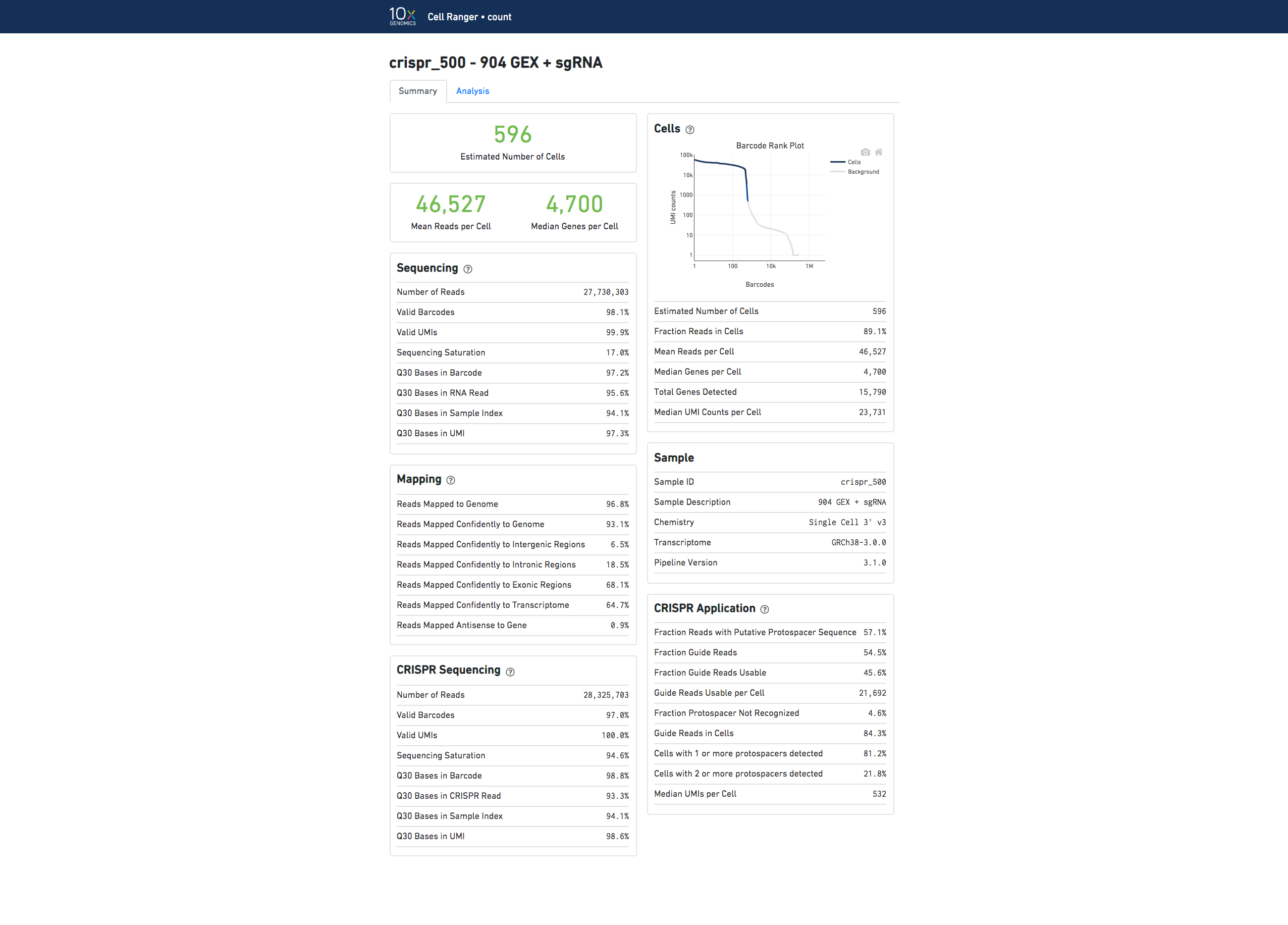
The run summary can be viewed by clicking "Summary" in the top left corner. The summary metrics describe sequencing quality and various characteristics of the detected cells.
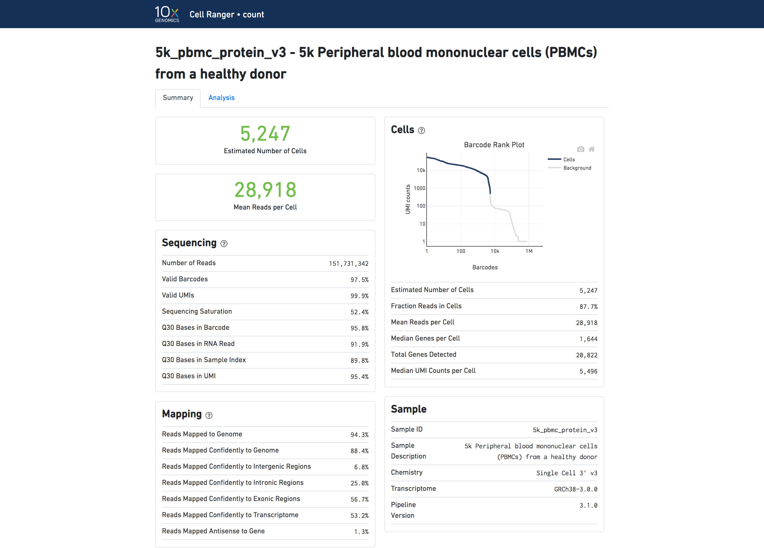
The number of cells detected, the mean reads per cell, and the median genes detected per cell are prominently displayed near the top of the page.
Click the '?' in the top of each dashboard for more information on each metric.
The Barcode Rank Plot under the "Cells" dashboard shows the distribution of barcode counts and which barcodes were inferred to be associated with cells. The y-axis is the number of UMI counts mapped to each barcode and the x-axis is the number of barcodes below that value. A steep drop-off is indicative of good separation between the cell-associated barcodes and the barcodes associated with empty partitions. Barcodes can be determined to be cell-associated based on their UMI count or by their RNA profiles, therefore some regions of the graph can contain both cell-associated and background-associated barcodes. The color of the graph represents the local density of barcodes that are cell-associated. See Cell Calling Algorithms for more details.
The automated secondary analysis results can be viewed by clicking "Analysis" in the top left corner. The secondary analysis provides the following:
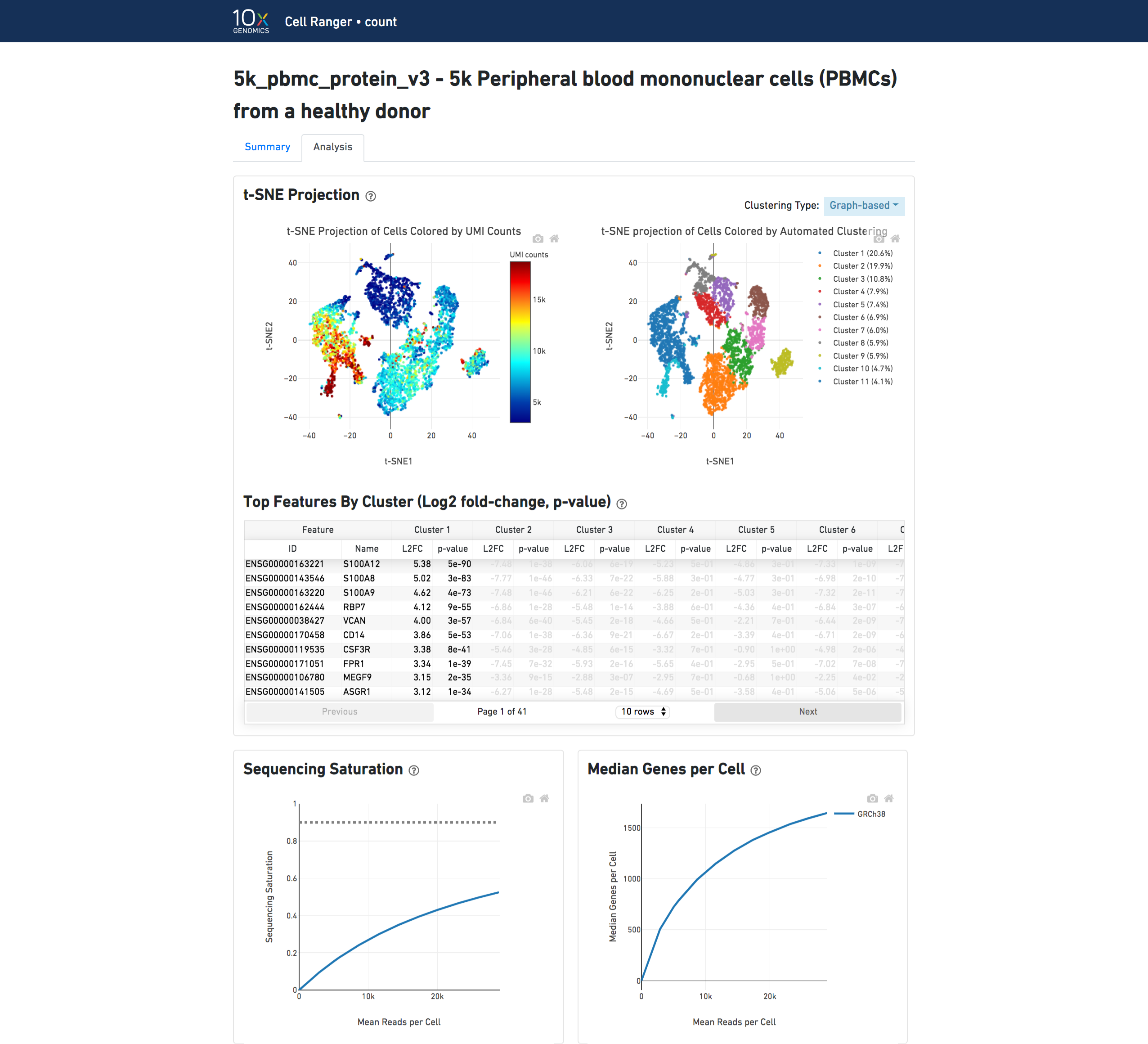
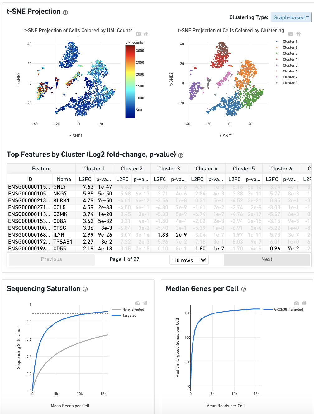
The top left plot shows the 2-D t-SNE projection of the cells colored by the total UMI counts per cell. This is suggestive of the RNA content of the cells and often correlates with cell size - redder points are cells with more RNA in them.
The top right plot overlays the clustering results onto the 2-D t-SNE projection of cells. The type of clustering analysis is selectable from the dropdown in the upper right - change this to vary the type of clustering and/or number of clusters that are assigned to the data.
The table in the middle shows which genes are differentially expressed in each cluster relative to all other clusters. To find the genes associated with a particular cluster, you can click the cluster number to sort the table by specificity for that cluster.
The bottom left plot shows the effect of decreased sequencing depth on Sequencing Saturation, which is a measure of the fraction of library complexity that was observed. The far right point of the line is the full sequencing depth obtained in this run.
Similarly, the bottom right plot shows the effect of decreased sequencing depth on Median Genes per Cell, which is a way of measuring data yield as a function of depth. The far right point is the full sequencing depth obtained in this run.
If you use Cell Ranger to process Feature Barcode data, new metrics that are specific to the given Feature Barcode libraries will appear in summary tab.
Below is an example web summary when the Antibody Capture library type is used:
Here is an example web summary when the CRISPR Guide Capture library type is used:
The analysis view for Feature Barcode experiments contains the same secondary analysis as purely gene expression experiments, and uses only the gene expression part of the feature-barcode matrix for dimensionality reduction, clustering, and differential gene expression analysis.
If you analyzed a multi-species experiment, the output will look different. For example, the human-mouse mixing experiment is run to verify system functionality. It consists of mixing approximately 500 human (HEK293T) cells and 500 mouse (3T3) cells in a 1:1 ratio.
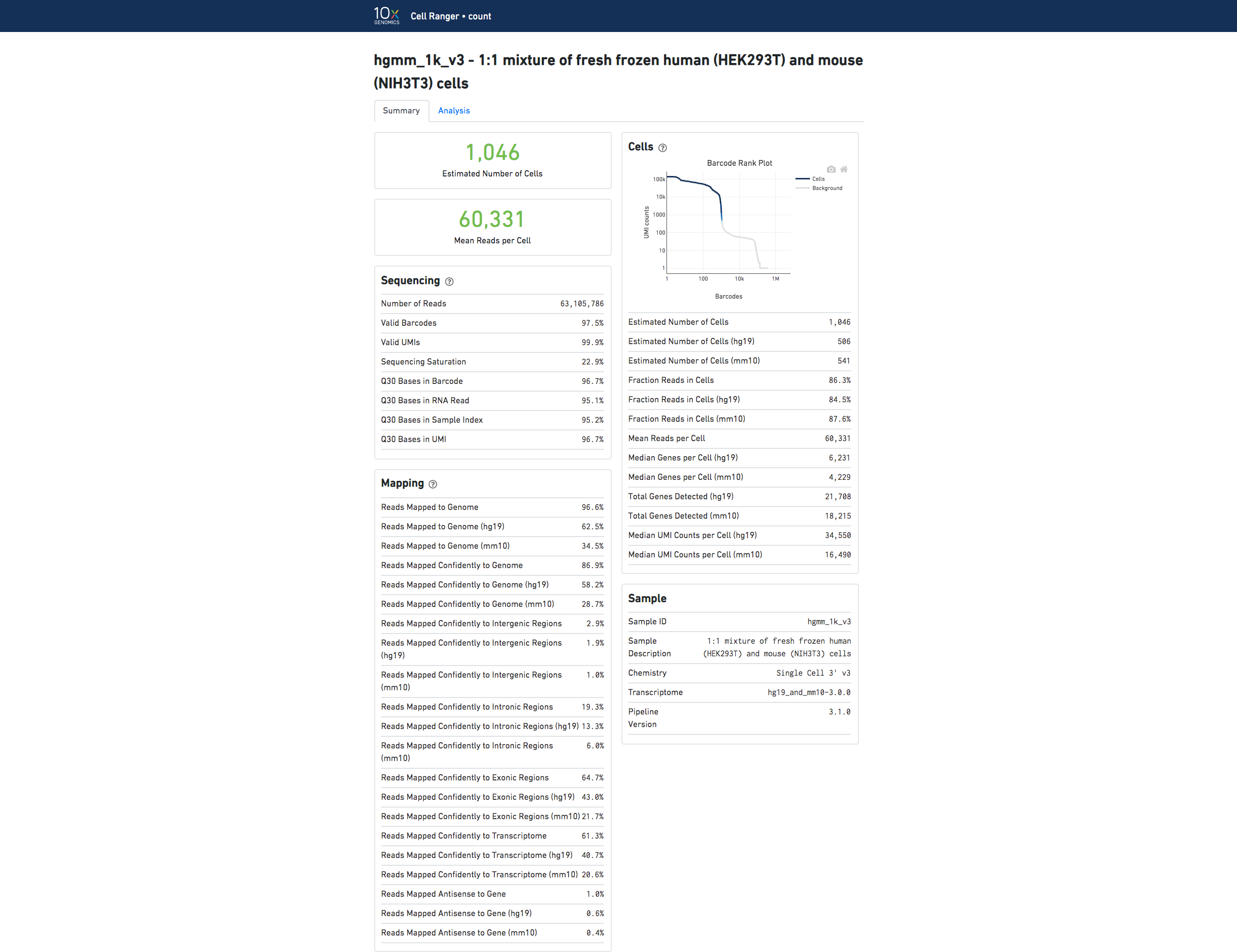
Click the '?' in the top of each dashboard for more information on each metric.
In the Analysis View, running the human-mouse mixing experiment results in the following plot:
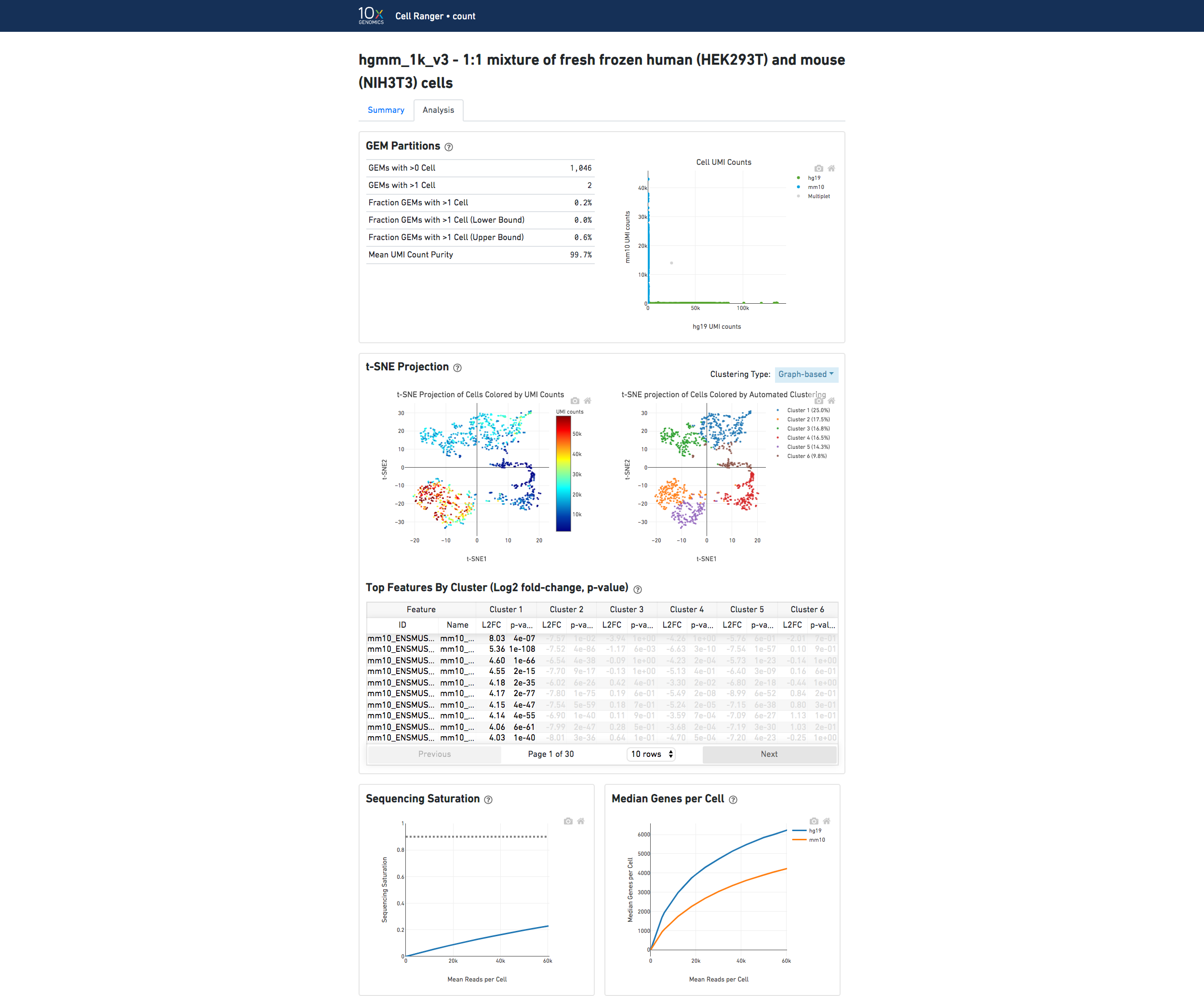
Each point represents a barcode; the gray points are inferred to be associated with GEM partitions that contained more than one cell because they contained a large number of molecules that came from human cells and mouse cells. The GEMs containing human-human and mouse-mouse cell combinations are not visible here, but their presence is inferred in the "Fraction GEMs with >1 Cell" metric shown next to the plot.
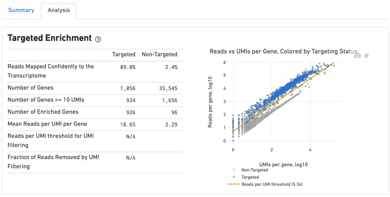
If you ran a Targeted Gene Expression experiment, the output includes modifications that highlight targeting performance. The following is an example of the Run Summary from a Cellranger Targeted Count run.
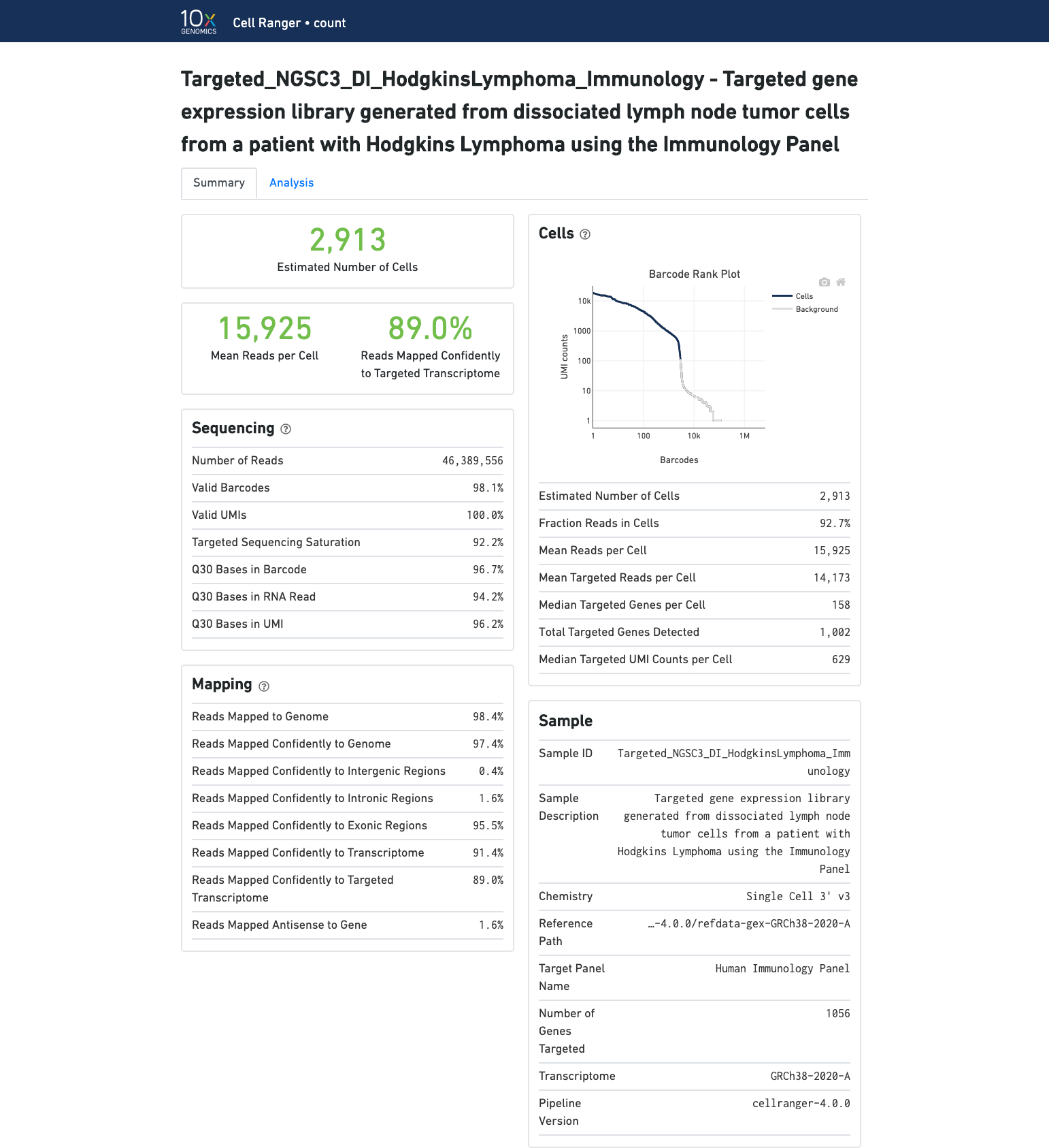
The analysis tab includes a "Targeted Enrichment" dashboard with metrics that assess targeting performance. On the right is a scatterplot of read counts per gene versus UMI counts per gene. A successful targeted experiment where targeted genes are well enriched looks like the one below, with targeted genes (blue) cleanly separable from non-targeted genes (gray). See Targeted Gene Expression Algorithms for more information on how gene enrichments are computed.
The remainder of the analysis tab is very similar to that of a regular gene expression analysis, but focuses on targeted genes (Sequencing saturation, Median genes per cell). As described under Targeted Gene Expression Analysis, all secondary analysis (t-SNE, differential expression) is done using only targeted genes.