Space Ranger5.1, printed on 03/29/2025
To learn how to navigate the Loupe Browser interface, a pre-loaded mouse brain dataset is included and described to demonstrate the interactive functionality.
NOTE: Spatial Enrichment is new with Loupe Browser 5.1! Click here for a complete list of features new to Loupe Browser 5.1.
The following image provides an overview of the key components of the Loupe Browser interface. Each of these components are described in more detail below.
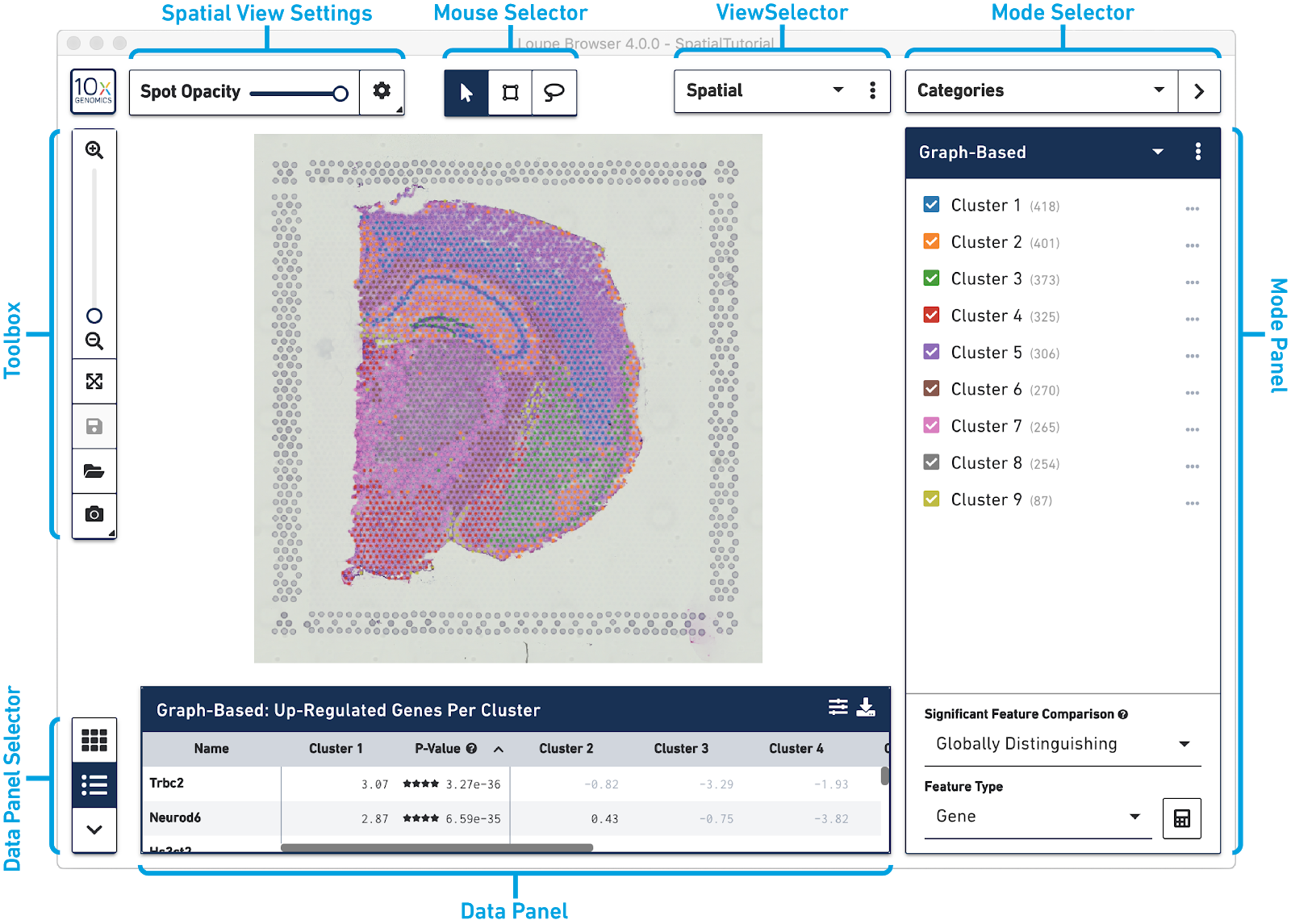
The Mouse Selector has three options from left to right:
| Tool | Description |
|---|---|
 |
Pan - Move the image up and down, or left and right. |
 |
Drag Selection - Select and label an image area within a region of your choosing. Hovering over the button will allow you to choose either a freehand or rectangular selection. |
 |
Draw Selection - Select and label individual spots using a brush tool. |
The Toolbox is on the left side of the window. Move your mouse over the toolbox icons to see an explanation of what each tool does. The tools in the toolbox perform the functions listed in the table below.
| Tool | Description |
|---|---|
 |
Zoom In and Zoom Out - Click on + to Zoom In, click on - to Zoom Out, or use the slide bar to zoom in and out. In Spatial mode, the current magnification level is shown. |
 |
Autoscale Autoscale to fit the screen after zooming in or out. |
 |
Save/Save As Save changes to a .cloupe file. |
 |
Open File Open a new .cloupe file. |
 |
Export Plot Click to export a spatial plot as .PNG, or a scatter plot as an SVG or PNG. |
 |
Marker Settings Marker Settings can be used with t-SNE, UMAP and Feature Plot views to scale marker size. Uncheck the Auto-scale box to choose a percentage. |
The Data Panel Selector tools are on the bottom left of the window. They are used to change the information located in the Data Panel at the bottom of the window. Move your mouse over the icons to see an explanation of what each tool does. The tools perform the functions listed in the table below.
| Tool | Description |
|---|---|
| Heat Map | |
| Feature Table | |
 |
Spatial Enrichment |
| Violin Plots | |
| Hide Bottom Panel |
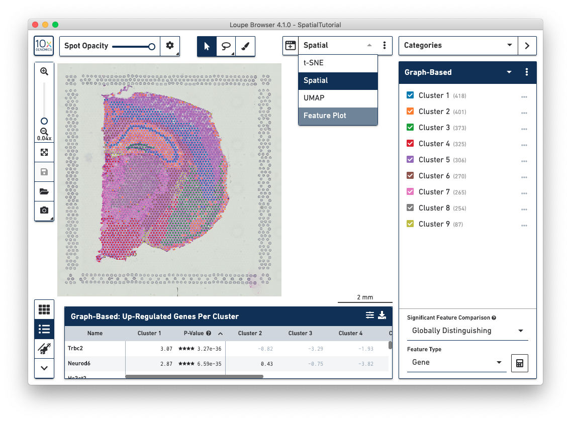
The View Selector controls what is displayed in the View Panel. There are three different types of views that can be selected:
Multiple concurrent views of the same data can be viewed via linked windows on the desktop. For example, a Spatial projection can also be opened alongside a t-SNE, UMAP, or Feature Plot view. Changes made in any of the linked windows are seen in all open linked windows.
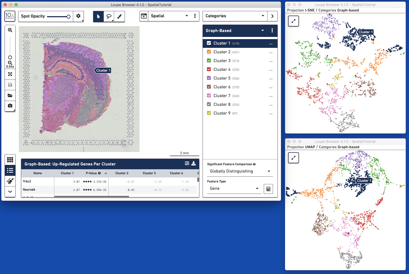
Linked windows can be opened through the View Selector. Icons shown in the following table explain how to use linked windows.
| Icon | Description |
|---|---|
| Click on the icon to see a list of linked windows for the current projection. | |
 |
This icon is seen in the View Selector to indicate what projections can be opened from the current view. It is also seen in new projection windows. |
 |
Toggle Mini-Mode - Linked windows open in a small size. Use this icon to open the window to full size or toggle back to the smaller size. |
A few navigational elements are now view-dependent. The following sections underline the differences between views.
When a Spatial Gene Expression .cloupe file is opened, the initial workspace is centered around the Spatial View, which shows the tissue image overlayed by the tissue covered spots on the slide. The spots have already been aligned to the correct positions in the image. Each spot is color-coded based on the active legend in the Mode Panel.
In the Spatial view, drag the mouse over the image to reposition it, and use the mouse wheel or track pad to smoothly zoom in and out. The cluster label associated with a spot is shown when you hover your mouse over that spot in the image.
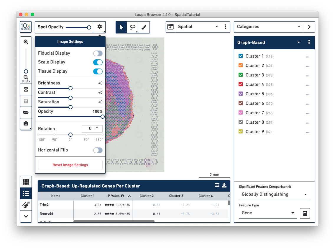
Spatial Image Settings, located in the top left corner, provides a number of options to view the image and gene expression data including:
There are more controls for multi-channel fluorescent images:
Space Ranger and Cell Ranger pipelines calculate t-SNE and UMAP projections over expression data. Loupe Browser shows these scatter plots. When a UMAP, t-SNE or custom coordinate projection is shown, a Split View selector is visible in the upper-left hand corner of the interface. Like the Spatial View, each spot is color-coded based on the active legend in the Mode Panel.
In t-SNE and UMAP views, dragging the mouse over the display area repositions the projection, and the mouse wheel or track pad can be used to smoothly zoom in and out. The cluster label associated with a spot is shown when you hover your mouse over that spot in the image.
The Feature Plot view allows you to visualize the expression levels of one or two genes for each spot. This view makes it easy to threshold sets of spots based on the level of expression of one or two genes. Features, in this case genes, can be entered in the text box at the top of the Y axis or on the right side of the X axis. These selectors also contain a control to switch the scale of the axis between linear and log scale.
There are many scripts and third-party tools that can be used to generate different projections of the data including but not limited to the following:
If you generate alternate projection coordinates from customer analysis, you can input that projection into Loupe Browser. To do this, click on the three vertical dots in the View Selector to import a csv file to use a custom projection for a dataset.
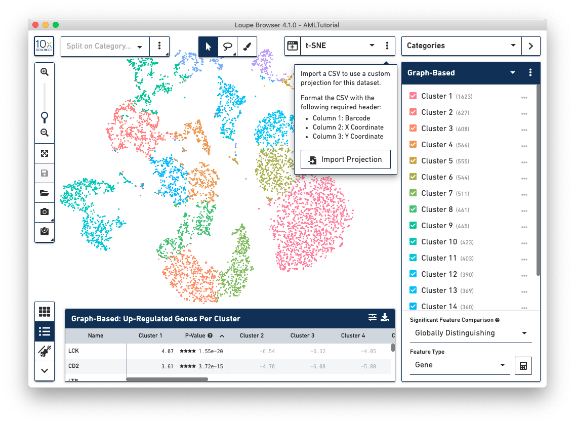
The csv format for importing projections is as follows:
To import new projections, click on Import Projection, select the csv file, and click on Import Projection. Once a custom projection is uploaded, click on Import Projection again to edit the name of the projection, or to delete it.
Use the mode selector in the top right corner of the workspace to switch between Loupe Browser's different modes. Switching between modes applies mode-specific coloring to the View Panel, and changes mode-specific functionality to the Mode Panel. There are four modes in Loupe Browser:
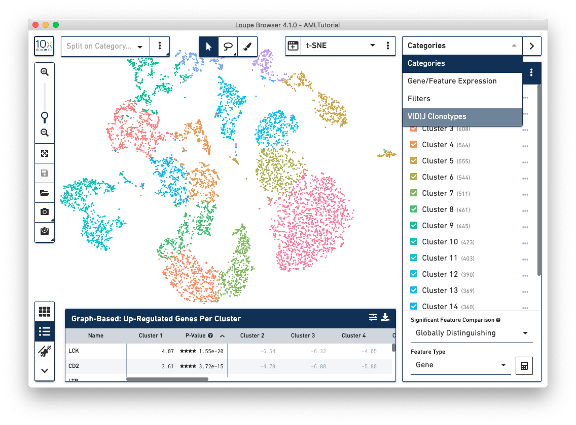
When you are in Categories Mode, you can control the content in the Mode Panel by clicking on the three vertical dots next to the drop-down menu.
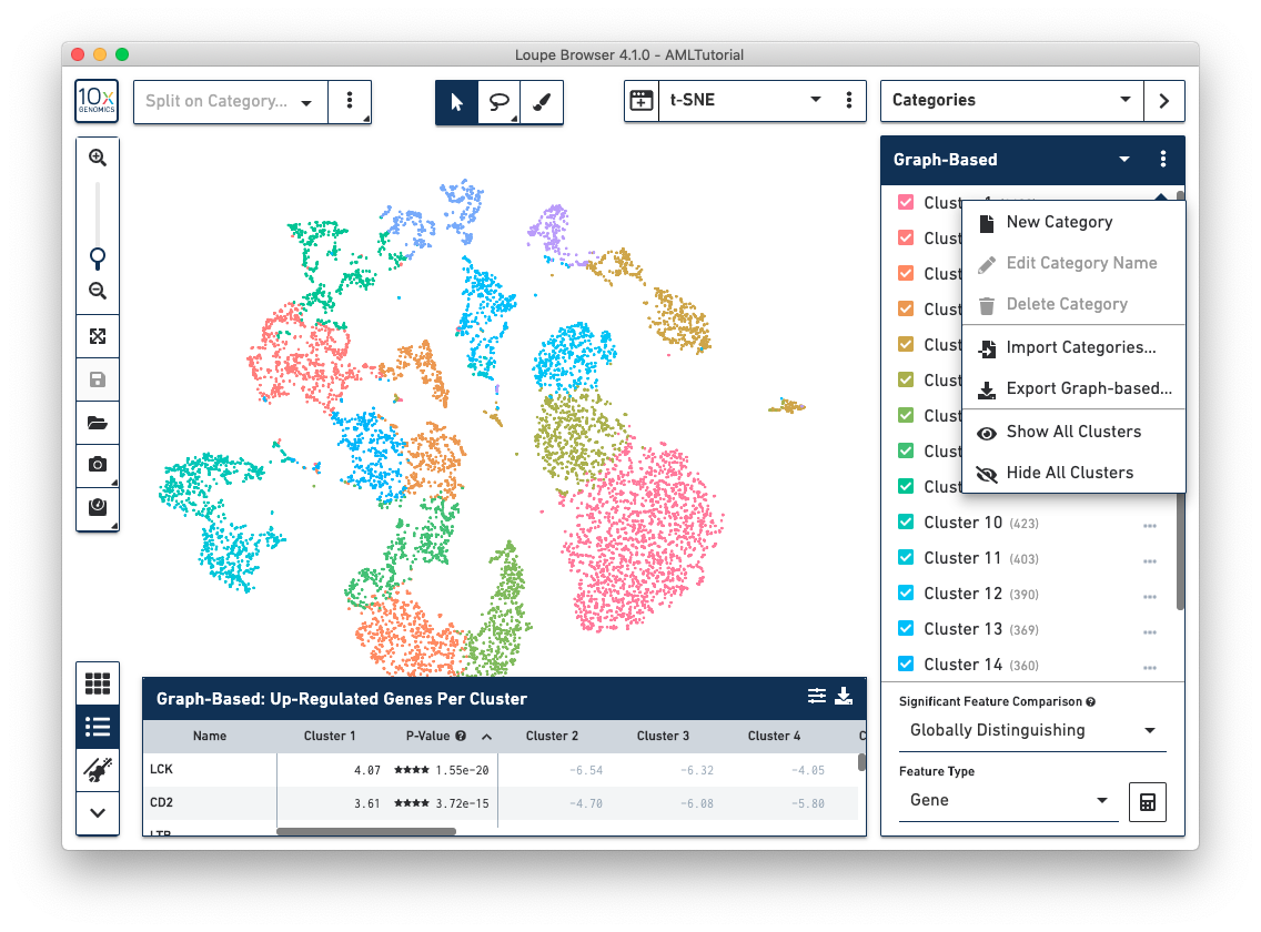
Use this option to create a custom category and associated custom clusters.
This option is only applicable to custom categories.
This option is only applicable to custom categories.
Use this option to upload a csv file that contains customer cluster definitions on a per-barcode basis. The format of the csv file is as follows:
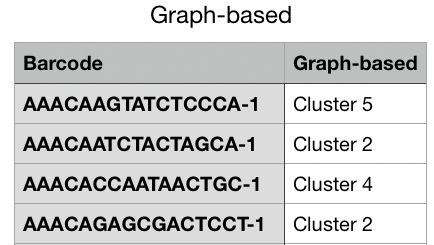
For this option, the [Name of Category] reflects the name of the current Category that you are viewing. This option exports a complete list of barcodes for the current Category and the associated cluster name that is associated with that Category. For example, if you are currently viewing the Graph-Based category, then this option in the drop-down menu is Export Graph-based. When you select this option, you can download a csv file that contains a list of all barcodes in the first column and their associated graph-based cluster label in the second column. See the example below.
This option automatically selects all clusters in the Mode Panel.
This option automatically deselects all clusters in the Mode Panel.
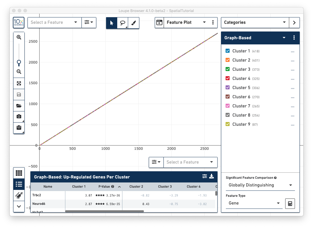
The Significant Feature Comparison functionality determines what features in the dataset distinguish one or more clusters, and allows differential expression analysis between clusters. There are two types of controls for this functionality. Select options for these two controls using the drop-down menus in the bottom right-hand corner. Once options are selected, click on the calculator icon to execute the comparative analysis.
There are two different methods available for conducting a Significant Feature Comparison analysis:
Use this drop-down menu to select which type of feature you want to use in the comparison. For Spatial Gene Expression dataset, the only option here is Gene. However, for other products, there may be more than one option.
The Gene/Feature Expression mode provides a graphical representation of gene or feature expression across a dataset. One or more features can be viewed at a time. You can search for a feature of interest, or upload and save lists of features.
The Active Feature List contains a list of the features that you have either searched for, or uploaded. The expression patterns of those features are displayed in the View Panel. If more than one feature is in the Active Feature List, then the expression pattern corresponds to a combination of all the features. If only one feature is present or selected in the Active Feature List, then the expression pattern corresponds to that feature.
At the bottom of the Active Feature List there are a number of options that control how the data is visualized in the View Panel. The Scale & Attribute parameters control how the expression patterns are rendered in the View Panel. The top left menu sets which scale value to display. The top right menu sets how to combine values when there are multiple features in the Active Feature List.
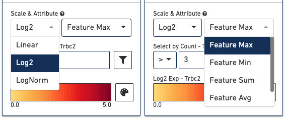
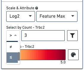
The Select by Count controls how to filter the expression values displayed.
The color palette in the bottom right controls the color scale and range of values. You can also choose to manually set the min and max of the color scale by unchecking the Auto-scale checkbox, typing in a value, and clicking the Update Min/Max button. When setting manual min and max values, barcodes with values outside the range, less than the minimum or greater than the maximum, are colored gray. This is particularly useful if there is a lot of noise or ambient expression of a gene. Increasing the minimum value of the scale filters that noise. It is also useful to configure the scale to optimally highlight the expression of genes of interest.
In Gene/Feature Expression Mode, you can control the content in the Mode Panel under the Active Feature List by clicking on the three vertical dots next to the drop-down menu. This gives a number of options, as described below.
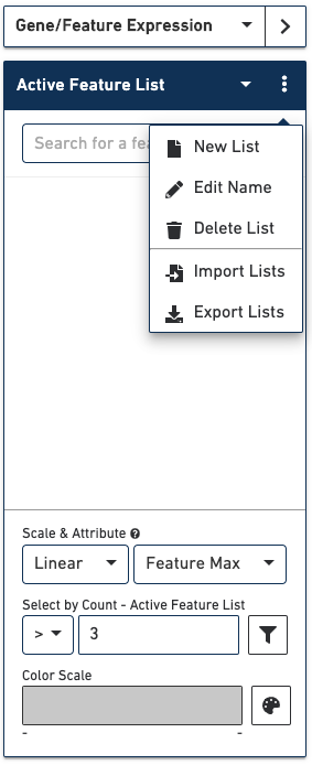
Use this option to create a custom list of features to visualize.
Edit the name of a list.
Delete a list.
Use this option to upload a csv file that contains a custom set of markers that results in one or more new lists. The format of the csv file is as follows:
The first row must be a header such as List Name, Gene Name, etc.
The first row can contain the name of one or more Feature Lists that will be created.
The second column is a list of the feature names, such as gene names associated with each list.
You can optionally include the Ensembl IDs in a third column.
The feature names and Ensembl IDs, if applicable, must match those that were in the reference file that was passed into Space Ranger.
If you have manually added features to a list, use this option to export the list of features as a csv file. This is useful if you want to reuse a list for other samples visualized in Loupe.
In Filter mode, you can compose complex boolean filters to find barcodes which fulfill your criteria. You can create rules based on feature counts or cluster membership and combine these rules using boolean operators. You can then save and load filters and use them across multiple datasets. For more details on using the Filter Mode, see the following tutorial built around Single Cell Gene Expression data.
The data panel on the bottom of the workspace displays information about the features driving differences between clusters. By default, it enumerates the genes that drive differences between the current precomputed clustering selected in the Categories sidebar. It also displays the results of a Significant Features analysis. The mini-toolbar to the left of the data panel switches between a table and a hierarchical heat map of differentiating features. Clicking on a feature name in the table view allows you to add that feature to a list for future reference, or to show counts of that feature across the dataset in the active projection.