Space Ranger1.3, printed on 03/10/2025
The spaceranger count and aggr pipelines output a summary HTML file named web_summary.html that contains summary metrics and automated secondary analysis results. Any alerts issued by the pipeline are displayed at the top of the page, such as an indication that results or sequencing data are out-of-spec. Further information about alerts is provided in the troubleshooting documentation.
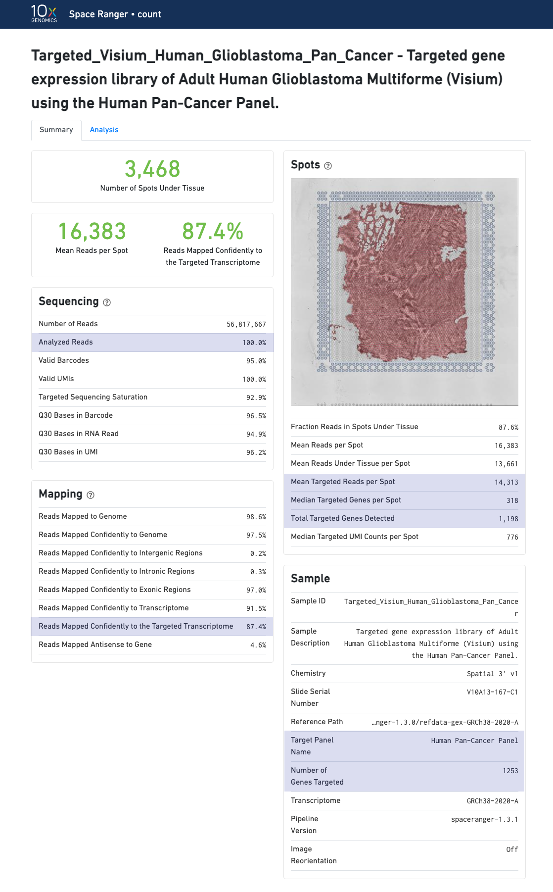
| If automated tissue detection was performed, a reddish color will be assigned to any pixel labeled as tissue, even if that pixel does not coincide with a spot. Spots panel is intended for checking the quality of the alignment and tissue selection that was performed, and is an important first step in interpreting your results. See Imaging Algorithms for details about these features. |
Select the tabs to find the summary information for each pipeline.
The summary metrics describe sequencing quality and various characteristics of the detected spots for whole-transcriptome (WTA) analyses.
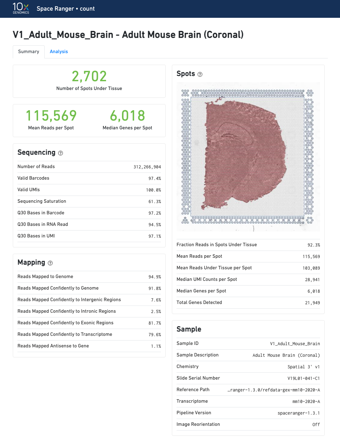
Number of Spots Under Tissue will vary by sample and between 20 and 4800 is acceptable.
The recommended value for Mean Reads per Spot is 50,000.
Median Genes per Spot will vary by sample and low values are not indicative of failed experiment. Samples with lots of connective tissue may have some tissue covered spots with few UMIs and that is expected.
The Visium for FFPE web summary includes the probe-specific metrics under Mapping
None with --no-probe-filter.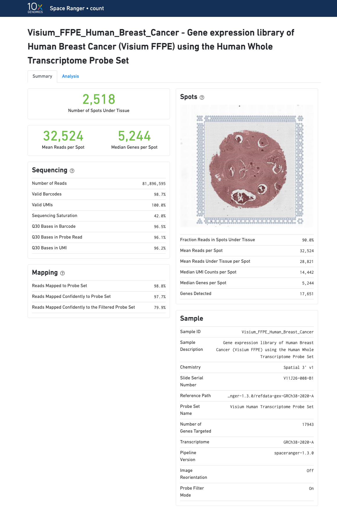
Number of Spots Under Tissue will vary by sample and between 20 and 4800 is acceptable
The recommended value for Mean Reads per Spot is 25,000.
Median Genes per Spot will vary by sample and low values not indicative of failed experiment. Samples with lots of connective tissue may have some tissue covered spots with few UMIs and that is expected.
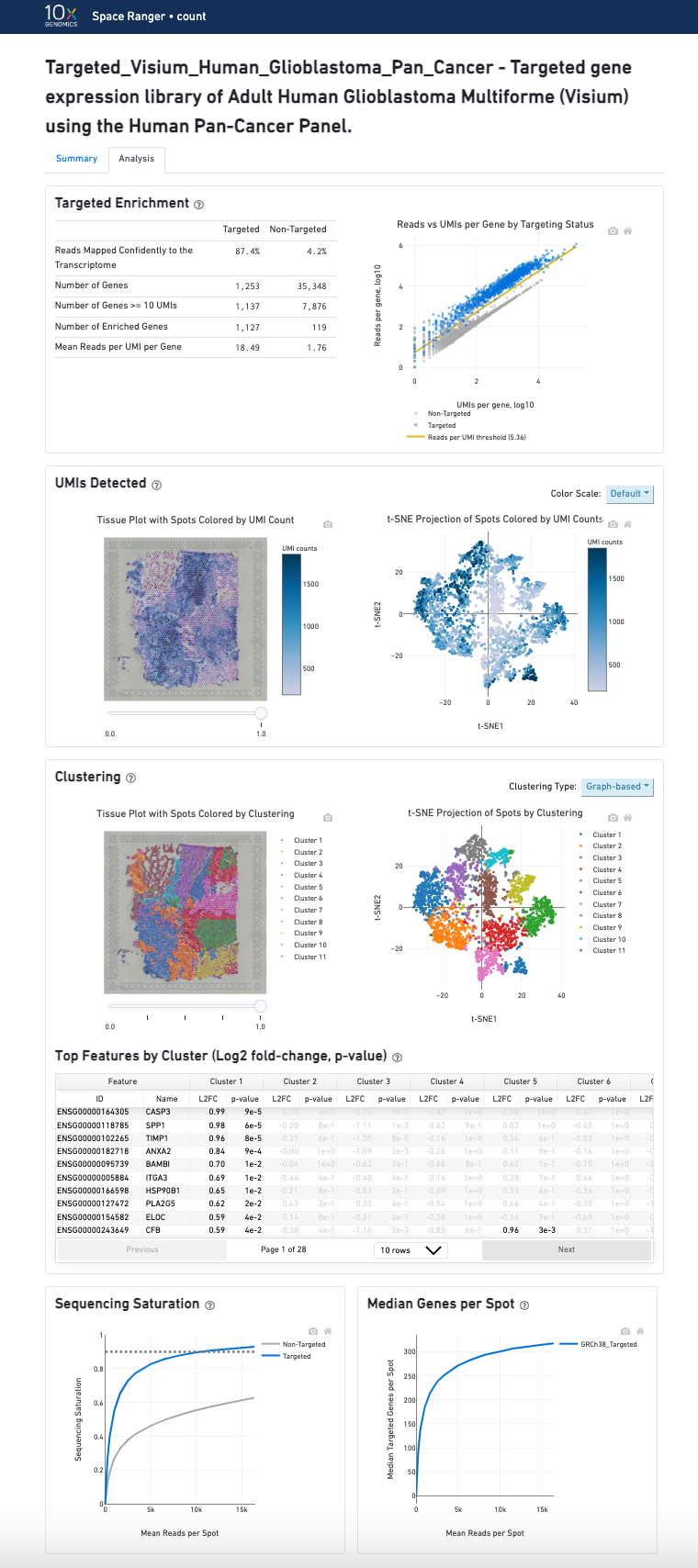
In addition to the metrics included in the WTA output, the targeted output includes targeting-specific metrics (highlighted in blue) such as Analyzed Reads, Mean Targeted Reads per Spot and Median Targeted Genes per Spot.
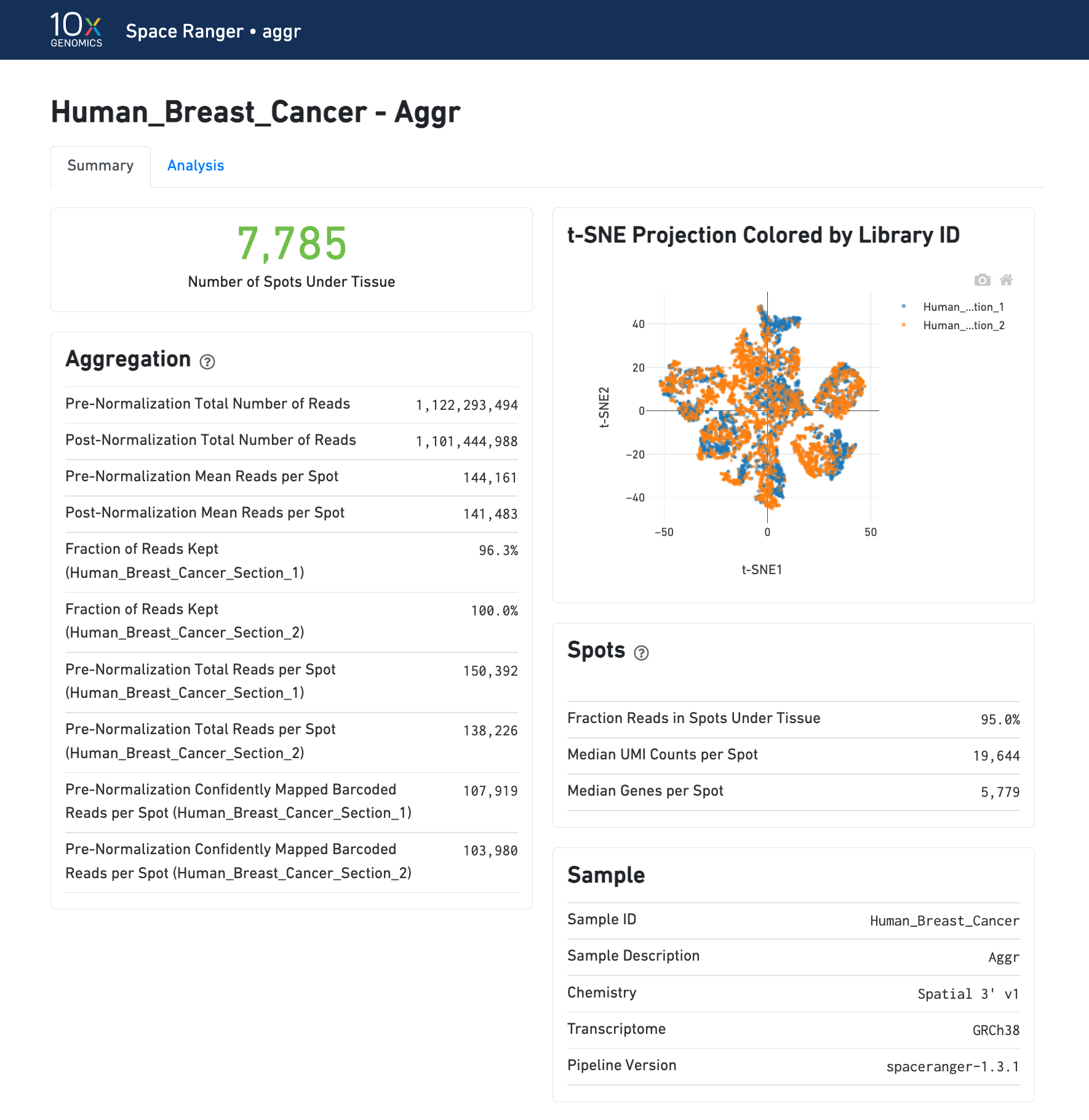
The summary metrics of an aggr run describe various characteristics about the aggregation process such as how many spots have been retained in the aggregated data. The individual sample images are not generated. To view the quality of alignment, refer to the individual web_summary.html outputs from count pipeline. The combined downstream analysis of aggr can also be visualized in Loupe Browser using the generated .cloupe file.
The secondary analysis provides the following:
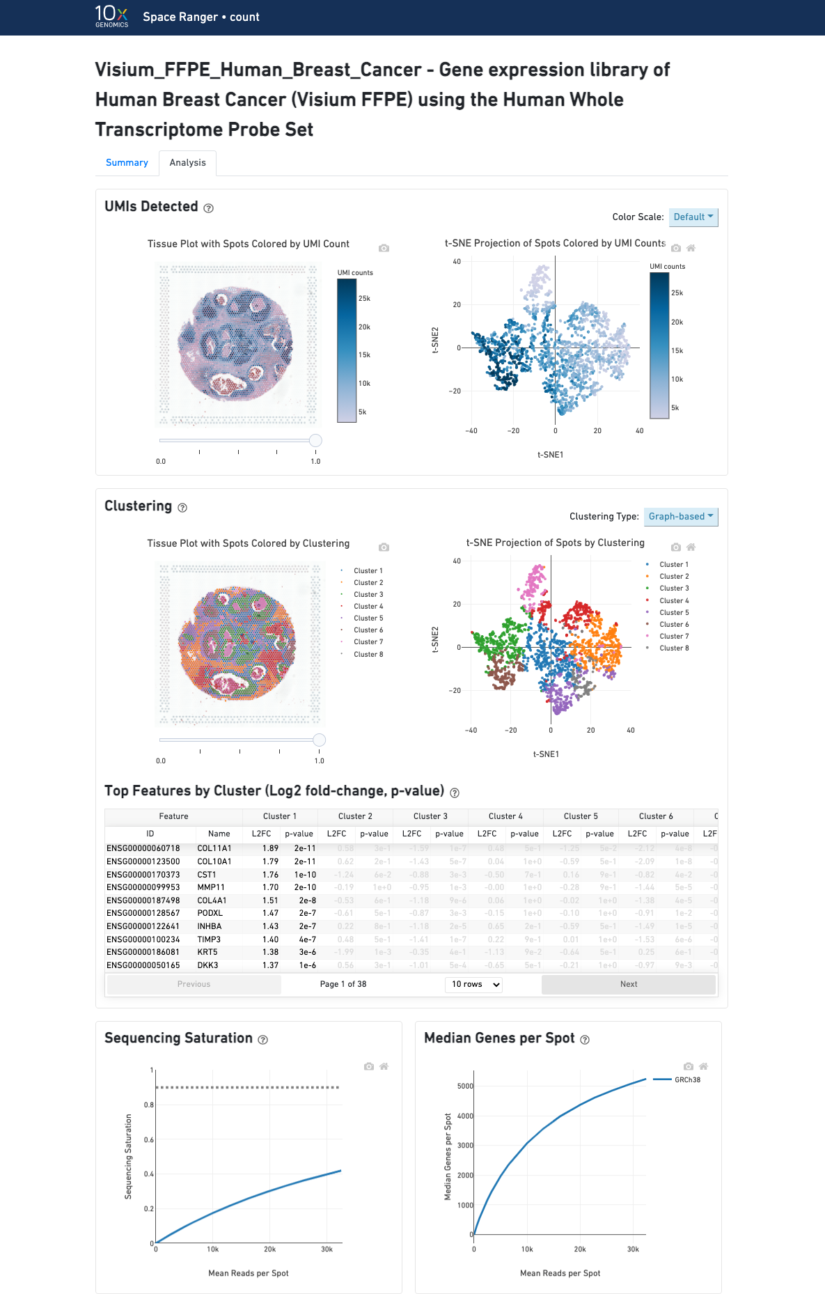
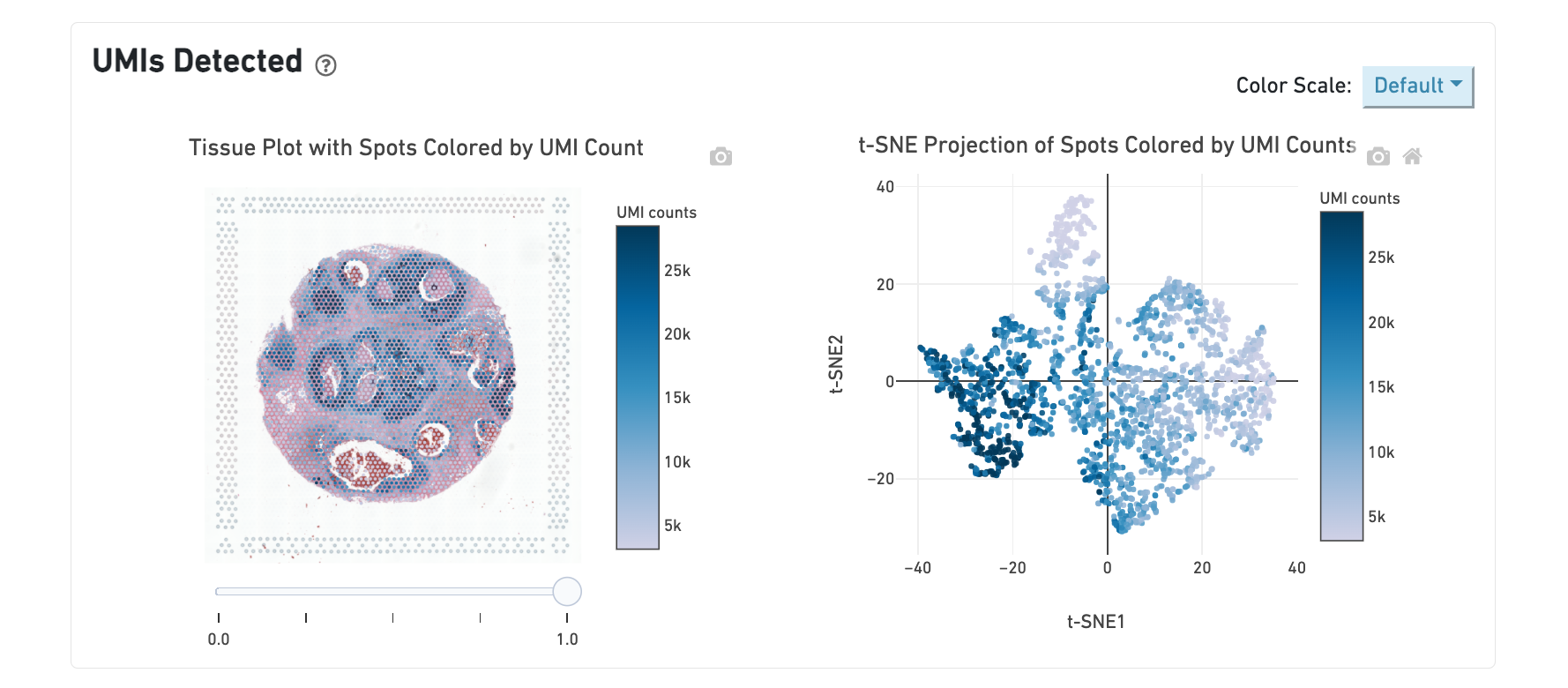
The top left plot shows the tissue colored by the total UMI counts per spot, where darker blue indicates higher UMI counts and more RNA content in each spot. Regions containing mostly connective tissue or other RNA poor structures will typically have low UMI counts.
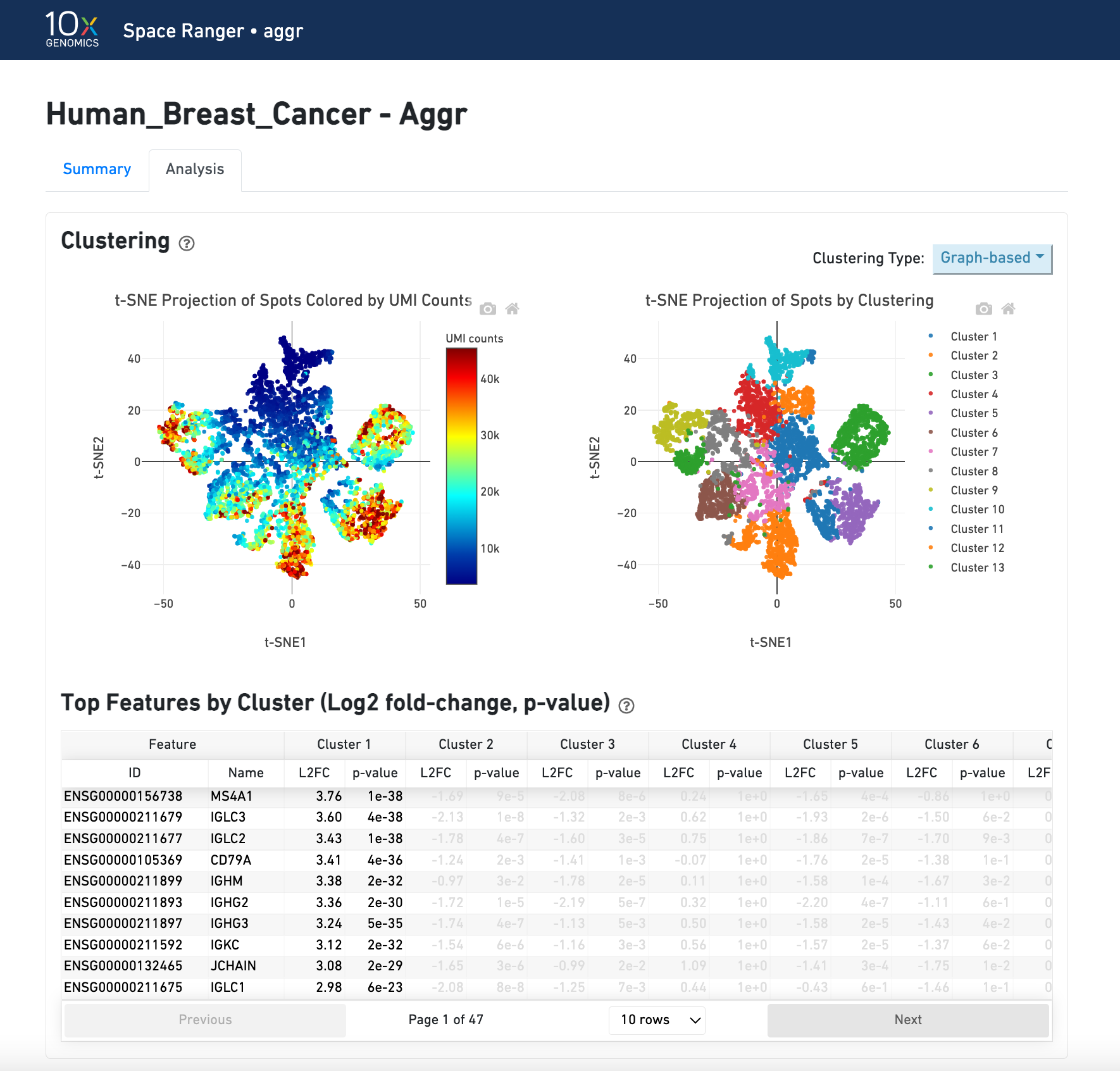
The top right plot shows the 2-D t-SNE projection of the spots colored by the total UMI counts per spot. In this space, pairs of spots that are close to each other have more similar gene expression profiles than spots that are distant from each other. The color scale is selectable from the dropdown in the upper right - change this to vary the default coloring scheme.
The middle left plot overlays the clustering results onto the tissue segment. The spots are colored according to the cluster they are assigned to - clustering itself is done on the transcriptome data, without taking into account the spatial information.
The middle right plot overlays the clustering results onto the 2-D t-SNE projection of spots. The type of clustering analysis is selectable from the dropdown in the upper right - change this to vary the type of clustering and/or number of clusters that are assigned to the data.
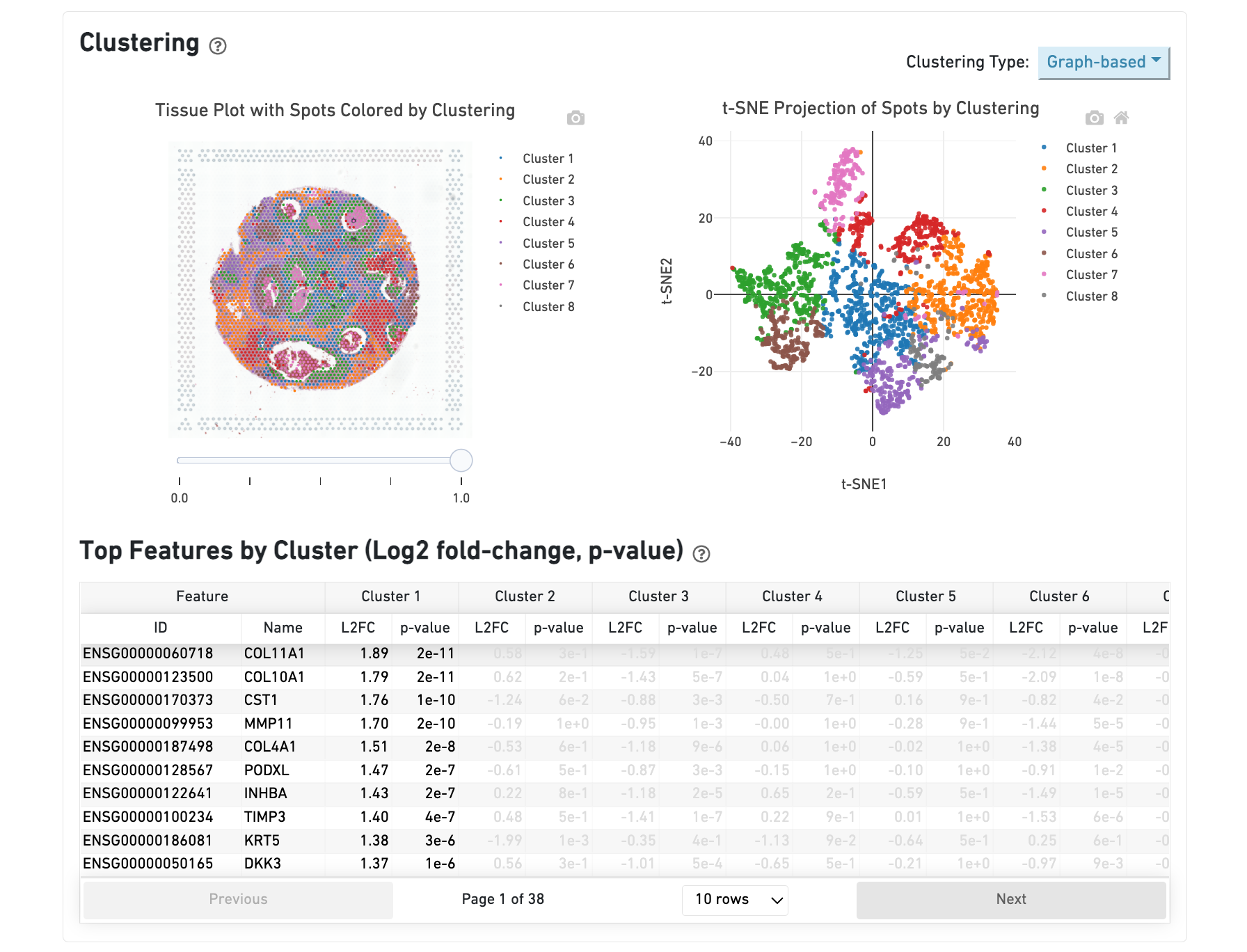
The table in the middle shows which genes are differentially expressed in each cluster relative to all other clusters. The table presents the opportunity to check for known cell markers and assign clusters to cell types. To find the genes associated with a particular cluster, you can click the cluster number to sort the table by specificity for that cluster.
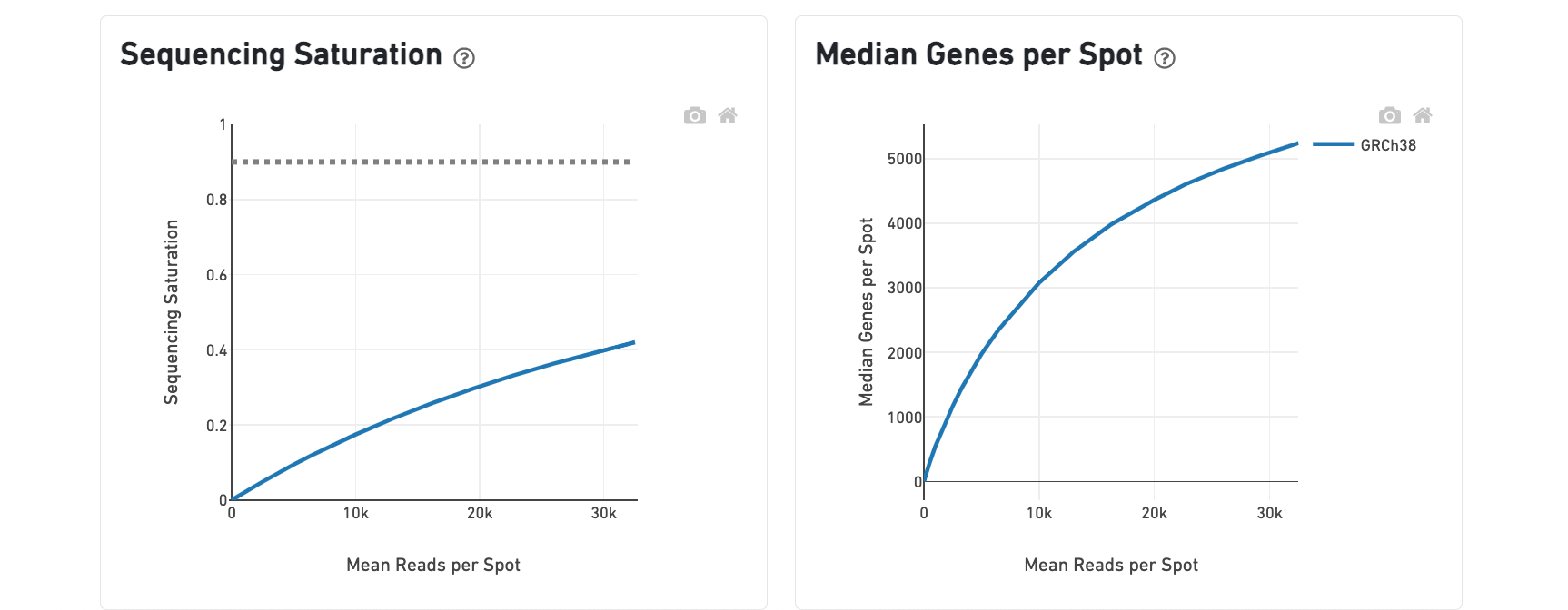
The bottom left plot shows the effect of decreased sequencing depth on Sequencing Saturation, which is a measure of the fraction of library complexity that was observed. The far right point of the line is the full sequencing depth obtained in this run.
Similarly, the bottom right plot shows the effect of decreased sequencing depth on Median Genes per Spot, which is a way of measuring data yield as a function of depth. The far right point is the full sequencing depth obtained in this run.
These plots can be helpful for assessing the benefit of sequencing the library deeper. A steep slope at the end of either plot suggests there maybe a benefit, while a plateaued curve suggests no further gain.
In addition to the output from spaceranger count in WTA mode, additional targeting-specific metrics are captured when run against a targeted panel. A Targeted Enrichment dashboard is added to the top with
A successful targeted experiment where targeted genes are well-enriched looks like the example below, with targeted genes (blue) cleanly separable from non-targeted genes (gray). See Targeted Gene Expression Algorithms for more information on how gene enrichments are computed.
The remainder of the analysis tab is similar to that of a WTA run, but focuses on targeted genes (Sequencing Saturation, Median Genes per spot). As described under count-targeted Targeted Gene Expression Analysis, all secondary analyses (t-SNE, differential expression) are done using only targeted genes.
The analysis view for spaceranger aggr gives two main outputs:
A joint reduced-dimension projection of spots into a synthetic 2-D space (t-SNE) based on gene expression of the aggregated dataset
A table at the bottom which shows genes that are differentially expressed in each cluster relative to all other clusters