Space Ranger1.0, printed on 03/26/2025
The spaceranger pipeline outputs a summary HTML file named web_summary.html that contains summary metrics and automated secondary analysis results. Rarely, an issue may also be detected during the pipeline run leading to an alert also appearing on this page, and more information about these is provided in the troubleshooting documentation.
The run summary can be viewed by clicking "Summary" in the top left corner. The summary metrics describe sequencing quality and various characteristics of the detected spots.
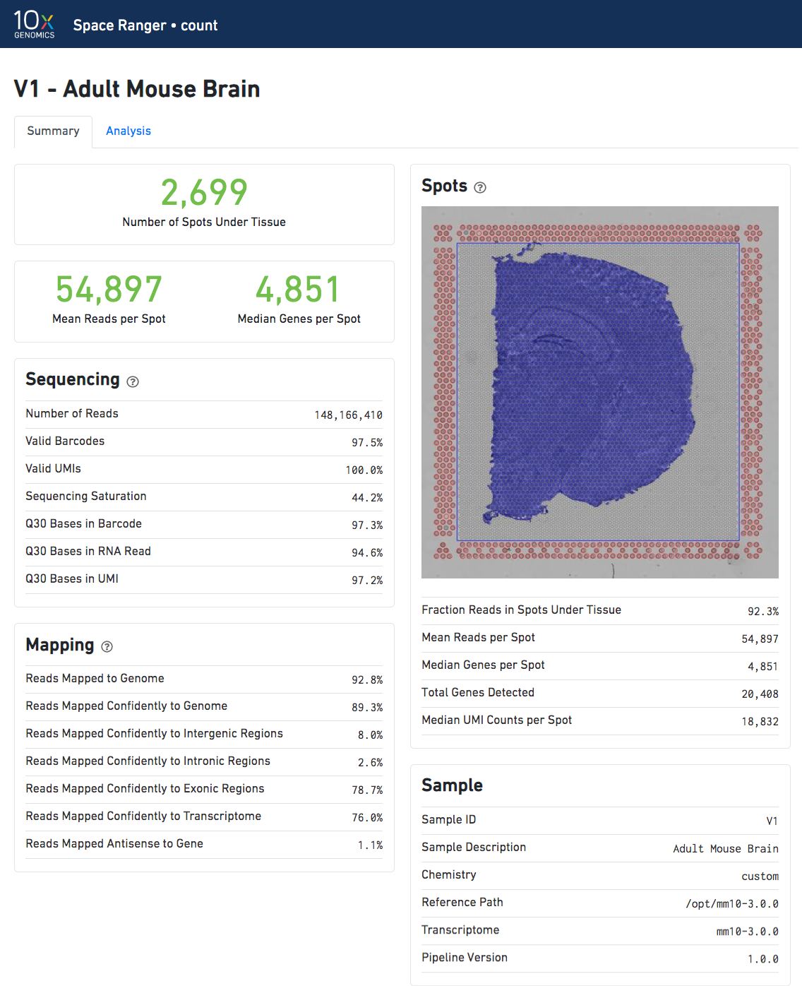
The number of spots detected, the mean reads per spot, and the median genes detected per spot are prominently displayed near the top of the page.
Click the '?' in the top of each dashboard for more information on each metric.
The "Spots" panel shows the slide and tissue image, including the aligned fiducials (red spots), the blue bounding box, the under-tissue spots (solid blue), and the out-of-tissue spots (gray). See Imaging Algorithms for details on how these features are implemented.
The automated secondary analysis results can be viewed by clicking "Analysis" in the top left corner. The secondary analysis provides the following:
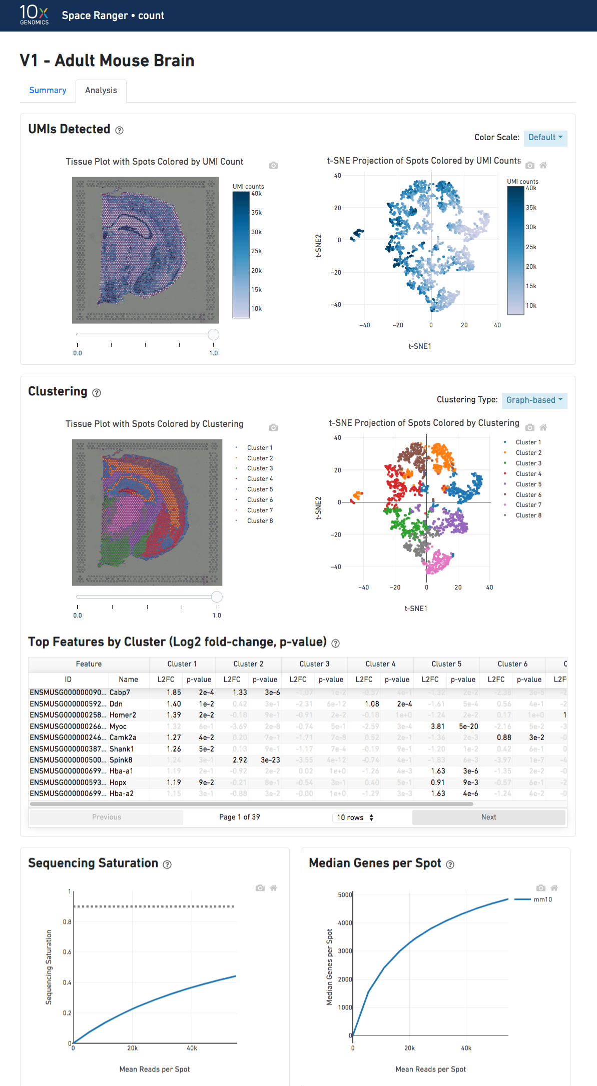
The top left plot shows the tissue colored by the total UMI counts per spot. This is suggestive of the RNA content of the spots and often correlates with number of cells in each spot - darker blue points are spots with more cells in them.
The top right plot shows the 2-D t-SNE projection of the spots colored by the total UMI counts per spot. The color scale is selectable from the dropdown in the upper right - change this to vary the default coloring scheme.
The middle left plot overlays the clustering results onto the tissue segment. The spots are colored according to the cluster they are assigned to - clustering itself is done on the transcriptome data, without taking into account the spatial information.
The middle right plot overlays the clustering results onto the 2-D t-SNE projection of spots. The type of clustering analysis is selectable from the dropdown in the upper right - change this to vary the type of clustering and/or number of clusters that are assigned to the data.
The table in the middle shows which genes are differentially expressed in each cluster relative to all other clusters. To find the genes associated with a particular cluster, you can click the cluster number to sort the table by specificity for that cluster.
The bottom left plot shows the effect of decreased sequencing depth on Sequencing Saturation, which is a measure of the fraction of library complexity that was observed. The far right point of the line is the full sequencing depth obtained in this run.
Similarly, the bottom right plot shows the effect of decreased sequencing depth on Median Genes per Spot, which is a way of measuring data yield as a function of depth. The far right point is the full sequencing depth obtained in this run.