Cell Ranger ATAC2.1, printed on 04/14/2025
The Cell Ranger ATAC pipeline outputs a summary HTML file containing metrics and secondary analysis plots and results.
The top of the summary HTML file shows the sample ID
and its description, followed by four key metrics that provide an overall view of
the experiment. If any of the main metrics fall out of an expected range, a
color-coded warning or alarm is displayed at the top of the page. The different
sections of the summary HTML file are described next. Descriptions of metrics in
the following sections can also be found by clicking the ? next to the section
header in the summary HTML file itself.
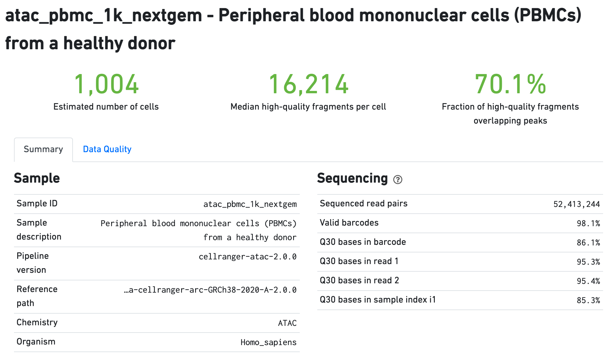
The Sample section summarizes the inputs to and version of
the pipeline execution. Sequencing QC metrics are shown in the Sequencing
section.
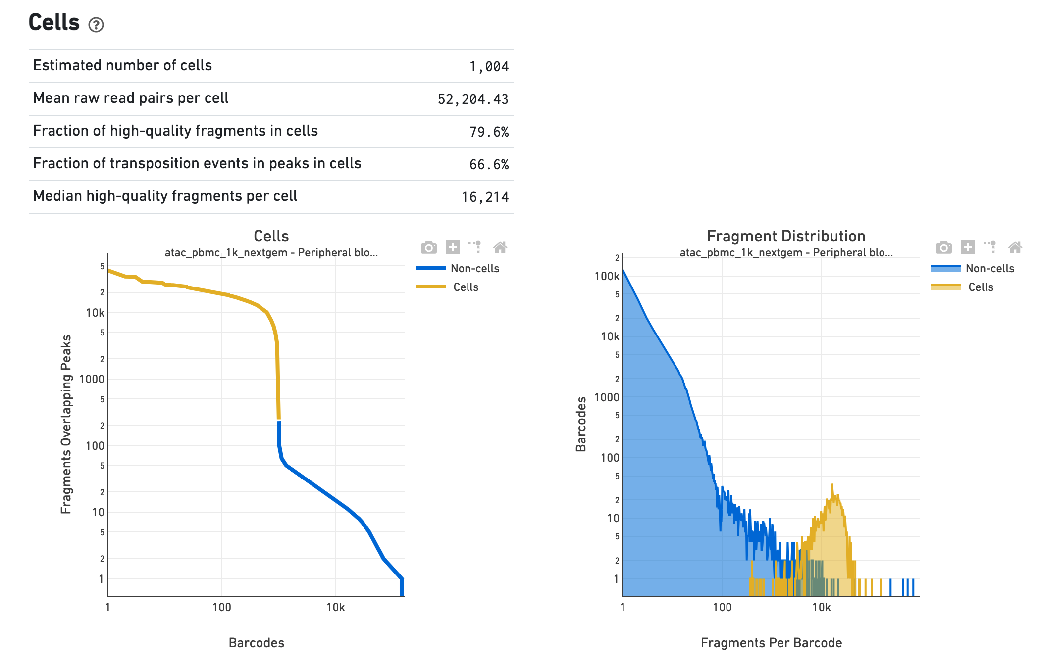
The Cells section shows metrics and plots related to
identification of cells. The web summary shows the barcode rank plot (or knee plot) for
fragments overlapping peaks (see
Algorithms
for details) and mark the barcodes that were inferred to be associated with
cells. A steep drop-off is indicative of good separation between the
cell-associated barcodes and the barcodes associated with empty droplets. Also shown is
the distribution of the number of fragments per cell barcode for the
non-cell and cell groups. Notice the knee plot is based on fragments that
overlap peaks, whereas the distribution plot corresponds all fragments per
barcode. The metrics in the table are key statistics derived from the data that
help call cells on the knee plot and the histograms.
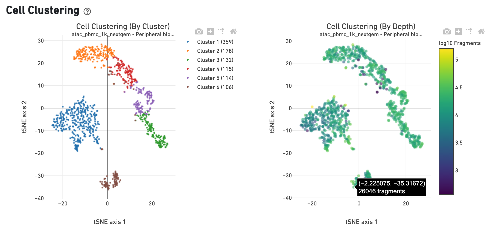
The Cell Clustering (By Cluster) plot shows the
cell-associated barcodes in a 2-D t-SNE projection, with colors showing an
automated graph clustering
analysis
which groups together cells that have similar chromatin accessibility profiles.
In the Cell Clustering (Colored by Depth) plot, the same 2-D projection is
shown, but cell coloring is based on the number of unique fragments associated
with the barcode.
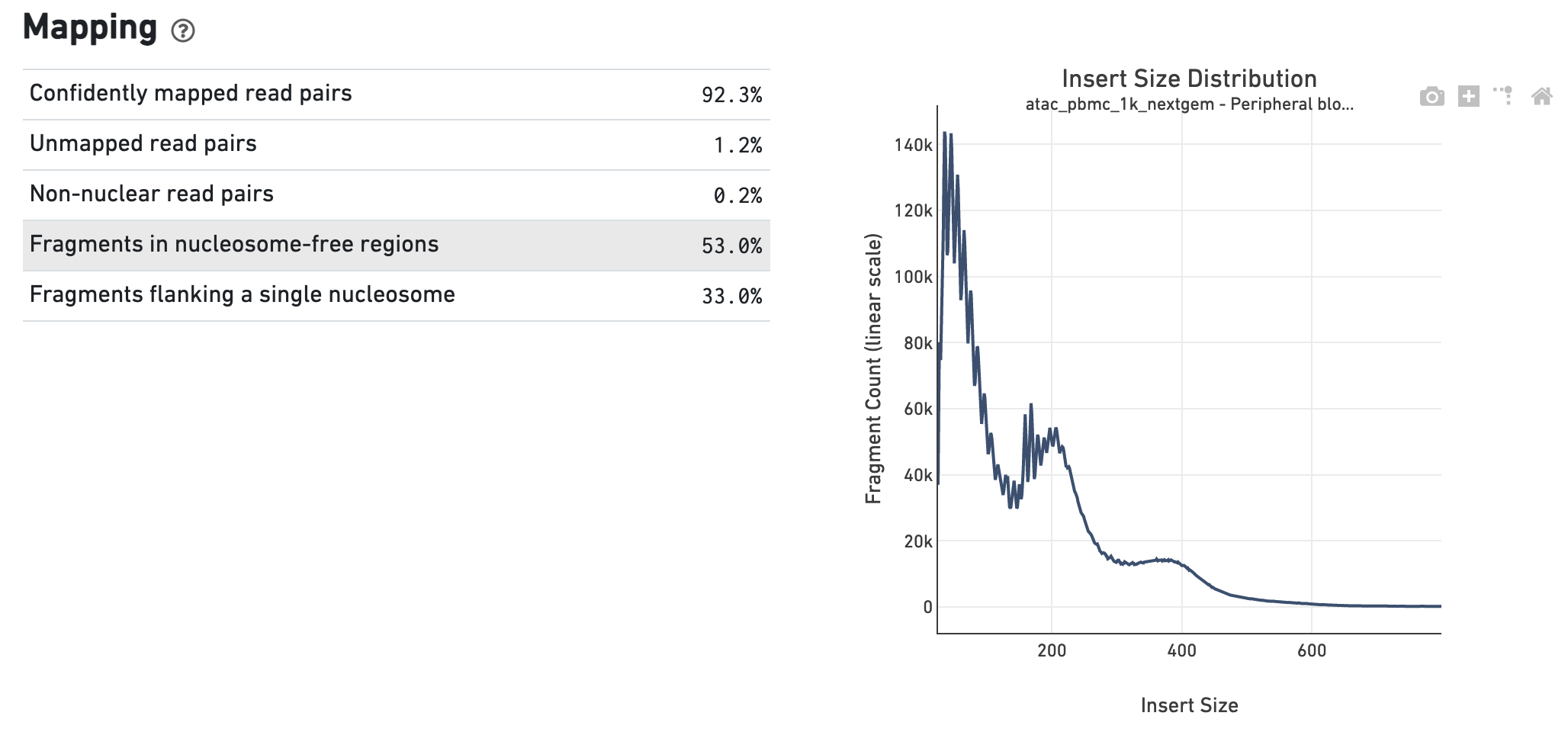
The Insert Sizes section shows the Insert Size
Distribution, and metrics derived from it. Single Cell ATAC read pairs produce
detailed information about nucleosome packing and positioning. The fragment
length distribution captures the nucleosome positioning periodicity.
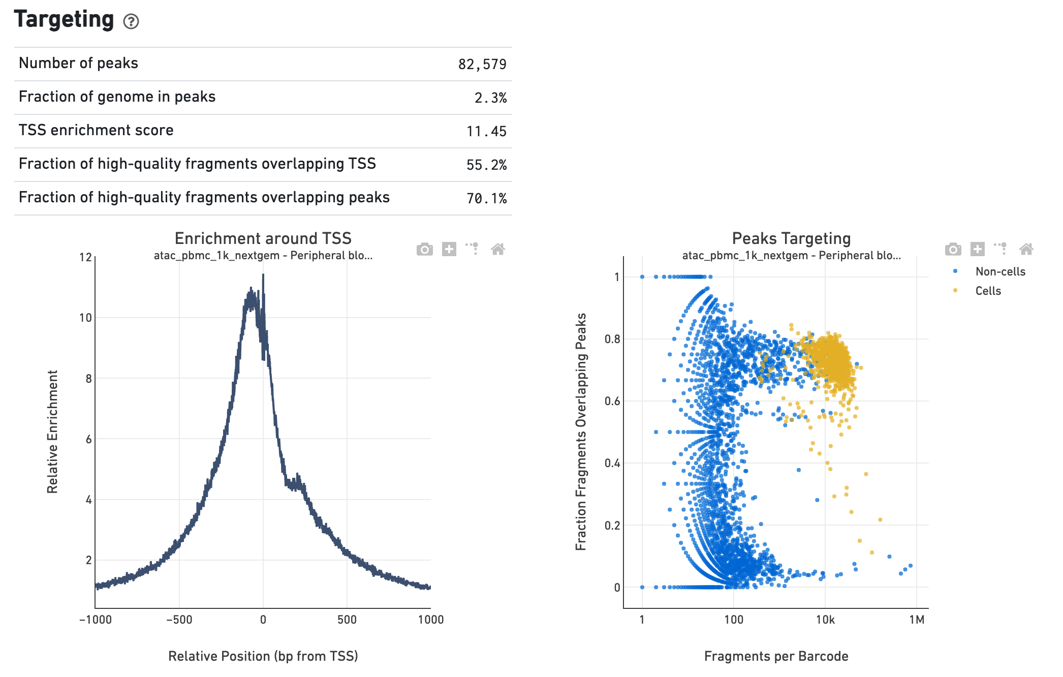
The Targeting section shows profiling of the chromatin
accessibility behavior of the library at known, annotated, epigenetically
relevant regions in the genome (see how the reference is
built
for more details). The first plot is the Transcription Start Site (TSS) profile,
which is computed as the summed accessibility signal, or the number of cut sites
per base, of all the barcodes irrespective of cell vs non-cell assignment, in a
window of 2,000 bases around the full set of annotated TSSs and is normalized by
the minimum signal in the window. This profile is helpful to assess the
signal-to-noise ratio of the library, as it is well known that TSSs and the
promoter regions around them have, on average, a high degree of chromatin
accessibility compared to the intergenic and intronic regions of the genome. The
"Enrichment score of transcription start sites" metric is derived from this
profile. Note that this enrichment score depends on the source of TSS sites as
packaged with the reference. The second plot presents the variation in the
number of on-target fragments, or fragments that overlap peaks, within each
barcode group, namely cells and non-cells. For cell-associated barcodes it is
expected that a high percentage of the barcode fragments overlap peaks. The
metrics table summarizes, for all barcodes, the percentage that overlap
not only peaks but also other kinds of annotated regions, such as enhancers and
DNase hypersensitive sites.
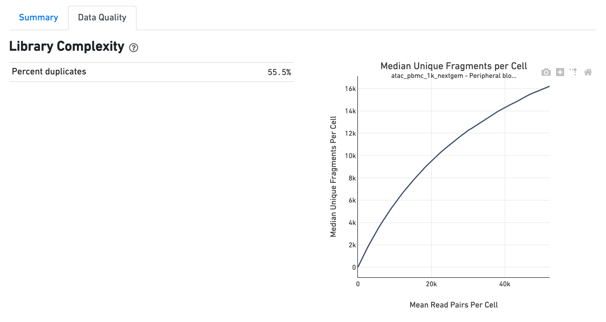
The Library Complexity section plots the observed per
cell complexity, measured as median unique fragments per cell, as a function of
mean reads per cell. The shape of the curve portrays the level of saturation in
the library and can be used to inform decisions regarding sequencing depth to
target for a sample. The metrics presented in the table summarize the complexity
of the library measured for single cells and also in pseudo-bulk.
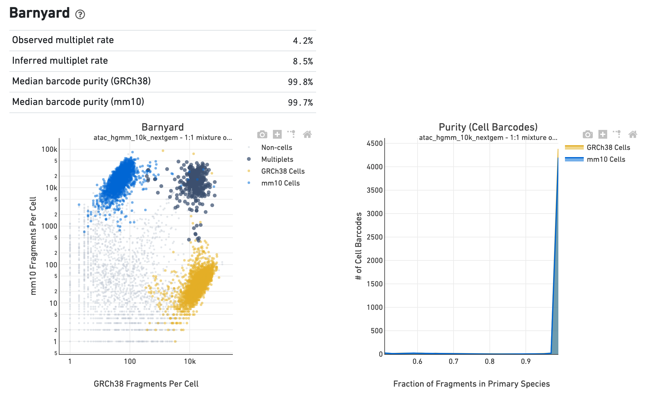
If the library corresponds to a multi-species experiment, the
summary page will look different. A typical multi-species experiment, for
instance, consists of mixing human and mouse cells. First, some of the metrics
described before will have a version for each of the species in the experiment.
Second, the summary will have a Barnyard section, which shows a scatter plot of
all the barcodes and their number of associated fragments from each species,
color coded by automatic assignment to non-cell, multiplet and cell barcode
groups. It also shows, for each species, the distribution of barcode purity,
measured as the fraction of fragments in a cell barcode that align uniquely to
the species assigned to the barcode. The metrics in the table summarize key
statistics from the data that generated the plots.
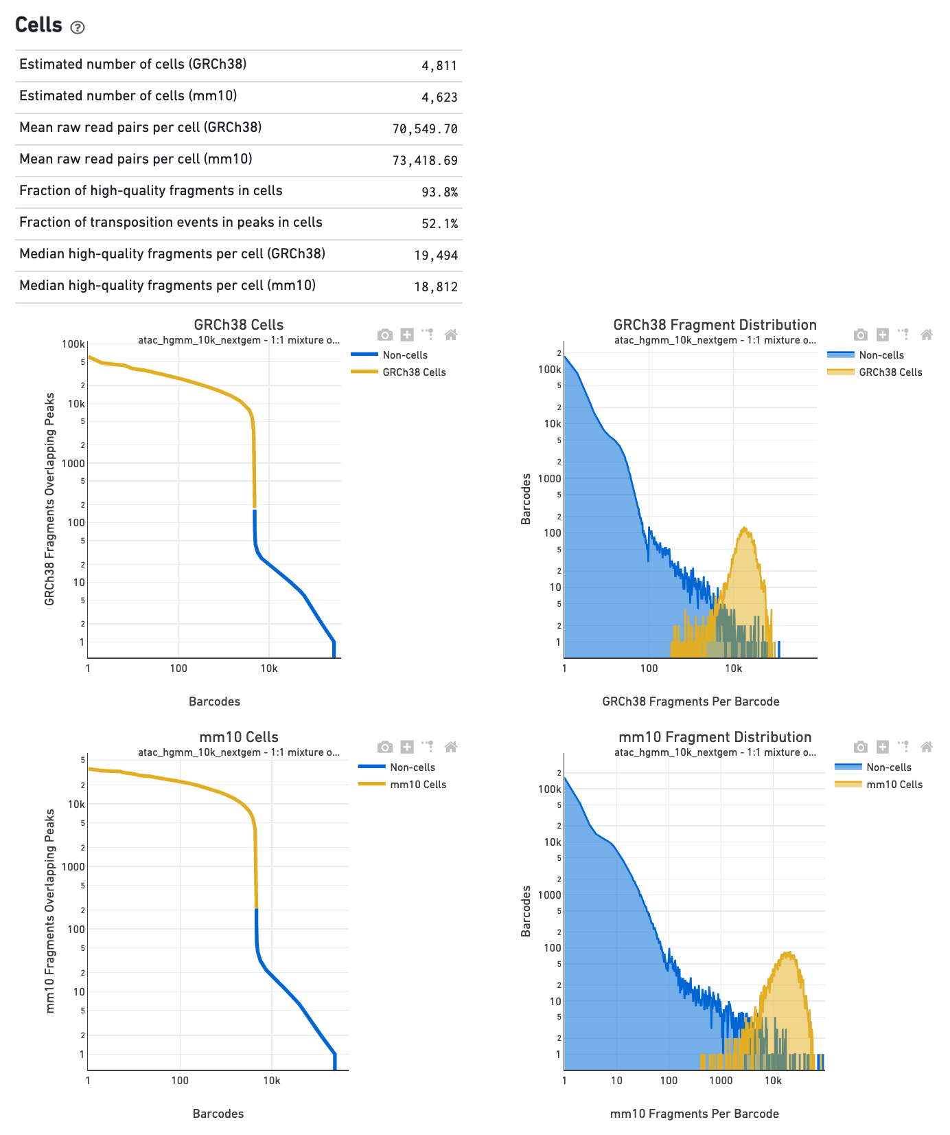
The Cells section in a multi-species library will show
plots corresponding to each of the species.
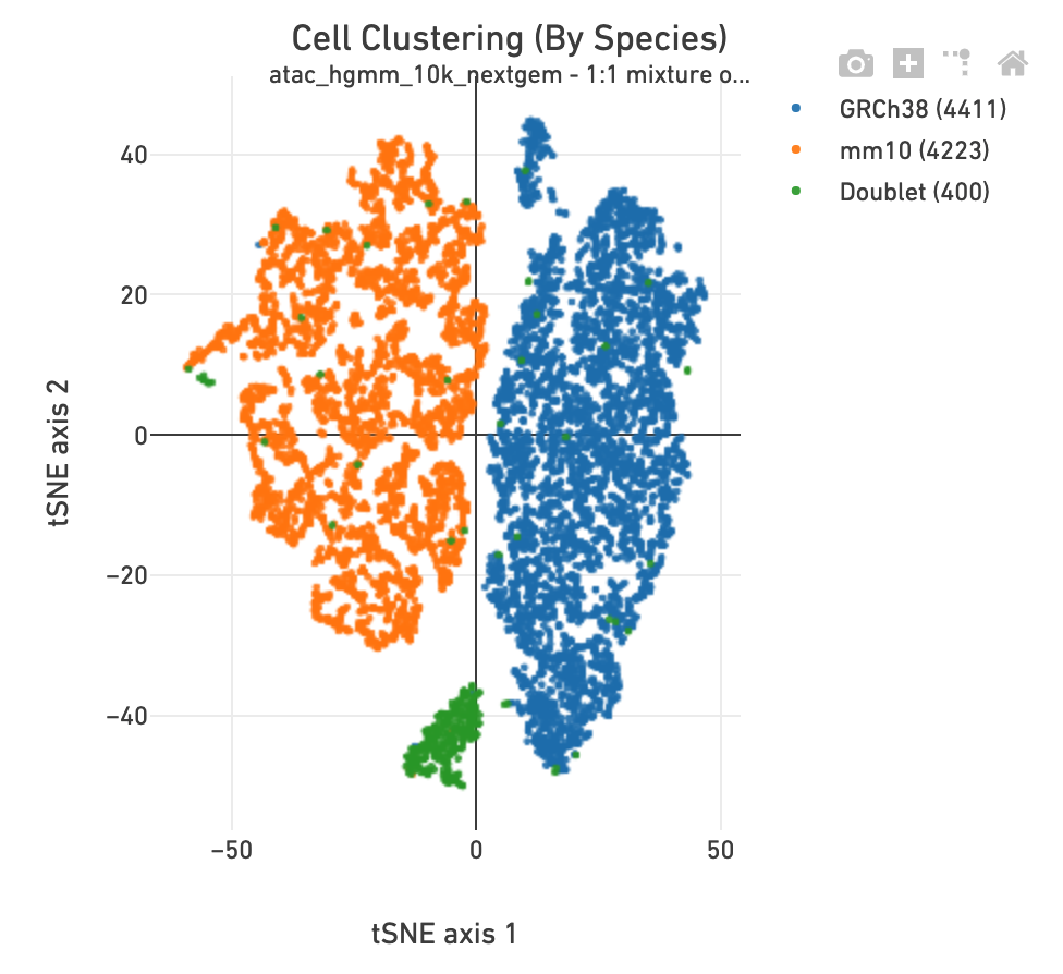
The Cell Clustering section in a multi-species
library includes one more clustering plot, in which each barcode is colored
according to its species assignment.
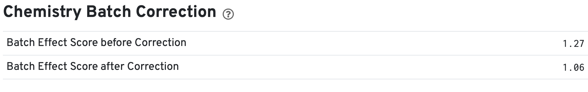
If chemistry batch correction was specified for the cellranger-atac aggr pipeline (batch column in input aggregation CSV file), there will be an additional Chemistry Batch Correction section with batch effect scores before and after correction in the web_summary.html and summary.json files. Batch effect scores indicate whether there is a batch effect (greater than one) or no batch effect (closer to one) (read more on the algorithm page).