Cell Ranger2.0, printed on 03/12/2025
With the AMLTutorial dataset loaded, let's take a quick tour of the Loupe Cell Browser user interface.
Front and center in the workspace is the plot created by the Cell Ranger pipeline. Cell Ranger generates this plot by identifying the most significant gene vectors using principal component analysis, and then applying t-SNE dimensionality reduction to produce a two-dimensional scatter plot. Each point represents a single barcode, the vast majority of which represent a single cell.

You can drag the mouse over the cells to reposition the plot, and use the mouse wheel or track pad to smoothly zoom in and out. You'll see cluster labels as you move your mouse over the plot, which is useful for data that has a high number of precomputed clusters. Cells are colored by the active legend in the sidebar.
At upper left is the toolbox. When you move your mouse over the toolbox buttons, you will see an explanation of what each button does. Use the toolbox to open files and save your work, control zoom, select cells for manual categorization, and to take screenshots of the current plot view. Clicking the 10x button will return you to the home screen and Recent Files list.
You will use the mode selector at the top right corner of the workspace to switch between Loupe Cell Browser's different modes. There are three modes in Loupe Cell Browser 2.0: Categories mode, Gene Expression mode, and V(D)J Clonotypes mode. Switching between modes will apply mode-specific coloring to the graph, and change the sidebar to reveal mode-specific functionality.
Cell Ranger pipelines compute and produce clusterings from two algorithms: a graph-based clustering algorithm and by K-Means clustering. A selector at the top of the Categories sidebar allows you to switch between these clusterings or other qualitative attributes. If your data comes from a cellranger aggr pipeline run, you can also color by library ID, and any additional attributes you add to the aggr spreadsheet, such as 'AMLStatus' in this dataset. Finally, you can also switch to categories that you make yourself within Loupe Cell Browser.
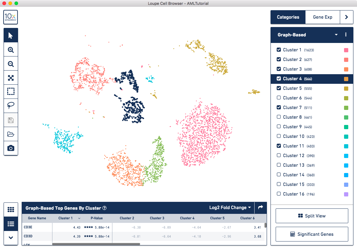
You may hide, show and highlight individual clusters within a category by using the sidebar. To highlight a cluster, click on the cluster name within the legend. To hide and show a cluster, click on the checkbox next to the cluster name. Finally, you may hide or show all clusters within a category by clicking on the menu with three dots, to the right of the category selector.
In Loupe Cell Browser 1.0.5 and later, you also have the ability to rename and recolor clusters. Read the v1.0.5 release notes for more information.
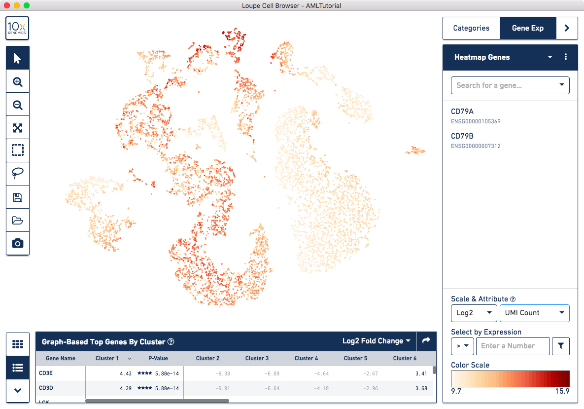
In Gene Expression mode, you see a graphical representation of gene expression across your dataset. You may look at one or more genes at a time, load and save lists of genes for analyzing across multiple datasets, and look at the density of transcript counts across your data. We will explore Gene Expression mode more in-depth when looking for cell types.
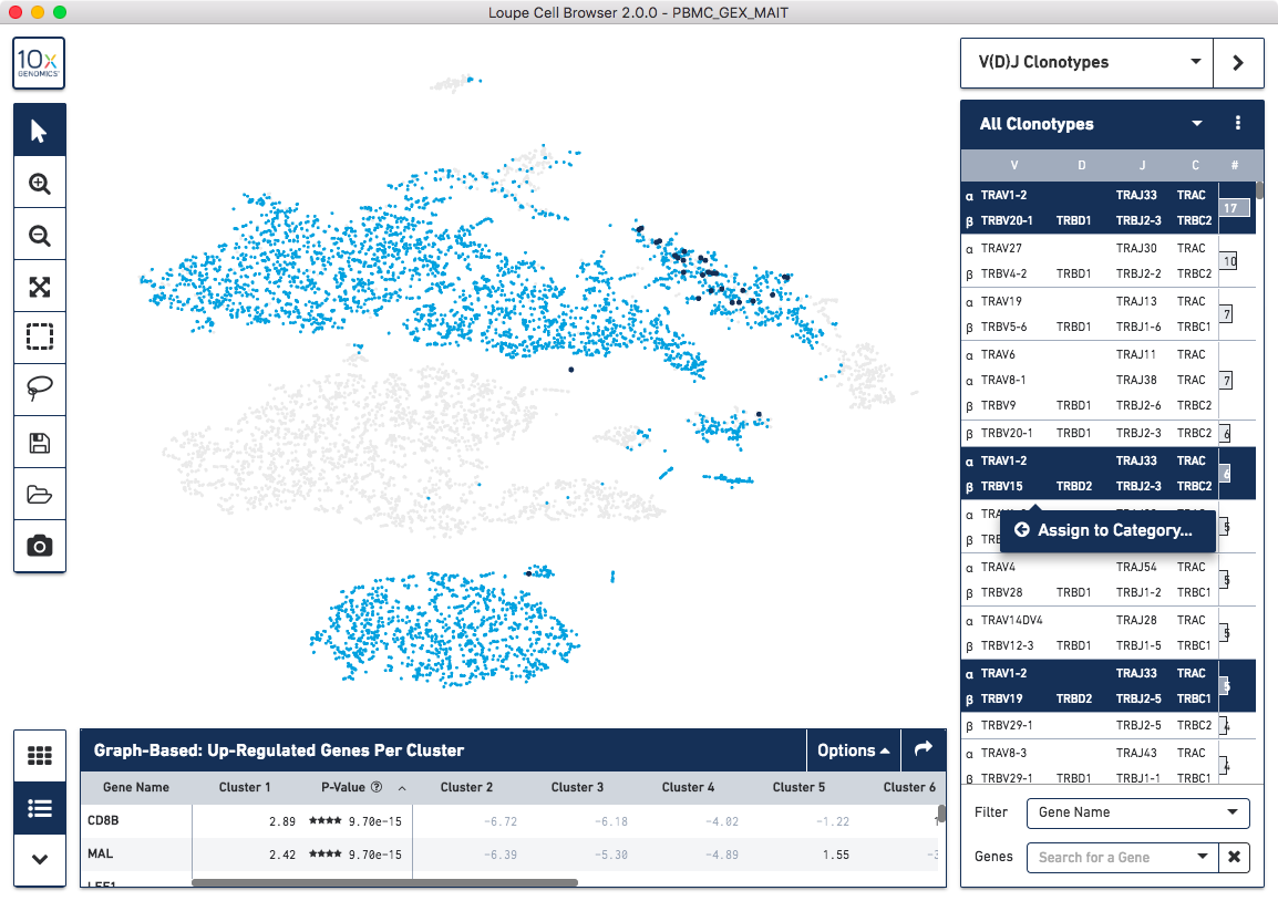
In V(D)J Clonotypes mode, you can load an input sample's corresponding V(D)J data into the Loupe Cell Browser workspace. Cells that belong to the active set of V(D)J clonotypes are colored blue, and the sidebar changes to a filterable clonotype list. For more information on how to use Loupe Cell Browser to combine gene expression and immune repertoire data, follow the Integrated Gene Expression and V(D)J Analysis in Loupe Cell Browser tutorial.
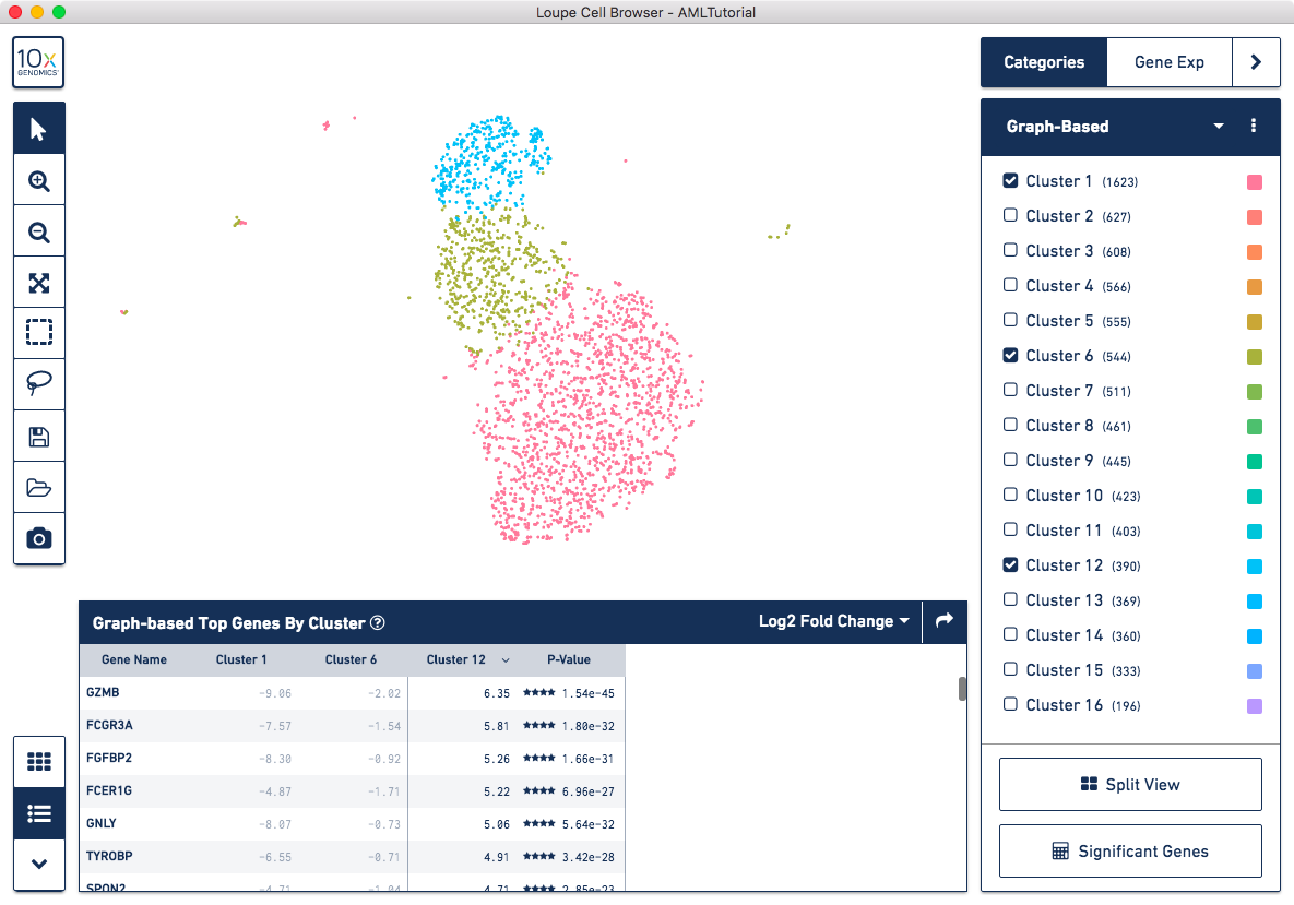
The data panel on the bottom of the workspace displays information about the genes driving differences between clusters. By default, it will enumerate the genes that drive differences between the current precomputed clustering selected in the Categories sidebar. It will also display the results of a Significant Genes analysis. The mini-toolbar to the left of the data panel switches between a table and a hierarchical heat map of differentiating genes. Clicking on either a heat map cell or a gene name in the table view will show the expression level for that gene in the t-SNE plot.
Now that you are familiar with the user interface, let's explore the data.