Cell Ranger ATAC3.0, printed on 04/06/2025
With the ATACTutorial dataset loaded, let's take a quick tour of the Loupe Cell Browser user interface for ATAC datasets.
The workspace is centered around the barcode plot, in which single points representing cell barcodes are shown in a variety of projections. Each point represents a single barcode, the vast majority of which represent a single cell. The default projection is the t-SNE plot created by the Cell Ranger ATAC pipeline. Cell Ranger ATAC generates this plot by identifying the most significant peak vectors using dimensionality reduction techniques, and then processing the lower-dimension matrix through t-SNE to produce a two-dimensional scatter plot. You may also view a projection that plots cut site counts in a peak, near a gene promoter, or within a certain motif on two-dimensional axes. The selector at the upper right of the barcode plot allows you to toggle between projections.
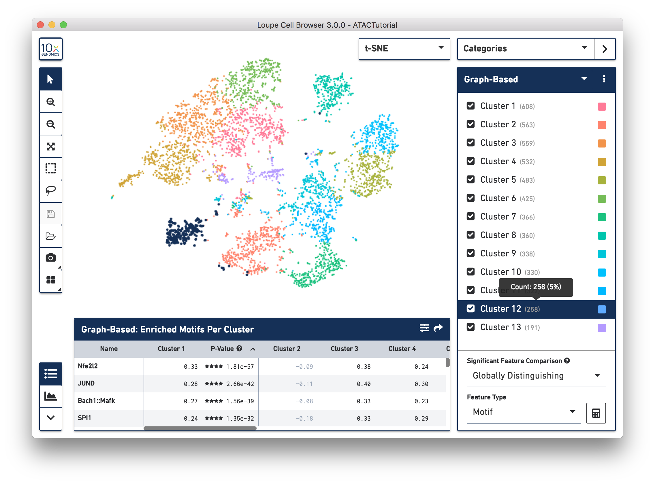
You can click-and-drag the mouse over the cells to reposition the plot, and use the mouse wheel or track pad to smoothly zoom in and out. You'll see cluster labels as you move your mouse over the plot, which is useful for data that has a high number of precomputed clusters. Cells are colored by the active legend in the sidebar.
On the left side of the window is the toolbox. When you move your mouse over the toolbox buttons, you see an explanation of what each button does. Use the toolbox to open files, save your work, control zoom, select cells for manual categorization, export screenshots of the current plot view, and split the barcode plot into individual clusters. Clicking the 10x button returns you to the home screen and Recent Files list.
Use the mode selector at the top right corner of the workspace to switch between Loupe Cell Browser's different modes. There are two modes in Loupe Cell Browser 3.0 for ATAC data: Categories mode, where you can see the different cluster assignments for all the cells, and Accessibility mode, where you can overlay quantitative cut site count information atop the barcodes. Switching between modes applies mode-specific coloring to the graph, and changes the sidebar to reveal mode-specific functionality.
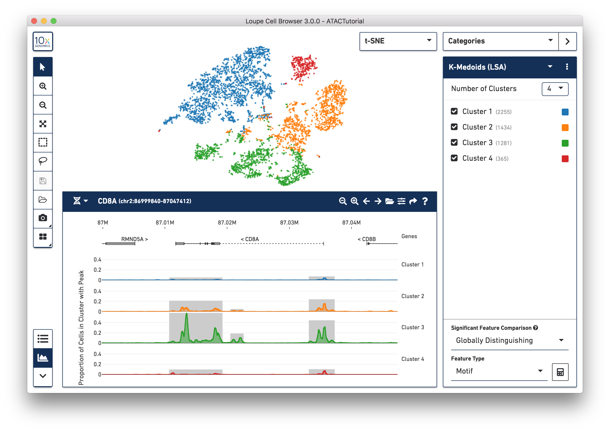
Cell Ranger ATAC pipelines compute and produce clusterings from two algorithms: a graph-based clustering algorithm and by either K-Means or K-Medoids clustering. A selector at the top of the Categories sidebar allows you to switch between these clusterings, or other clusterings that you can create yourself within Loupe Cell Browser.
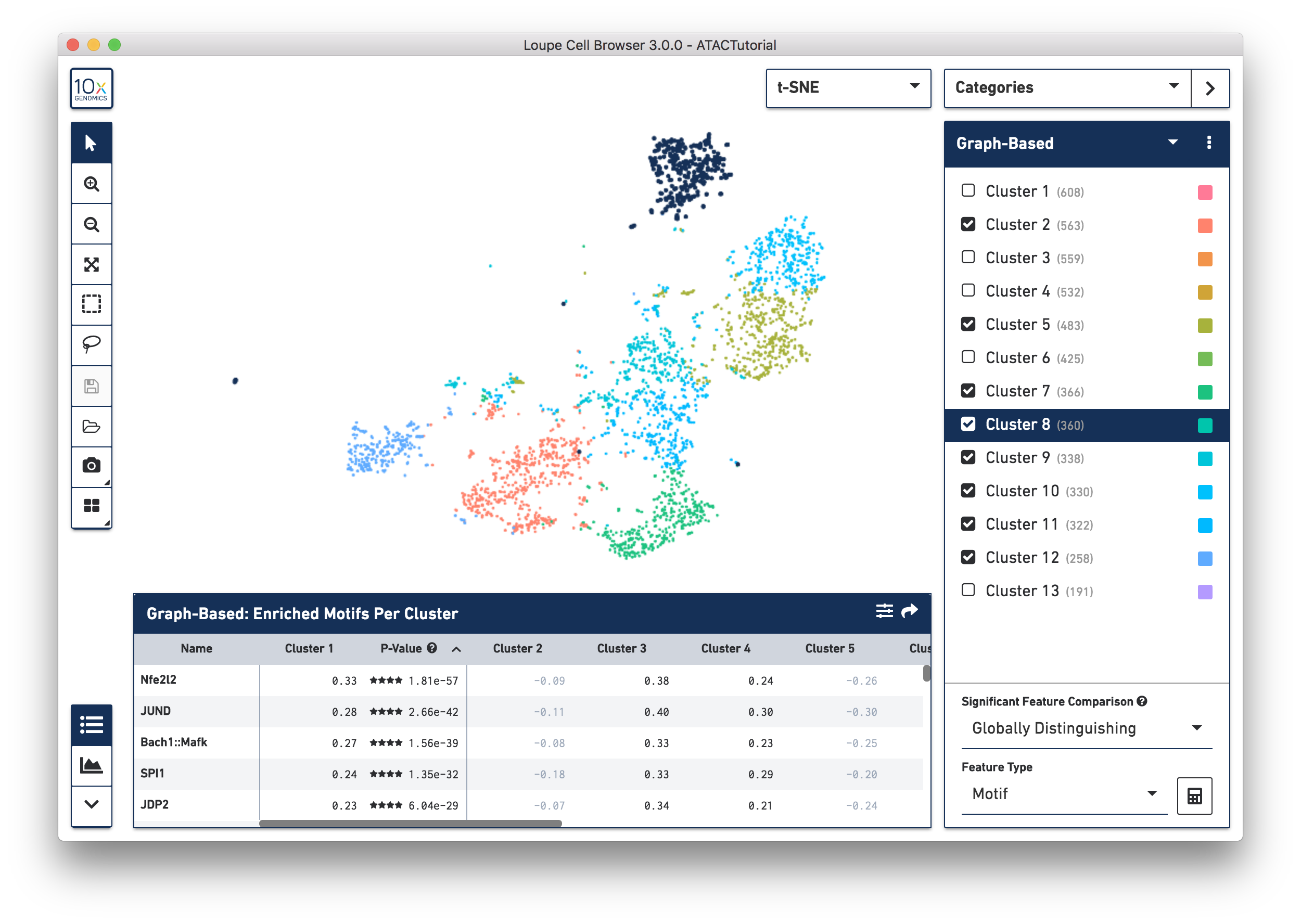
You can hide, show, and highlight individual clusters within a category by using the sidebar. To highlight a cluster, click on the cluster name within the legend. To toggle the appearance of a cluster, click on the checkbox next to the cluster name. Finally, you can hide or show all clusters within a category by clicking on the menu with three dots, located to the right of the category selector.
You can also rename and recolor clusters by right-clicking on a cluster name or color, and selecting the desired option from the pop-up menu.
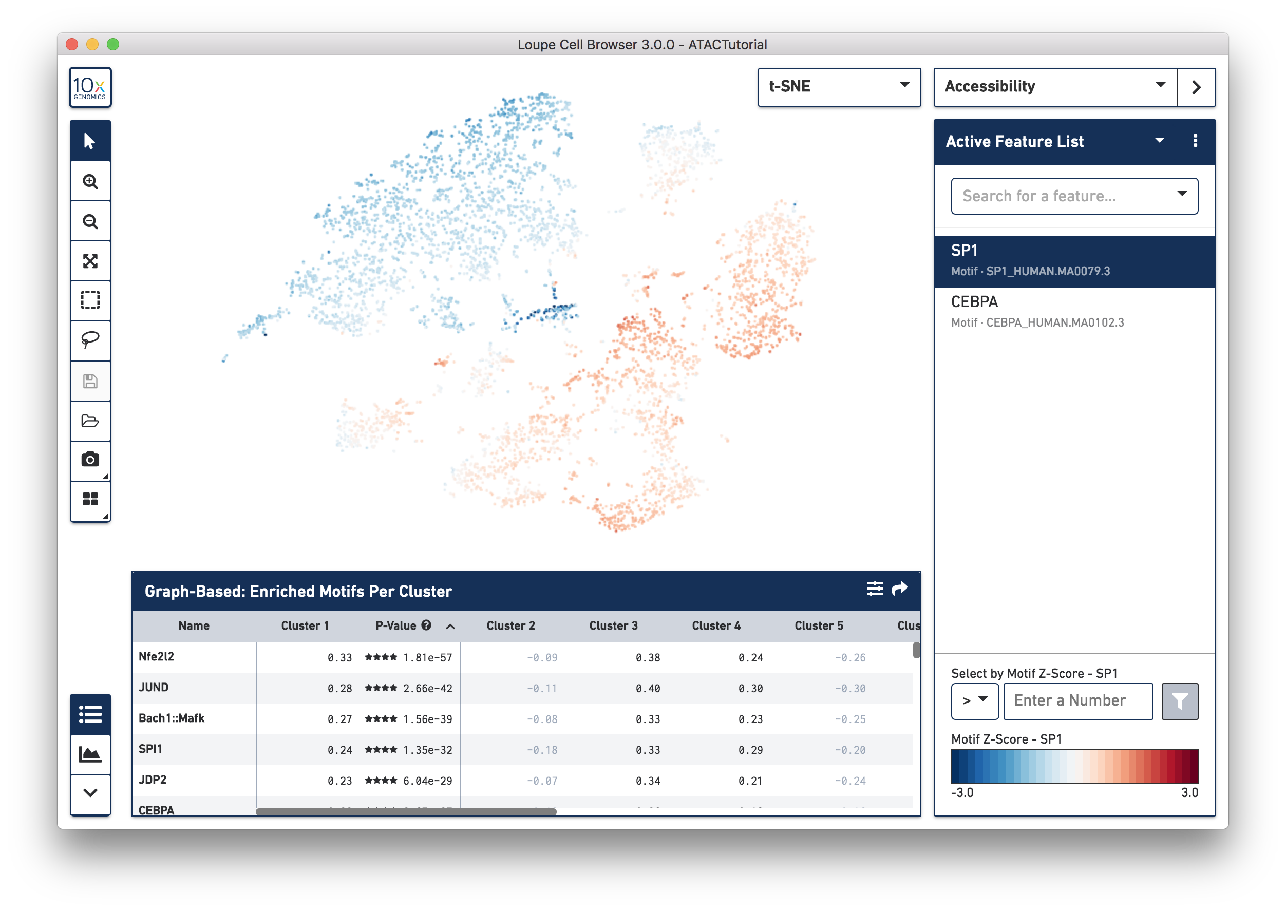
In Accessibility mode, you see a graphical representation of chromatin accessibility across your dataset. You can view the number of cut sites detected per cell within individual peaks, near the promoter regions of particular genes, or in total across the entire genome, through the Peak Sum feature. You can also view Z-scores of transcription factor motif counts per barcode, look at one or more features at a time, load and save lists of features for analyzing across multiple datasets, and look at the density of cut site counts across your data. We will explore Accessibility mode more in-depth when looking for cell types.
The panel on the bottom of the workspace does double duty for ATAC data in Loupe Cell Browser. The Feature Table shows information about differentially accessible peaks, transcription factor motifs, or promoter sums between clusters.
The Peak Viewer shows the differential distribution of peaks and cut sites per cluster within the genome. You can use the toolbar at bottom left to toggle between the two panels. When you first load the ATAC dataset, you see the feature table, preloaded with the transcription factor motifs that are most significantly different between the clusters in the active category. Selecting the Peak Viewer, by default, shows the first five peaks in the genome, and their distribution within the active set of clusters. We will explore the Feature Table in depth in Significant Features, and cover how to hone in on regions of interest on the Peak Viewer page.
Now that you are familiar with the user interface, let's explore the data.