Cell Ranger ARC2.0, printed on 04/10/2025
The cellranger-arc count outputs a summary HTML file named web_summary.html that contains summary metrics and automated secondary analysis results. Click the '?' in the top of each dashboard for more information on each metric.
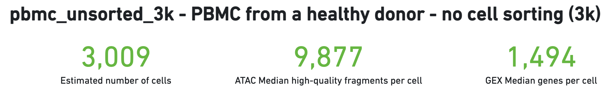
The number of cells detected, ATAC median high-quality fragments per cell, and GEX median genes per cell are prominently displayed near the top of the page. Rarely, an issue may be detected during the pipeline run leading to an alert to appear at the top of this page. For more information, refer to the troubleshooting documentation.
This is the default view visible upon first rendering the summary and can be accessed by clicking "Joint" at the top left corner. This view is divided into the following sections:
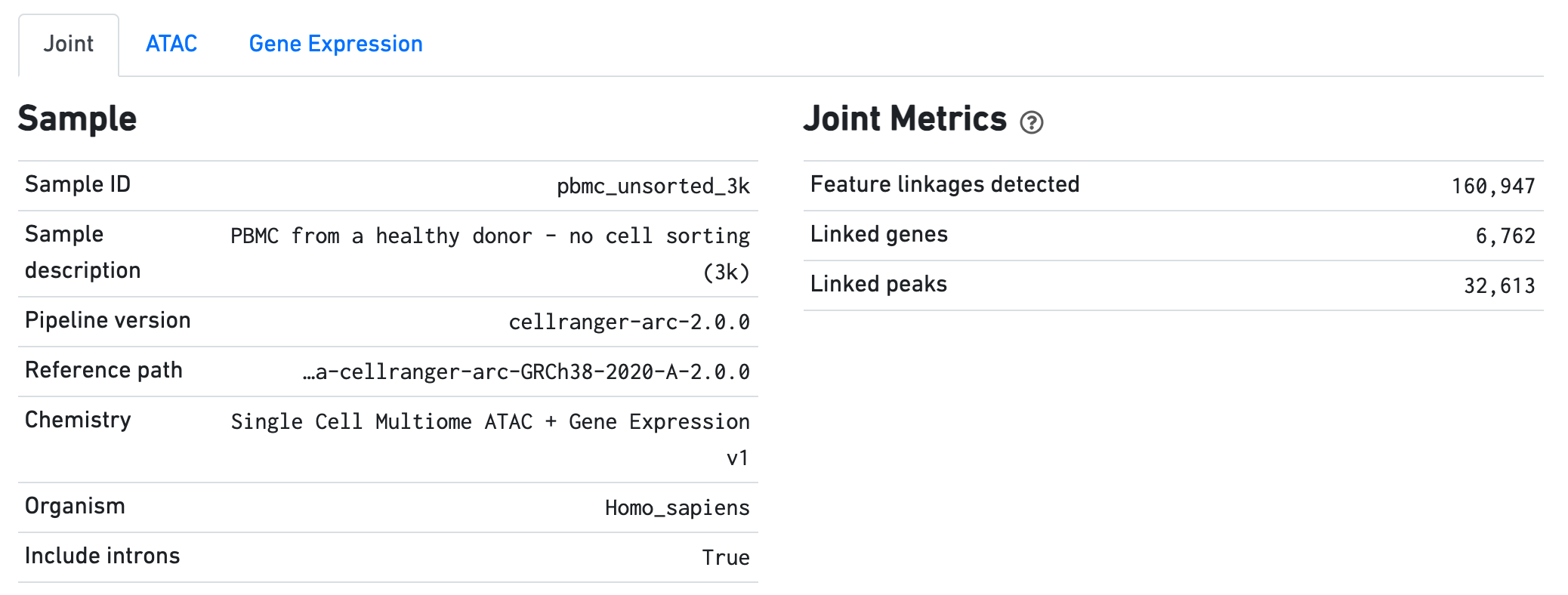
The Sample dashboard included in this view gives an overview of the sample and key parameters used for this analysis. The Joint Metrics dashboard describes metrics that are generated using paired chromatin accessibility and gene expression data.
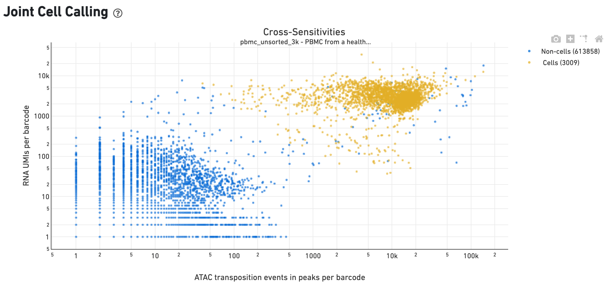
The Cross-sensitivity Plot under the Joint Cell Calling dashboard shows a scatterplot representing each barcode as a point. The position on the x-axis reflects the number of ATAC transposition events in peaks associated with that barcode, while the position on the y-axis corresponds to the number of GEX UMI counts. See Cell Calling Algorithms for more details on how each barcode is classified into non-cell and cell groups, represented as different colors. A clean gap between the non-cell and cell groups in this 2-D plot is indicative of good signal separation between the cell-associated barcodes and barcodes associated with empty partitions. In addition, barcodes are excluded from being classified as cells if the ATAC data suggests they are gel bead doublets or if the fraction of transposition events in peaks is low. This would explain why some barcodes in the vicinity of the cell-cloud are classified as non-cell barcodes.
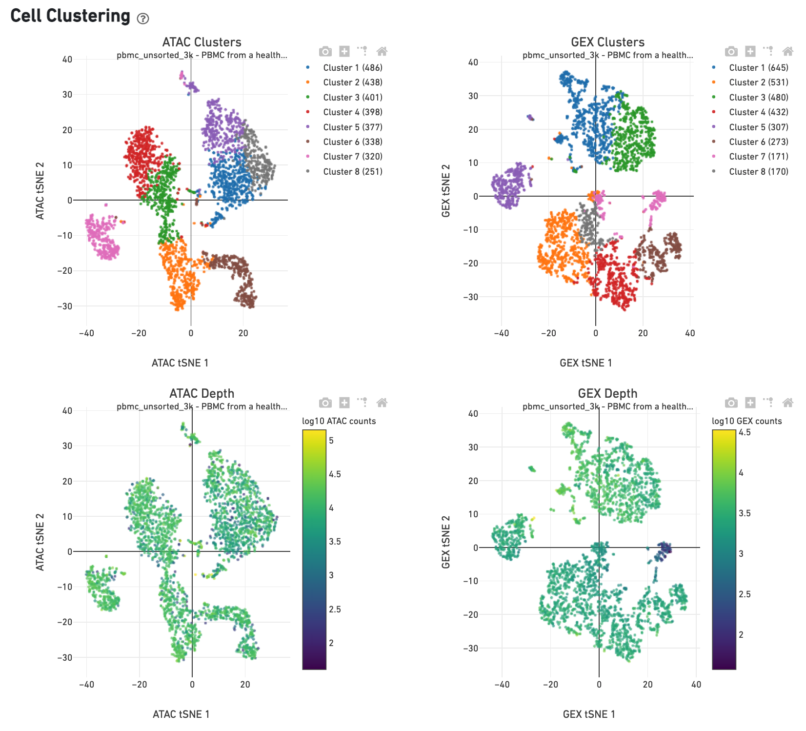
The Cell Clustering dashboard presents dimensional reduction analysis which projects the cell barocdes into 2-D space (t-SNE) as determined by ATAC counts and GEX UMI counts, independently. The points are colored to show:
Metrics that are specific to the given Chromatin Accessibility library will appear in the ATAC tab. This view is divided into the following sections:
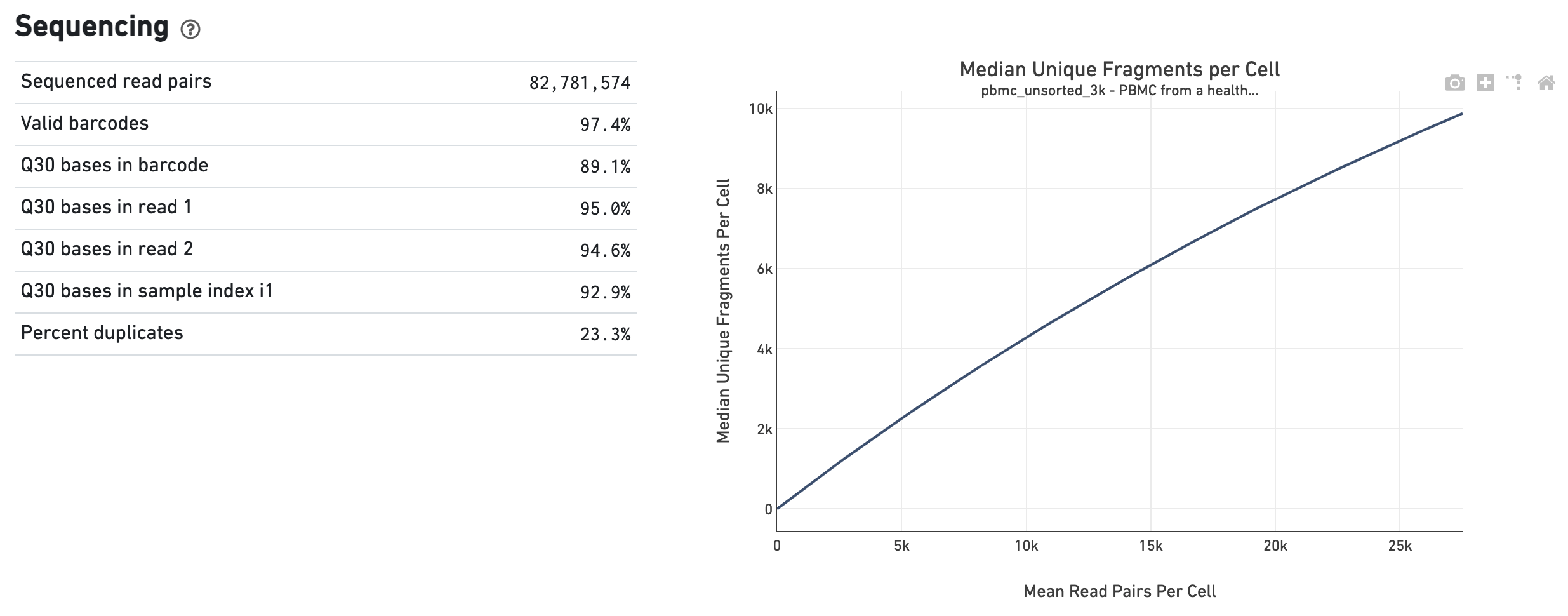
The Sequencing dashboard shows the sequencing QC metrics and a plot showing the effect of decreased sequencing depth on observed library complexity, as measured by median unique high-quality ATAC fragments per cell barcode.
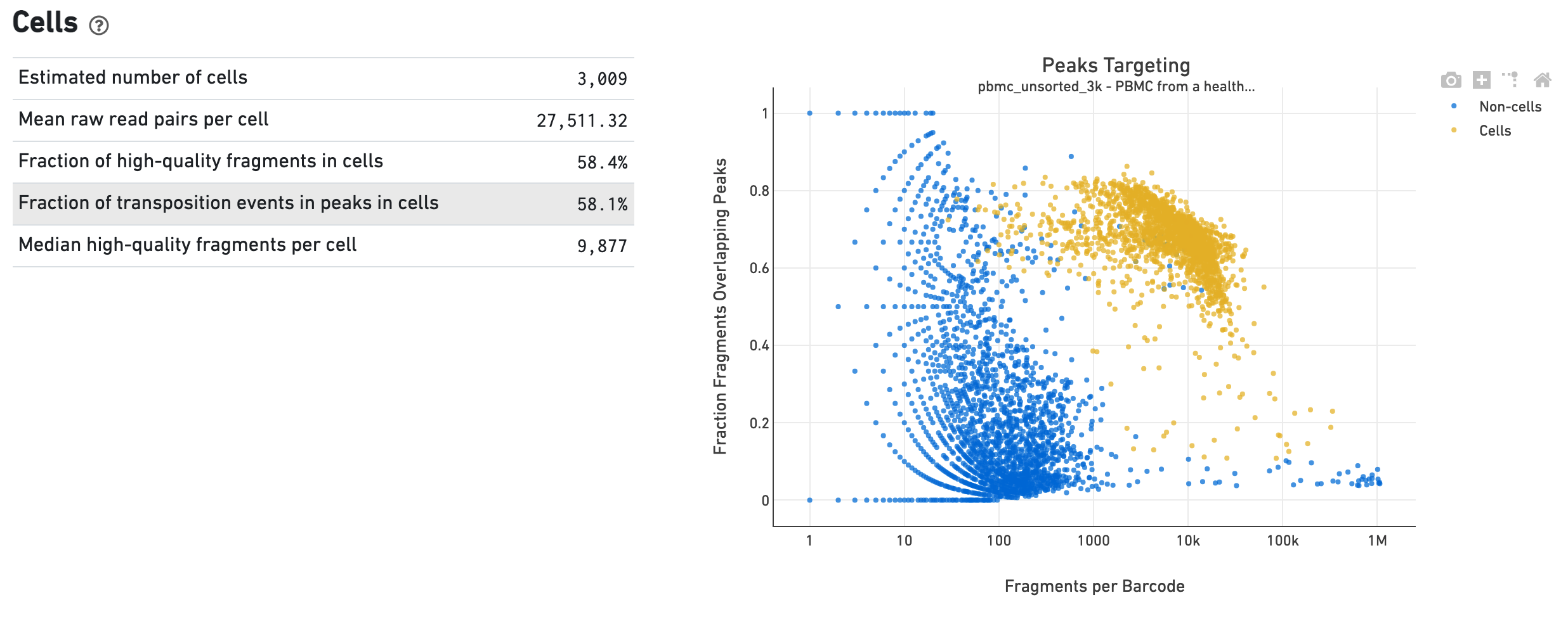
The Cells dashboard shows QC and sensitivity metrics associated with cell barcodes. The plot presents the variation in the number of fragments that overlap peaks within each barcode group, namely cells and non-cells. For cell-associated barcodes, it is expected that a high percentage of the barcode fragments overlap peaks.
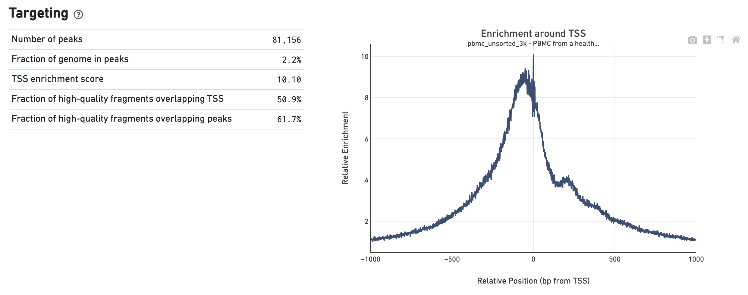
The Targeting dashboard shows metrics associated with peak calling and chromatin accessibility behavior of the library at Transcription Start Sites (TSS). The TSS profile plot is computed as the summed accessibility signal across all barcodes, in a window of 2,000 bases around the full set of annotated TSSs, and is normalized by the minimum signal in the window. This profile is helpful for assessing the library signal-to-noise ratio, as it is well known that TSSs and the adjacent promoter regions on average have a higher degree of chromatin accessibility compared to the intergenic and intronic regions of the genome. Note that both this plot and the TSS enrichment score metric depends on the source of TSS sites as packaged with the reference.
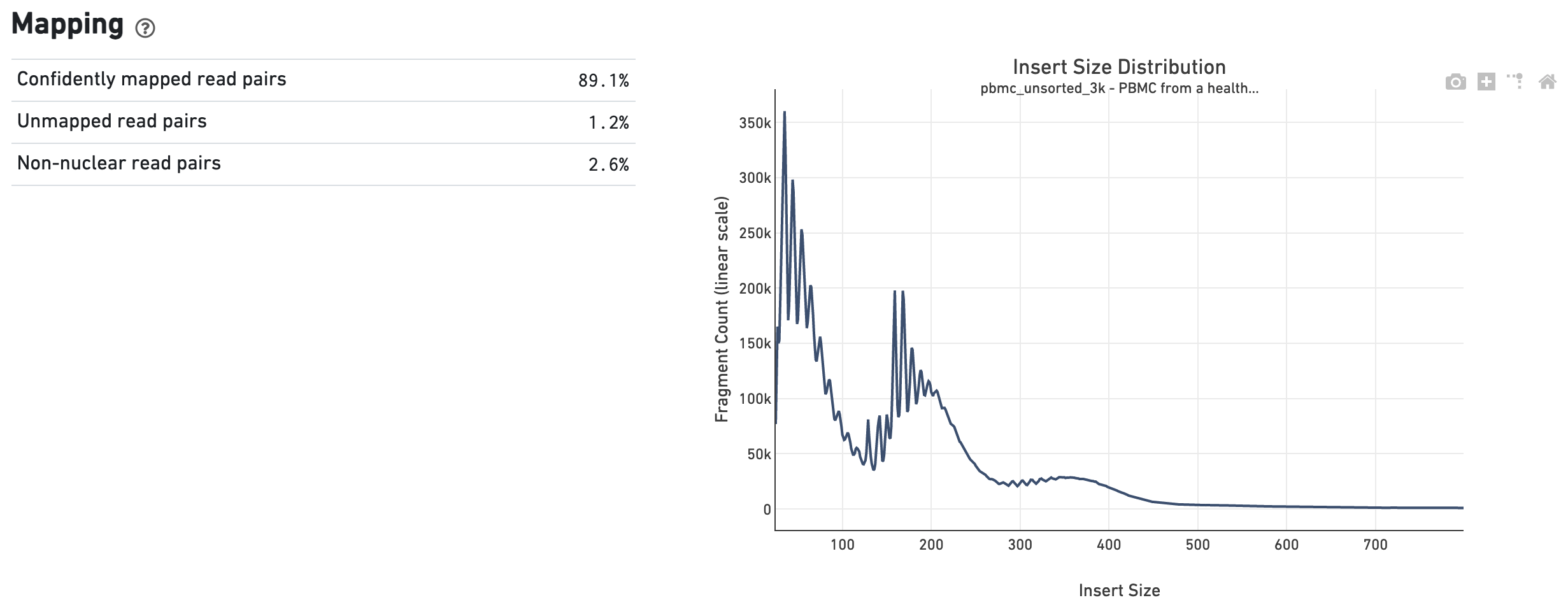
The Mapping dashboard shows metrics associated with the alignment of the sequenced read pairs to the input reference. Read pairs from single cell chromatin accessibility libraries produce detailed information about nucleosome packing and positioning. The insert size distribution (aka fragment size distribution) plot captures the average nucleosome positioning periodicity. A typical plot shows a sharp peak at the <100 bp (open chromatin), and a peak at ~200 bp (mono-nucleosome), and other larger peaks (multi-nucleosomes). A clear nucleosome phasing pattern is indicative of a good quality chromatin accessibility library.
Metrics that are specific to the given gene expression library will appear in the Gene Expression tab. This view is divided into the following sections:
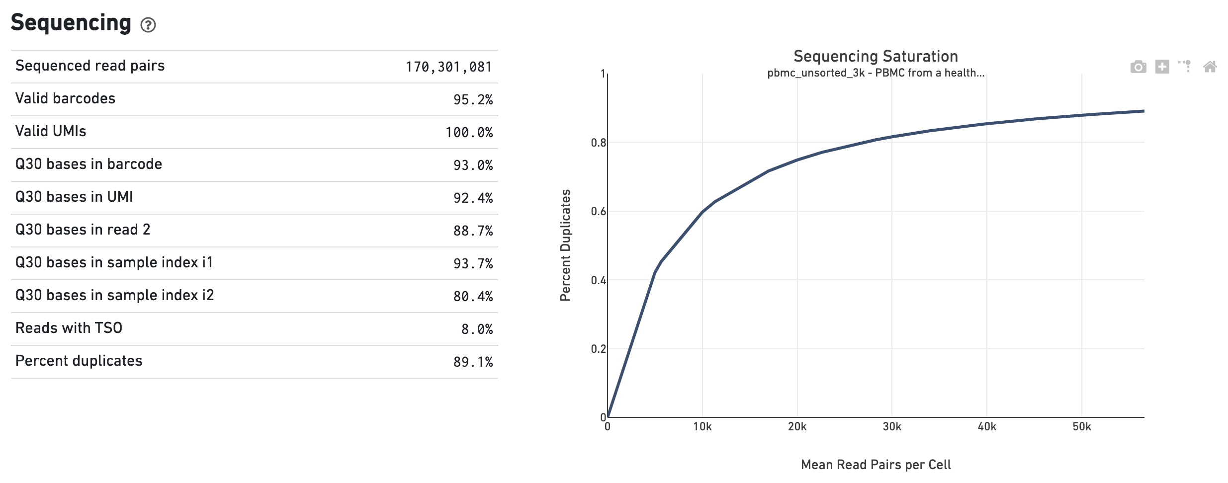
The Sequencing dashboard shows the sequencing QC metrics and a plot showing the effect of decreased sequencing depth on Sequencing Saturation, as measured by percent duplicates observed. Percent duplicates is the fraction of reads originating from an already-observed UMI and approaches 1.0 (100%) when all converted mRNA transcripts have been sequenced.
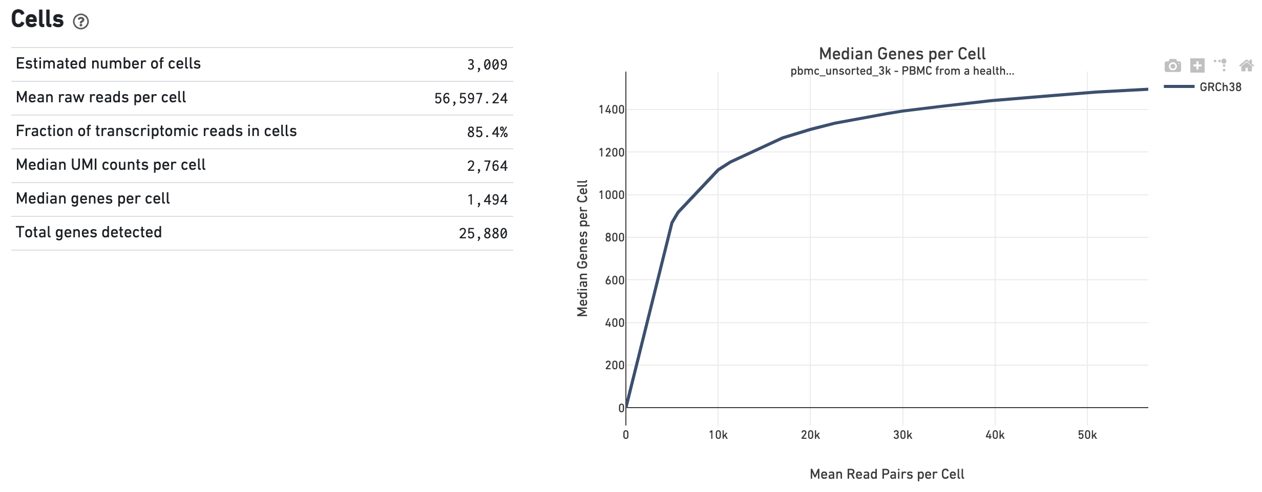
The Cells dashboard shows QC and sensitivity metrics associated with cell barcodes. The plot shows the effect of decreased sequencing depth on Median Genes per Cell, which is a way of measuring data yield as a function of depth.
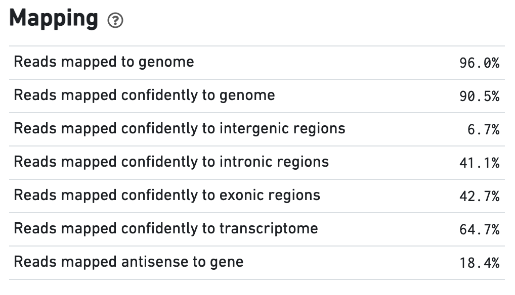
The Mapping dashboard shows metrics associated with the alignment of the sequenced read pairs to the input reference.
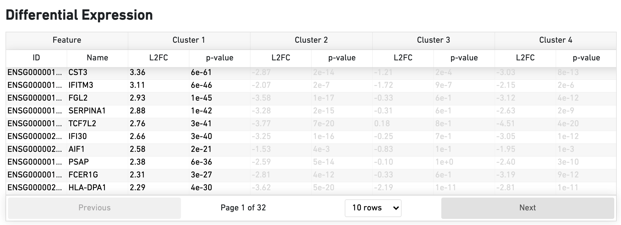
The Differential Expression dashboard shows a table with genes that are differentially expressed in each cluster relative to all other clusters. To find genes associated with a particular cluster, you can click the cluster number to sort the genes specifically by that cluster. The clusters are the result of an automated graph clustering analysis that groups cells with similar gene expression profiles, and are plotted in Cell Clustering section in the GEX 2-D space.