Space Ranger1.2, printed on 03/26/2025
The spaceranger count and aggr pipelines output a summary HTML file named web_summary.html that contains summary metrics and automated secondary analysis results. Any alerts issued by the pipeline are displayed at the top of the page, such as an indication that results or sequencing data are out-of-spec. Further information about alerts is provided in the troubleshooting documentation.
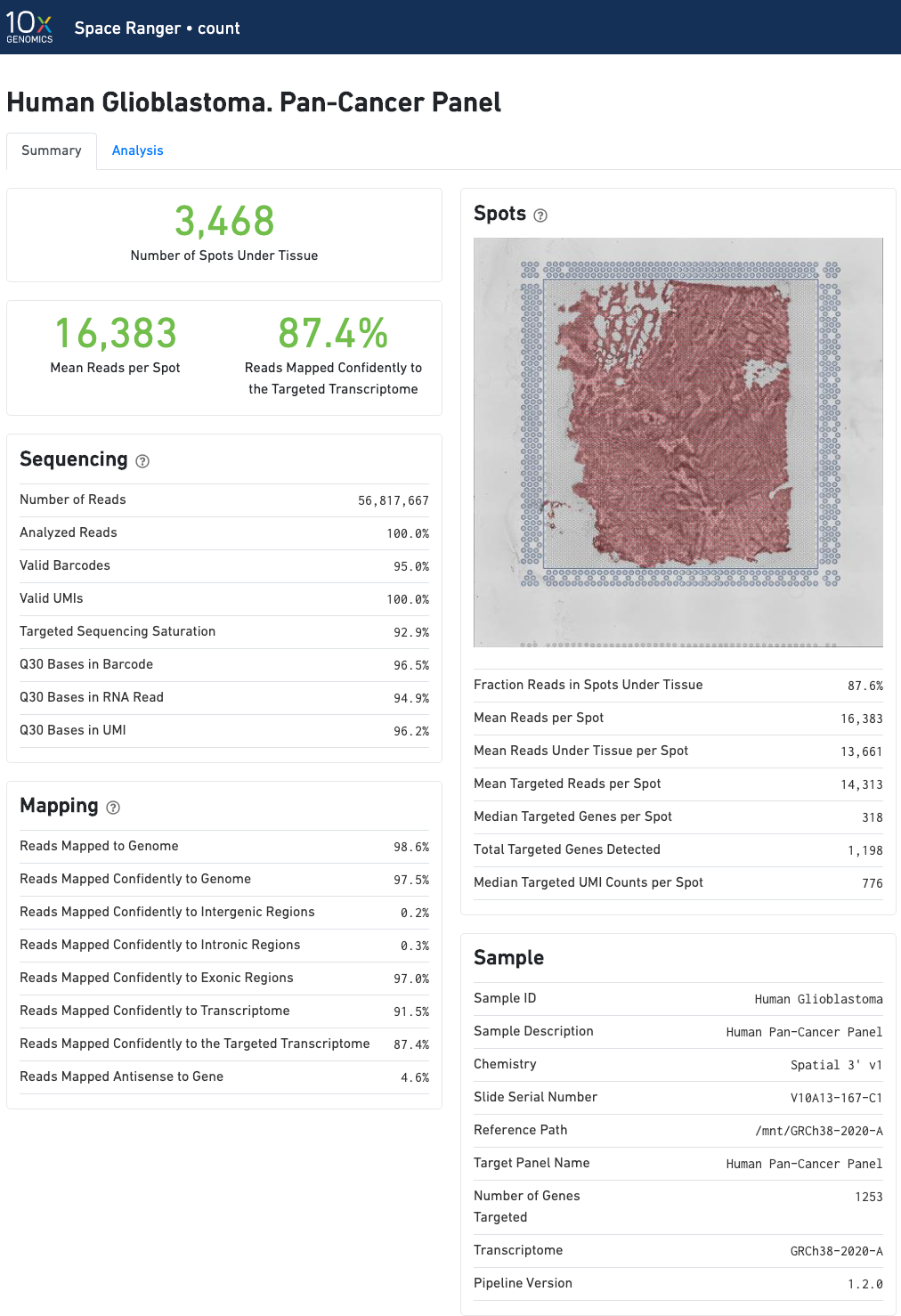
The run summary can be viewed by clicking "Summary" in the top left corner. The summary metrics describe sequencing quality and various characteristics of the detected spots for whole-transcriptome (WTA) analyses.
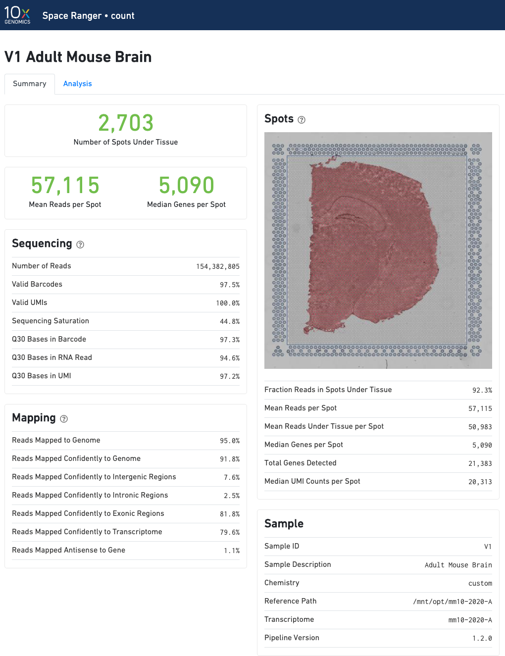
The number of spots detected, the mean reads per spot, and the median genes detected per spot are prominently displayed near the top of the page.
Click the '?' in the top of each dashboard for more information on each metric.
The "Spots" panel shows the tissue image in gray tones with an overlay of the aligned fiducials (blue spots), the under-tissue spots (solid red), and the out-of-tissue spots (gray). If automated tissue detection was performed, a reddish color will be assigned to any pixel labeled as tissue, even if that pixel does not coincide with a spot. An enlarged view of this panel appears as you move your cursor across the image. This panel is intended for checking the quality of the alignment and tissue selection that was performed, and is an important first step in interpreting your results. See Imaging Algorithms for details about these features.
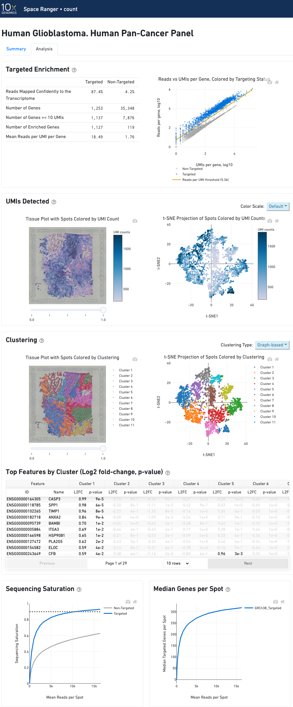
In addition to the metrics included in the WTA output, the targeted output includes targeting-specific metrics such as Analyzed Reads, Mean Targeted Reads per Spot, and Median Targeted Genes per Spot.
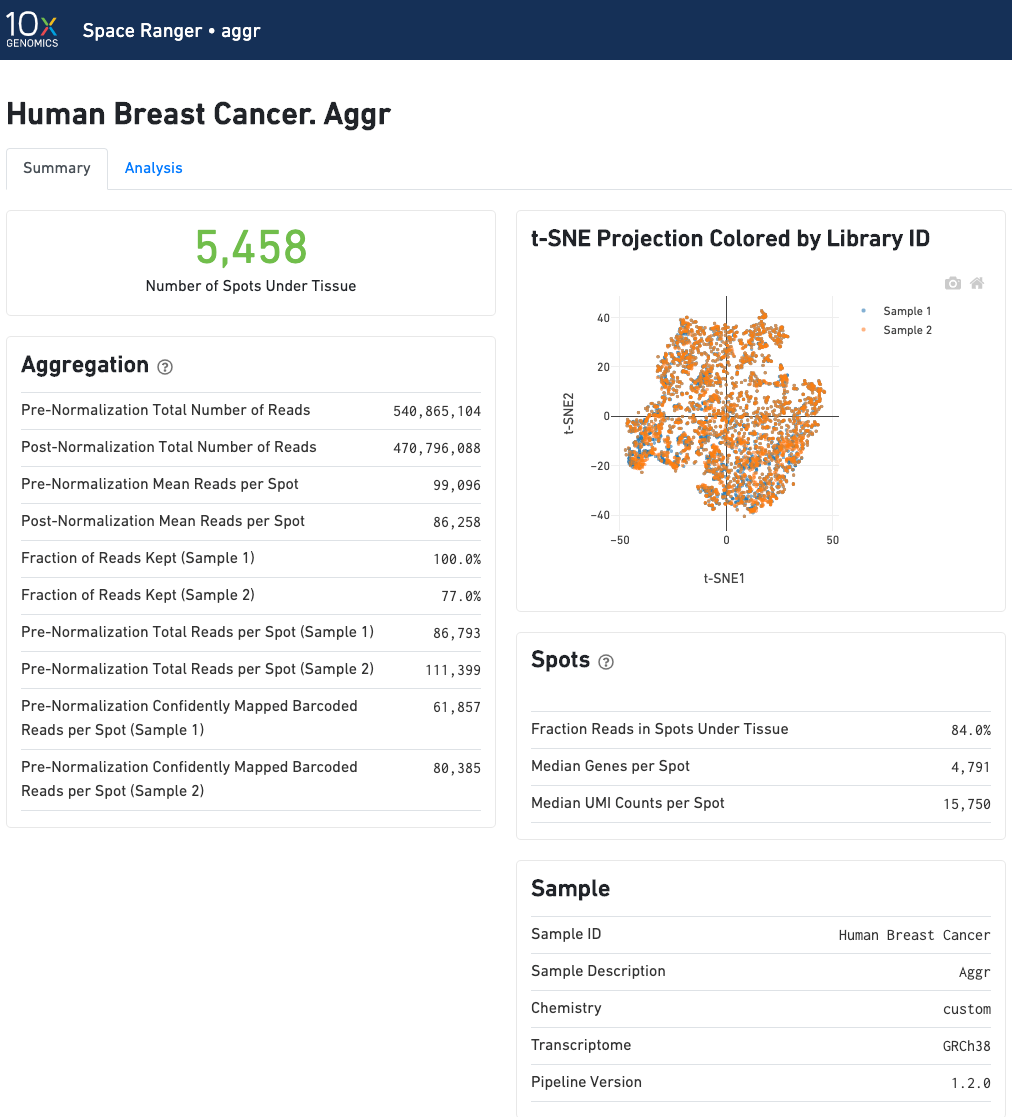
The summary metrics of an aggr run describe various characteristics about the aggregation process such as how many spots have been retained in the aggregated data. We do not generate image visualizations for each sample as we do in the count pipeline. For multi-sample image analysis, we recommend the new multi-sample features in Loupe Browser.
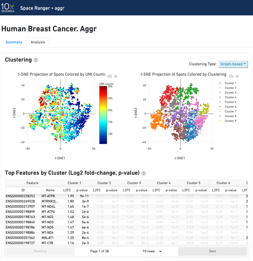
The automated secondary analysis results can be viewed by clicking "Analysis" in the top left corner. The secondary analysis provides the following:
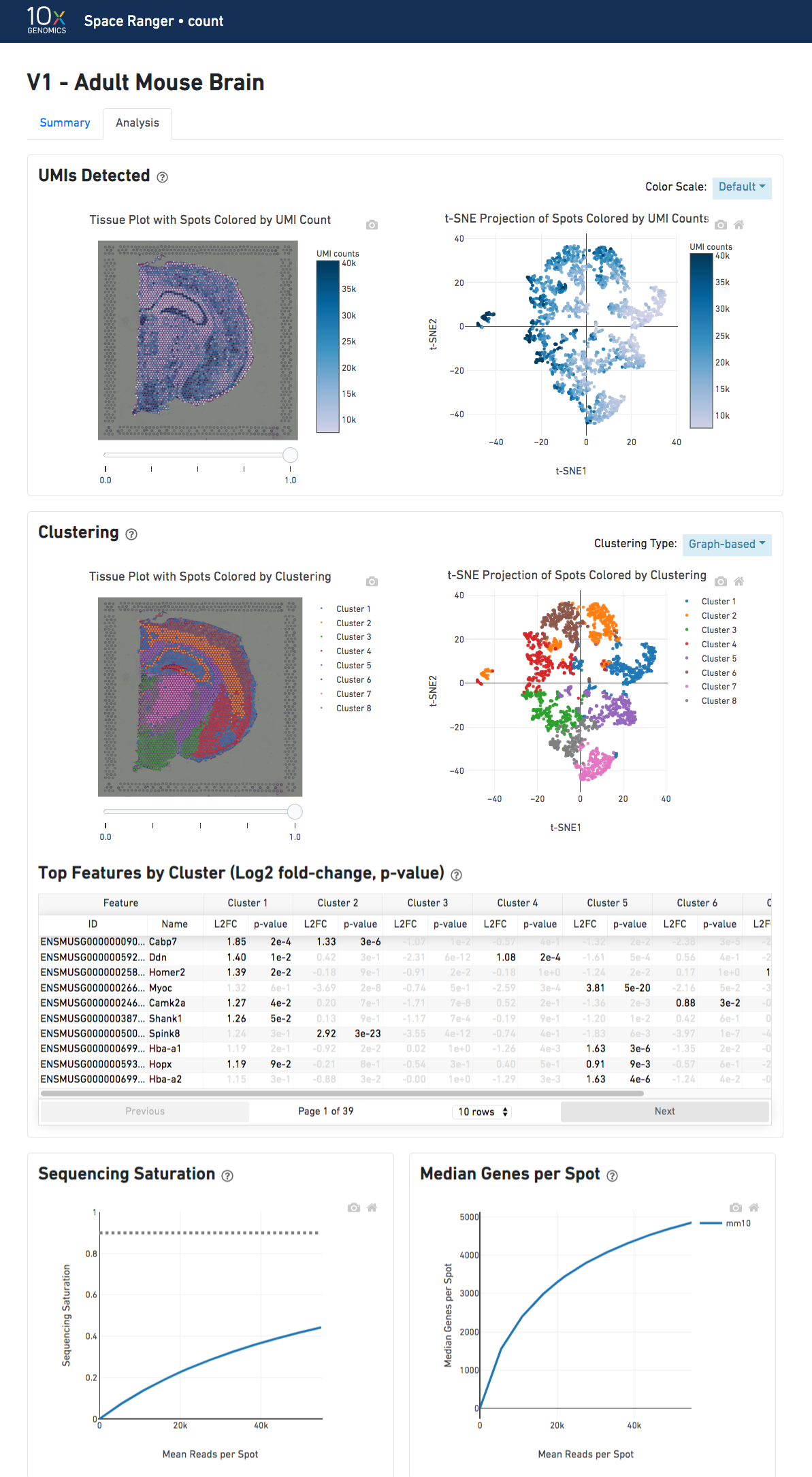
The top-left plot shows the tissue colored by the total UMI counts per spot, where darker blue indicates higher UMI counts and more RNA content in each spot.
The top right plot shows the 2-D t-SNE projection of the spots colored by the total UMI counts per spot. The color scale is selectable from the dropdown in the upper right - change this to vary the default coloring scheme.
The middle left plot overlays the clustering results onto the tissue segment. The spots are colored according to the cluster they are assigned to - clustering itself is done on the transcriptome data, without taking into account the spatial information.
The middle right plot overlays the clustering results onto the 2-D t-SNE projection of spots. The type of clustering analysis is selectable from the dropdown in the upper right - change this to vary the type of clustering and/or number of clusters that are assigned to the data.
The table in the middle shows which genes are differentially expressed in each cluster relative to all other clusters. To find the genes associated with a particular cluster, you can click the cluster number to sort the table by specificity for that cluster.
The bottom left plot shows the effect of decreased sequencing depth on Sequencing Saturation, which is a measure of the fraction of library complexity that was observed. The far right point of the line is the full sequencing depth obtained in this run.
Similarly, the bottom right plot shows the effect of decreased sequencing depth on Median Genes per Spot, which is a way of measuring data yield as a function of depth. The far right point is the full sequencing depth obtained in this run.
In an aggr run, the analysis tab shows two t-SNE plots of the aggregated dataset. Each dot represent a spot. The top left plot shows the t-SNE colored by the total UMI counts per spot.
The top right plot overlays the clustering results of the aggregated data onto the 2-D t-SNE projection of spots. The type of clustering analysis is selectable from the dropdown in the upper right - change this to vary the type of clustering and/or number of clusters that are assigned to the data.
In addition to the output from spaceranger count in WTA mode, there is the addition of targeting-specific metrics when run against a targeted panel. A Targeted Enrichment dashboard with metrics that assess targeting performance. On the right is a scatterplot of read counts per gene versus UMI counts per gene. A successful targeted experiment where targeted genes are well-enriched looks like the one below, with targeted genes (blue) cleanly separable from non-targeted genes (gray). See Targeted Gene Expression Algorithms for more information on how gene enrichments are computed.
The remainder of the analysis tab is very similar to that of a WTA run, but focuses on targeted genes (Sequencing saturation, Median genes per tissue-covered spot). As described under count-targeted Targeted Gene Expression Analysis, all secondary analysis (t-SNE, differential expression) is done using only targeted genes.
The analysis view for spaceranger aggr gives two main outputs: