Cell Ranger2.1, printed on 04/02/2025
Loupe V(D)J Browser 2 now allows you to load multiple samples into the same workspace and includes graphs, metrics, and statistics to compare them. You can also quickly switch between individual samples, or analyze differences between the clonotype distributions of different gene expression clusters.
To demonstrate the different comparisons available, you will need to download
three .vloupe files:
You can open these three files at the same time with Loupe V(D)J Browser. To
do so, from the Home/Recent Files menu, click on "Browse for a Loupe V(D)J Browser File",
and use the Command/Control or Shift keys to select the three PBMC .vloupe files in the
open file dialog.
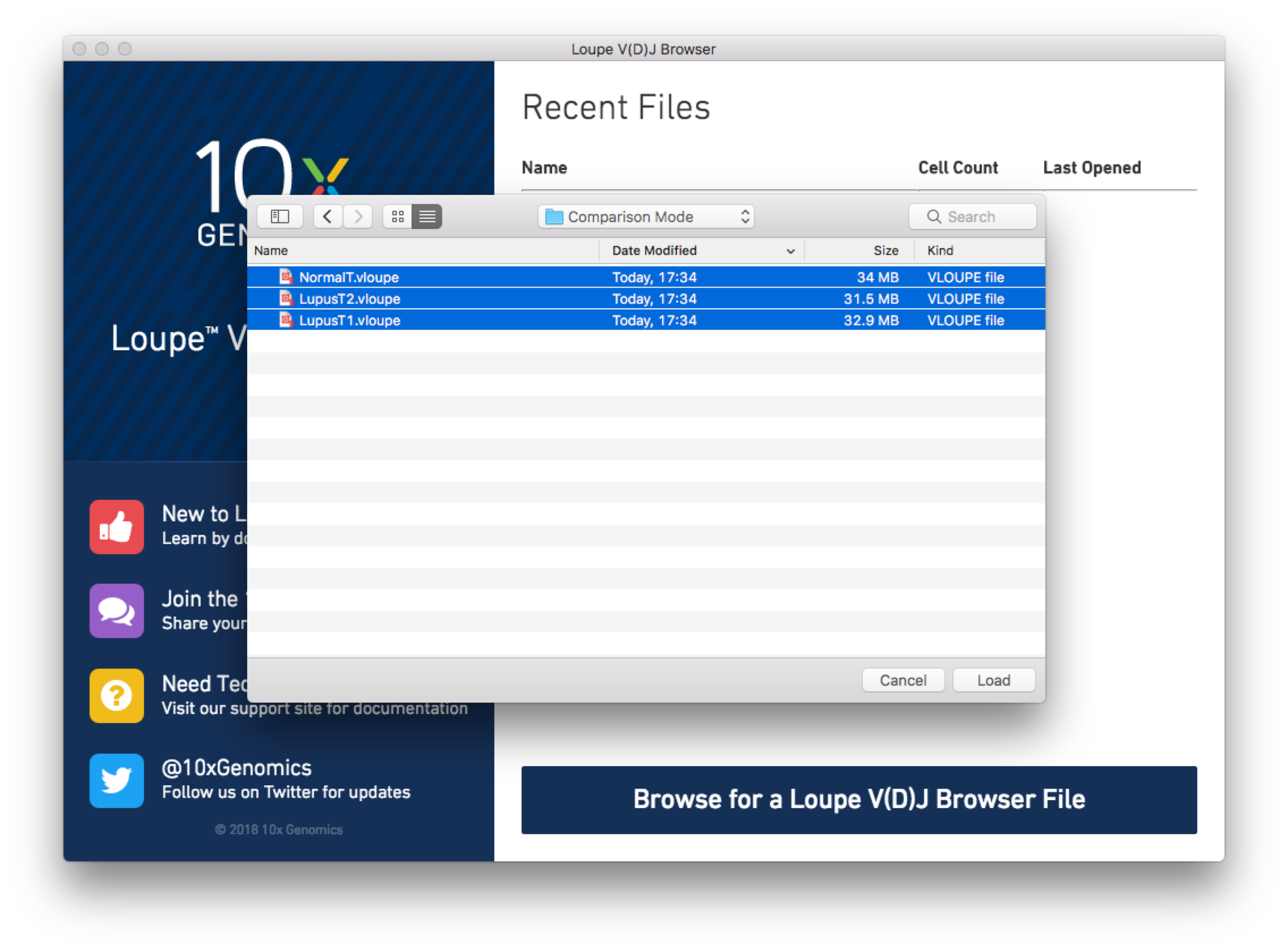
Loupe V(D)J Browser will load each file into the
active workspace, and display the single-sample view of the last loaded file. You may use the file
selector at the top of the screen to switch between .vloupe files, or choose
Comparison Mode at the top of the file selector to compare multiple files. You may also
click on the folder icon next to the file selector to add additional .vloupes to the workspace.
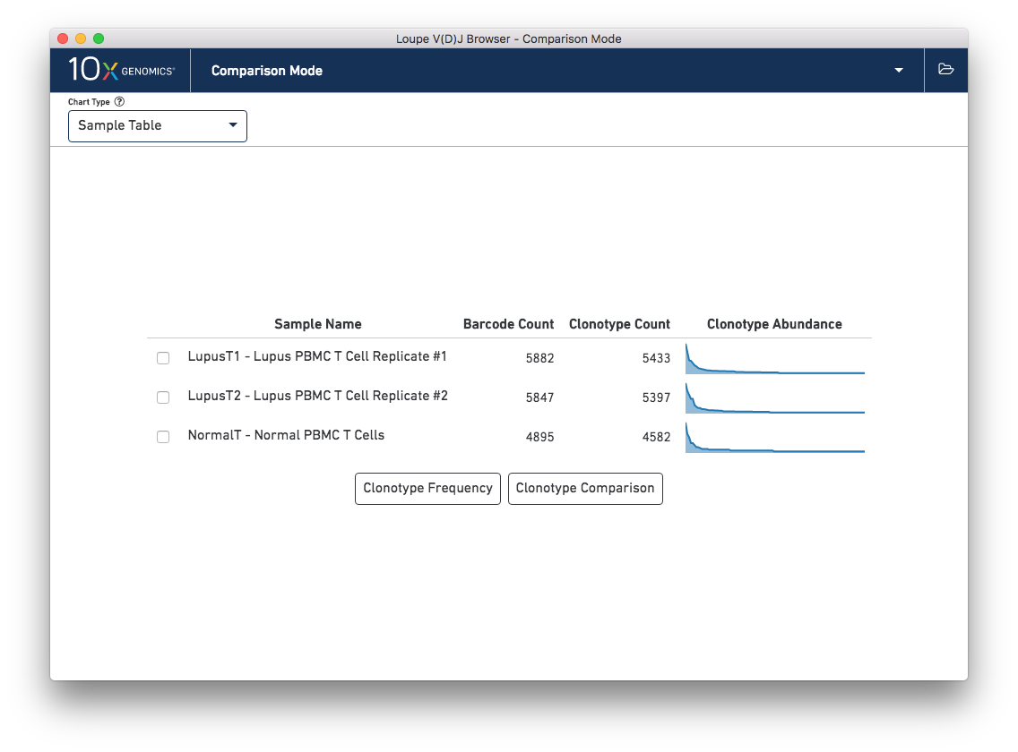
When switching into Comparison Mode, you will initially see a summary of all loaded samples -- the sample table.
Above the sample table and all other comparison charts is the control bar. The leftmost widget in the control bar is the Chart Type selector, which allows you to switch between charts. Each chart has its own set of options, which will be on the right side of the control bar. Most charts will have an export button, where the chart image can be exported to SVG or PNG, or the underlying data can be exported to a CSV file.
The Sample Table is the default comparison chart. For each loaded .vloupe sample in the workspace, you will
see a row in the sample table with its name, the number of detected barcodes for that file,
the number of unique clonotypes, and its distribution of clonotype frequencies.
From the sample table, you can make pairwise comparisons between two individual samples. There are two ways of doing this from the sample table chart: Clonotype Frequency, which shows pairwise frequencies of clonotypes in the two samples, and Clonotype Comparison, which shows the most distinct clonotypes for each sample. To perform a pairwise analysis, click the checkboxes next to the samples you wish to compare, and choose one of the buttons.
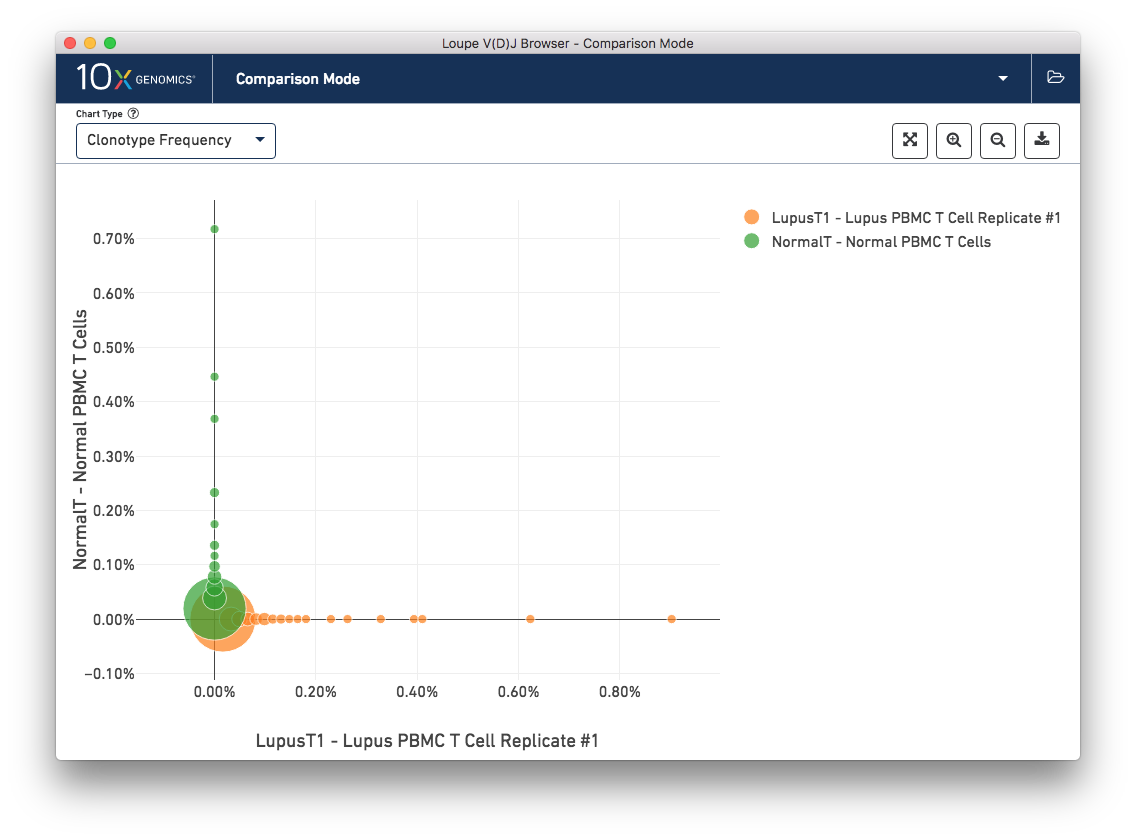
The Clonotype Frequency chart gives you a feel for how closely the clonotypes of two samples map onto each other. The x-axis represents the frequency of a particular clonotype in sample A, and the y-axis represents the frequency of a particular clonotype in sample B. The size of the circles at each point represent the number of clonotypes that have x barcodes in sample A and y barcodes in sample B.
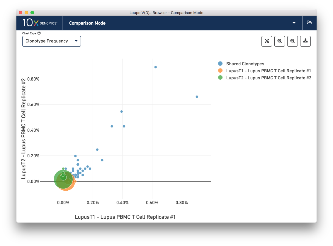
To get a feel for this, first compare the two lupus technical replicates. The mutual frequencies are distributed around the diagonal; clonotypes with many barcodes in sample A also have many barcodes in sample B. There are long tails of unique clonotypes in both samples, represented by the large circles at (0, 1) and (1, 0). In contrast, the mutual frequencies of the normal and lupus samples will be clustered around the axes, since there are no shared clonotypes between them.
You can use the zoom in/out and autoscale buttons on the control bar to zoom into regions of the chart in more detail, and drag the chart around with your mouse.
The other chart accessible from the sample table is Clonotype Comparison. This chart (which may take a few seconds to compute) shows which clonotypes are most significantly expanded between two samples. The clonotype differences are ordered by p-value, as computed by Fisher's exact test. The complete set of V(D)J genes for the paired clonotypes are shown, as are the CDR3s of the chains, and the counts and relative frequencies of the clonotype in each sample. A clonotype needs to have three or more barcodes in one sample to be included in the chart.
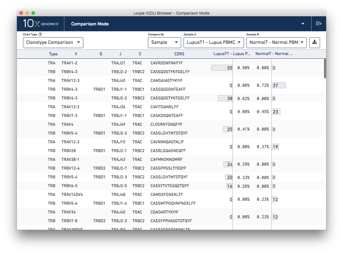
Comparing the normal PBMC sample versus a lupus PBMC sample will yield clear differences. However, there is also a small amount of variation between the two lupus technical replicates. You can switch between different samples by using the Sample A and Sample B selectors on the control bar.
It is also possible to compare clonotype frequencies between different gene expression clusters if you load the corresponding 5′ gene expression data from a .cloupe file into the workspace. For more information on how to do this, visit Integrated V(D)J and Gene Expression Analysis in Loupe V(D)J Browser.
Let's review the other comparison charts accessible through the Chart Type selector.
This chart shows a pairwise similarity metric between each loaded sample in the workspace. The default similarity metric is the Morisita-Horn overlap metric, which is a measure of overlap (where 0 signals no overlap, and 1 is an exact match) that weights common paired clonotypes in the head of the clonotype distribution more than the tail. As is expected, the Lupus technical replicates are more similar to each other than to the normal PBMC sample by this measure:
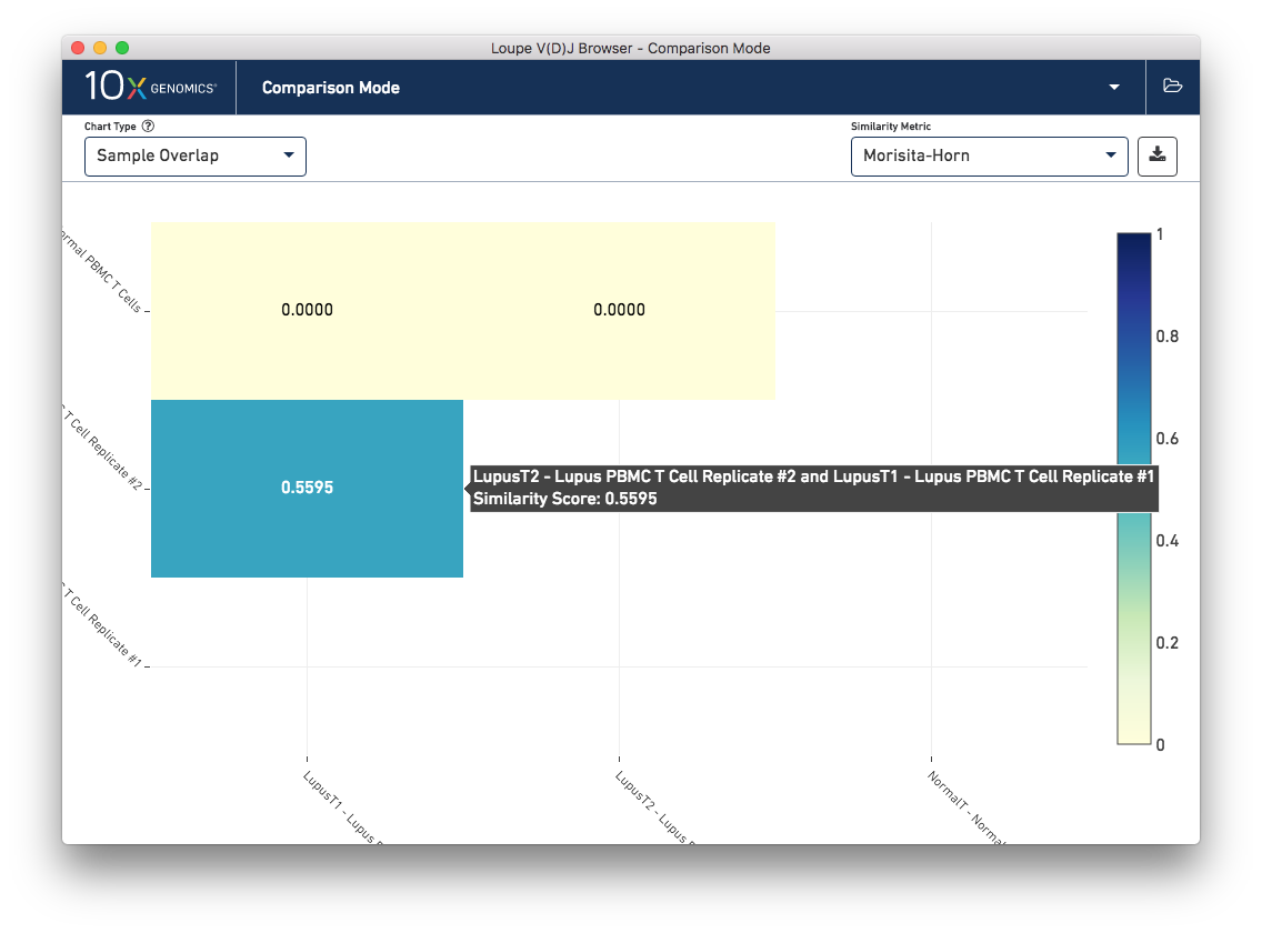
Other similiarity metrics, selectable via the Similarity Metric selector on the control bar, include the number of common paired clonotypes between samples, the number of common single-chain CDR3 sequences between samples, the number of barcodes between the samples that belong to common clonotypes, and the number of barcodes that have single chains also found in the other sample. The normal and lupus PBMC sets share some single chains; some of these are the well-conserved mucosal associated invariant T-cell (MAIT) alpha chain (TRAV1-2/TRAJ12,20,33) that is expected in PBMC samples.
This chart shows the frequencies of one sample's top clonotypes in the other loaded samples. You can set the anchor sample by selecting a sample from the Top 10 Clonotypes From selector at upper right. For example, when the LupusT2 (orange) lupus sample is selected as the anchor, the frequencies of the LupusT2's top N clonotypes for each sample are shown in the chart.
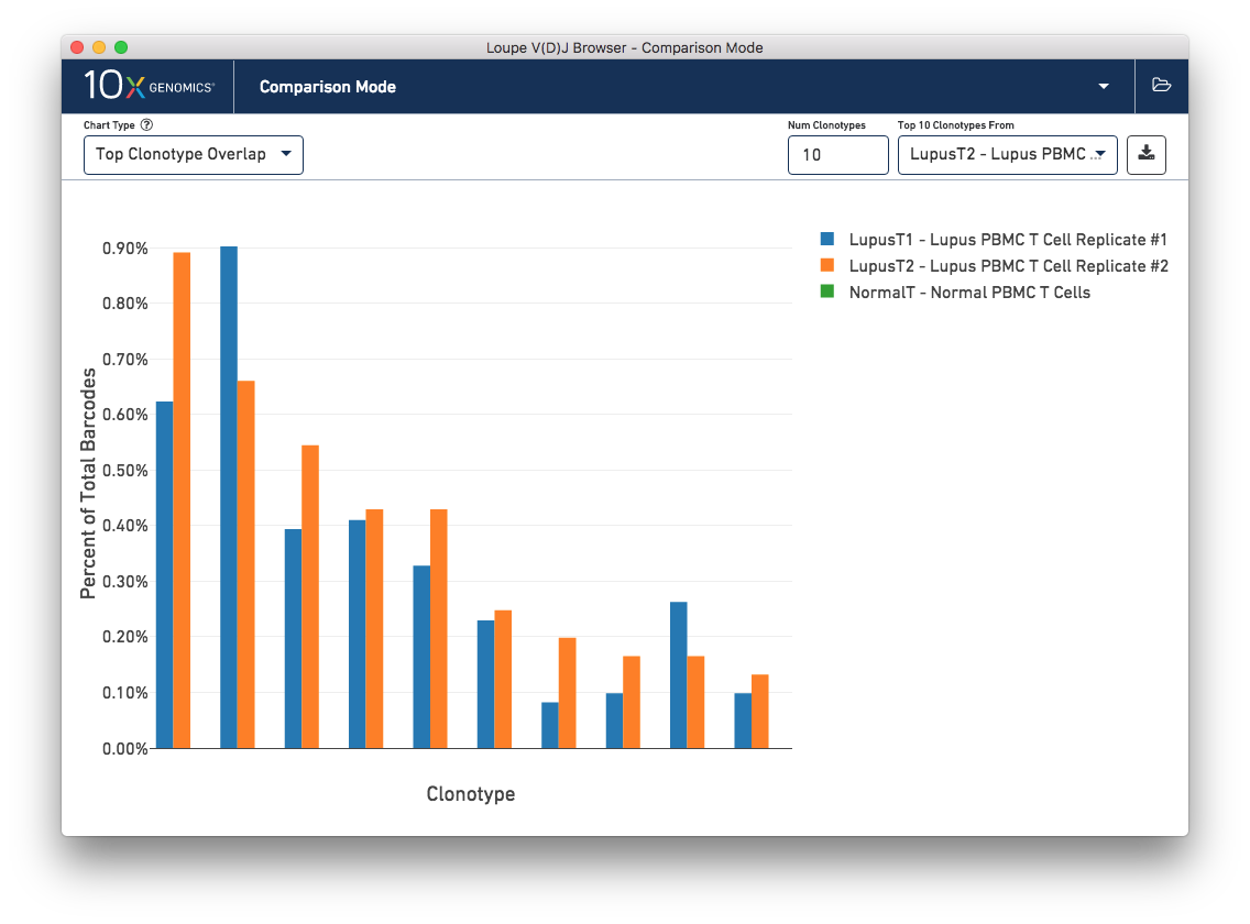
As expected, the top 10 clonotypes from the LupusT2 sample (orange) are also fairly abundant in the LupusT1 sample (blue), but are missing entirely from the normal PBMC sample (which would be green). You can change the number of clonotypes compared by editing the Num Clonotypes value in the control bar. You can toggle the visibility of any given sample by clicking on it in the legend in the upper right.
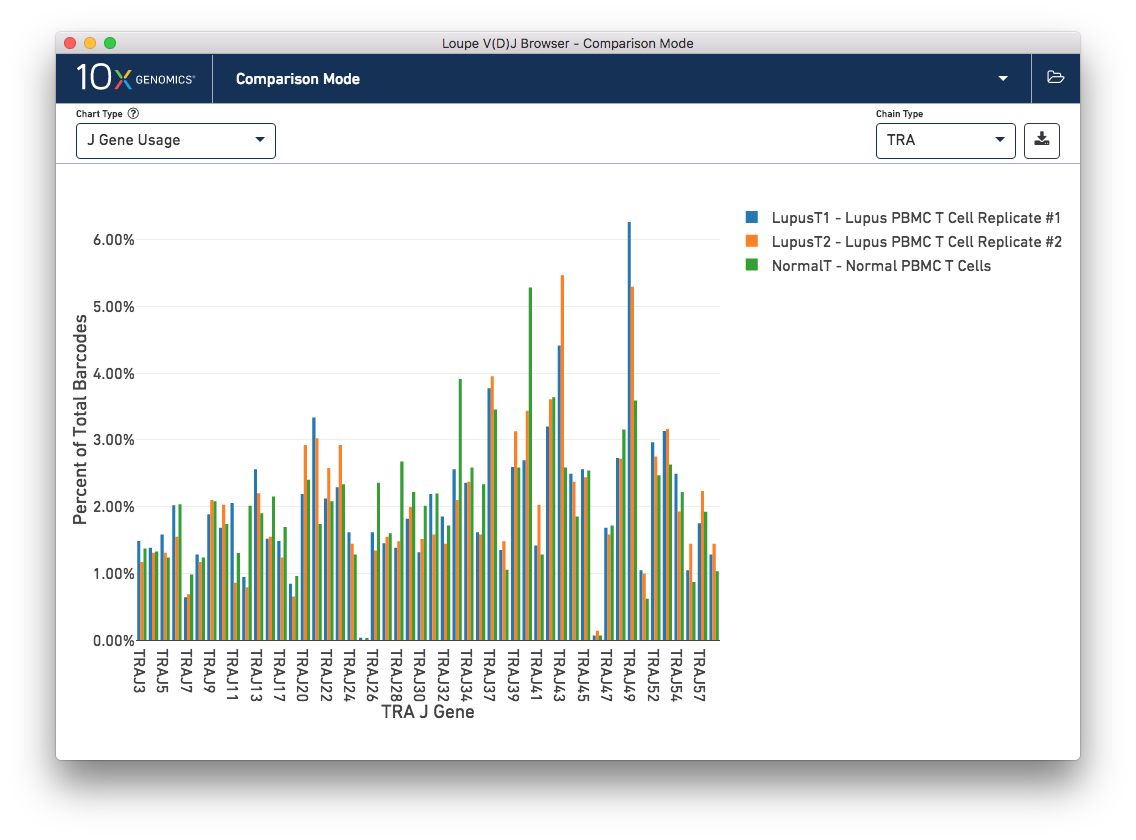
Finally, you can compare the relative frequencies of V, D, J, and C genes across multiple samples by selecting one of those four charts in the chart type selector. For each gene usage chart, you can either look at all chain types, or limit to a single chain type through the Chain Type selector.
This concludes the Loupe V(D)J Browser tutorial. We hope that you are comfortable enough now to use this tool on your own Chromium Single Cell 5′ V(D)J data. If you have matching 5′ Gene Expression data, the Loupe V(D)J and Cell Browsers are more powerful together. See the integrated V(D)J and gene expression analysis tutorial.
If you encounter difficulties or have general questions about the software, email support@10xgenomics.com with your questions.