Cell Ranger1.0, printed on 04/01/2025
The cellranger pipeline outputs a summary HTML file containing summary metrics and automated secondary analysis results.
The run summary can be viewed by clicking "Summary" in the top left corner. The summary metrics describe sequencing quality and various characteristics of the detected cells.
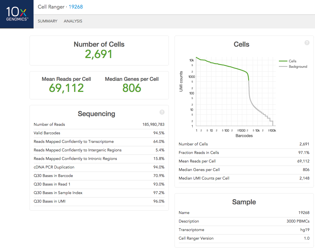
The number of cells detected, the mean reads per cell, and the median genes detected per cell are prominently displayed near the top of the page.
Click the '?' in the upper right corner of each dashboard for more information on each metric.
The Barcode Rank Plot under the "Cells" dashboard shows the distribution of barcode counts and which barcodes were inferred to be associated with cells. The y-axis is the number of UMI counts mapped to each barcode and the x-axis is the number of barcodes below that value. A steep drop-off is indicative of good separation between the cell-associated barcodes and the barcodes associated with empty partitions.
The automated secondary analysis results can be viewed by clicking "Analysis" in the top left corner. The secondary analysis provides the following:
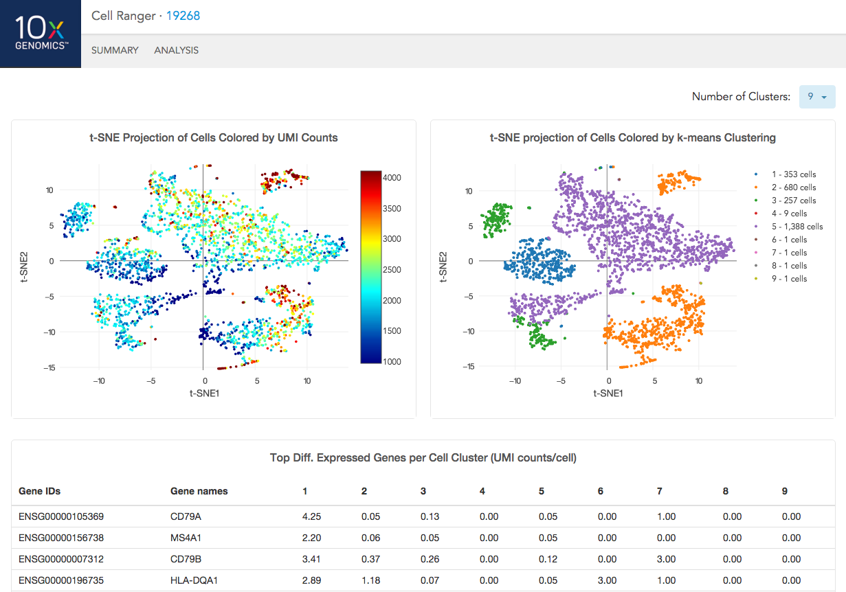
The top left plot shows the 2-D t-SNE projection of the cells colored by the total UMI counts per cell. This is suggestive of the RNA content of the cells and often correlates with cell size - redder points are cells with more RNA in them.
The top right plot overlays the K-means clustering results onto the 2-D t-SNE projection of cells. Each cluster is numbered from 1 to K. The value of K is selectable from the dropdown in the upper right - change this to vary the number of clusters that are assigned to the data.
The table at the bottom shows which genes are differentially expressed in each cluster relative to the other clusters. To find the genes associated with a particular cluster, you can click the cluster number to sort the table by specificity for that cluster.
If you analyzed a multi-species experiment, the output will look different. For example, the human-mouse mixing experiment is run to verify system functionality. It consists of mixing approximately 600 human (HEK293T) cells and 600 mouse (3T3) cells in a 1:1 ratio.
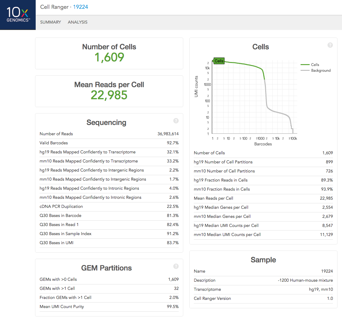
Click the '?' in the upper right corner of each dashboard for more information on each metric.
In the Analysis View, running the human-mouse mixing experiment results in the following plot:
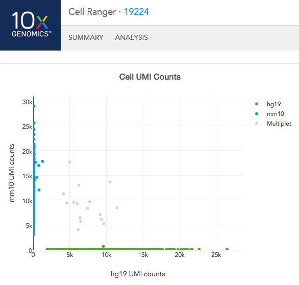
Each point represents a barcode; the gray points are inferred to be associated with GEM partitions that contained more than one cell because they contained a large number of molecules that came from human cells and mouse cells. The GEMs containing human-human and mouse-mouse cell combinations are not visible here, but their presence is inferred in the "Fraction GEMs with >1 Cell" metric in the Summary View.